Cozy Living Rooms: 23 Inviting Color Texture Ideas
Creating a living room that feels both stylish and welcoming requires more than selecting beautiful furniture pieces. The secret lies in thoughtfully combining colors and textures that work together to establish warmth, comfort, and visual interest. Whether you prefer subtle neutrals or bold statement hues, understanding how to layer different elements transforms your space from ordinary to extraordinary.
The modern approach to living room design embraces the tactile experience. Homeowners increasingly recognize that a truly inviting space engages multiple senses through carefully chosen materials, finishes, and color schemes. This comprehensive guide explores 23 distinct ideas that combine color theory with texture application to help you craft a living room that welcomes family and guests while reflecting your personal aesthetic.
Understanding the Foundation of Color and Texture
Before diving into specific ideas, it helps to grasp how color and texture interact within interior spaces. Color establishes mood and emotional response, while texture adds dimension and physical warmth. Together, these elements create layers of visual and tactile interest that prevent rooms from feeling flat or sterile.
Warm colors such as terracotta, soft browns, and muted oranges naturally generate feelings of comfort and security. Cool tones like soft blues and sage greens provide calm and serenity. Neutrals offer versatility and serve as canvases for bolder accents. Texture amplifies these effects through the physical qualities of materials, from smooth leather to nubby linen to plush velvet.
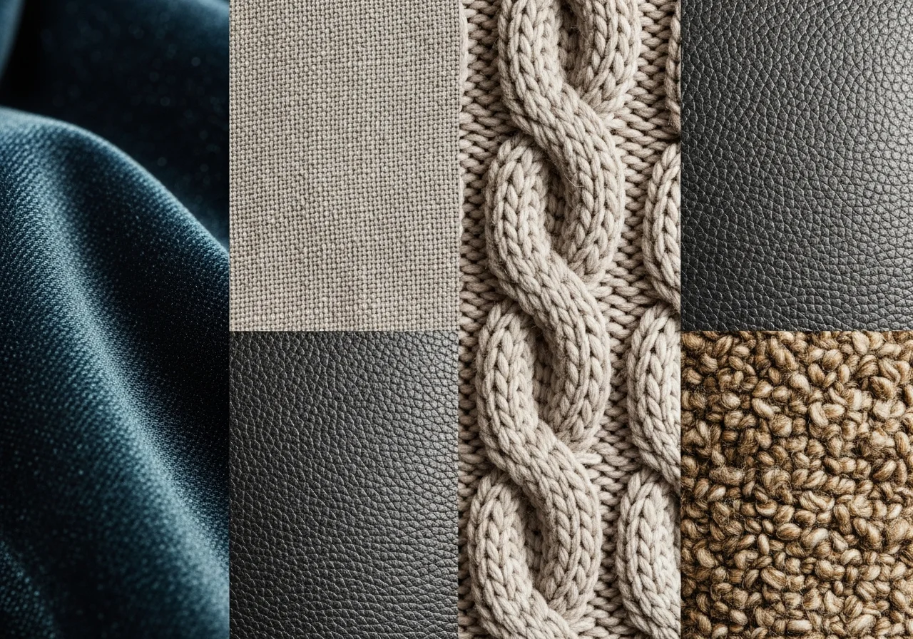
The most successful living rooms incorporate both visual and tactile textures. Visual texture refers to patterns and finishes that create the illusion of dimension, such as grasscloth wallpaper or wood grain. Tactile texture involves surfaces you can physically touch and experience, like a chunky knit throw or a hand-woven rug.
Warm Earth Tone Combinations
Rich Terracotta and Cream Layers
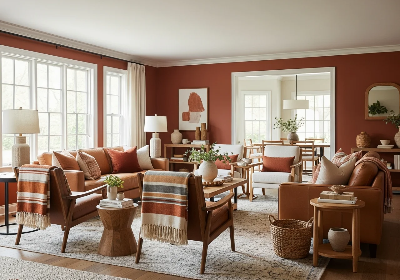
Terracotta brings instant warmth to living spaces through its connection to natural clay and Mediterranean design traditions. Pairing this vibrant earth tone with cream creates balance, allowing the terracotta to shine without overwhelming the space. Layer these colors through upholstered furniture, throw pillows, and ceramic accessories. Add texture with a terracotta-colored velvet sofa against cream walls, complemented by linen curtains and a wool area rug in complementary tones.
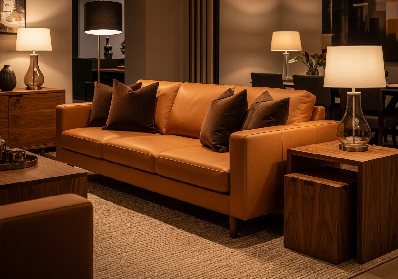
Caramel and Soft Brown Depths
Deep caramel tones combined with various shades of brown establish sophisticated warmth. This combination works particularly well in rooms with abundant natural light, where the depth of color creates coziness without darkness. Incorporate these hues through leather furniture, wooden accents, and woven textiles. A cognac leather sofa paired with chocolate brown throw pillows and a caramel-toned area rug demonstrates this principle beautifully. Add visual interest with different brown textures such as smooth leather, rough jute, and soft suede.
Burnt Orange and Taupe Sophistication
For those wanting warmth with modern sensibility, burnt orange and taupe create striking yet approachable combinations. The key lies in proportion, using taupe as the dominant neutral while burnt orange provides energetic accents. Consider taupe walls with burnt orange accent chairs, or reverse the approach with burnt orange feature walls balanced by taupe upholstery. Texture becomes crucial here through materials like boucle fabric, brushed metal finishes, and matte ceramic pieces.
Cool and Calming Color Textures
Sage Green and Natural Wood
Sage green offers botanical freshness while maintaining the softness needed for comfortable living spaces. When combined with natural wood tones, it creates organic harmony that feels grounded and peaceful. Paint walls in soft sage while incorporating wooden coffee tables, shelving, and picture frames. Add texture through linen upholstery in sage tones, jute rugs, and cotton throw blankets. The mix of smooth painted surfaces, visible wood grain, and woven textiles provides essential variety.
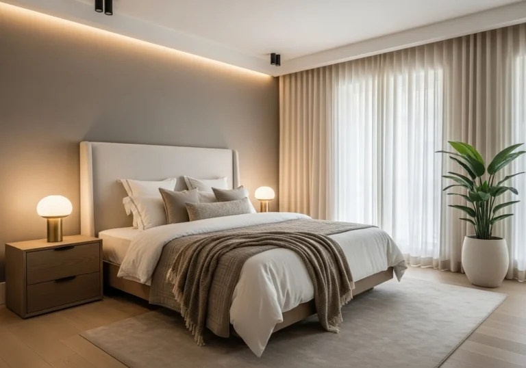
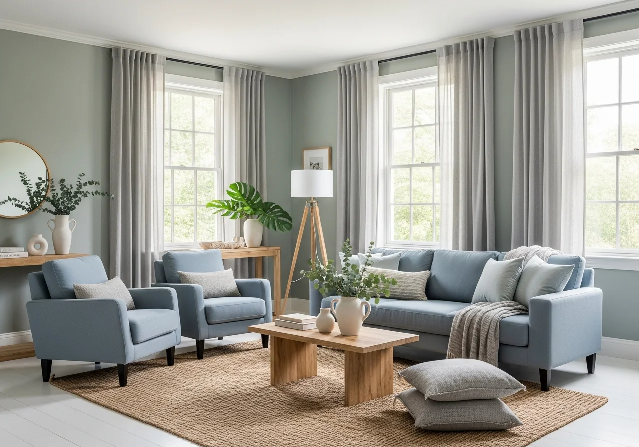
Dusty Blue and Warm White
Dusty blue provides the calming qualities of traditional blue while avoiding coldness through its muted, slightly grayed tone. Pairing it with warm white rather than stark white maintains coziness. Apply dusty blue to larger furniture pieces or feature walls, using warm white for trim, ceiling, and lighter textiles. Introduce texture through velvet pillows in dusty blue, a chunky cable-knit throw in cream, and a textured ceramic lamp base. The interplay between smooth painted surfaces and varied fabric textures creates visual depth.
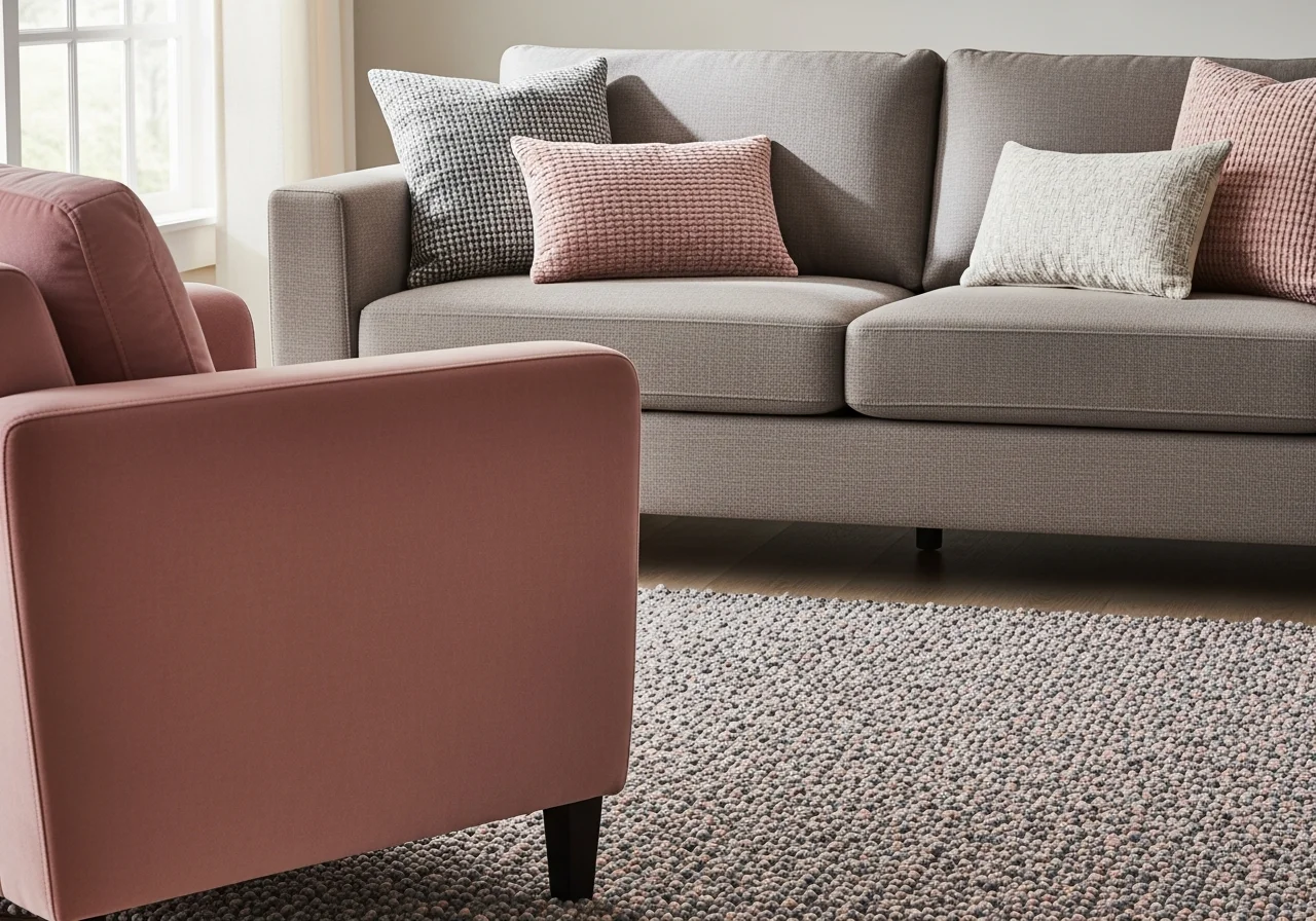
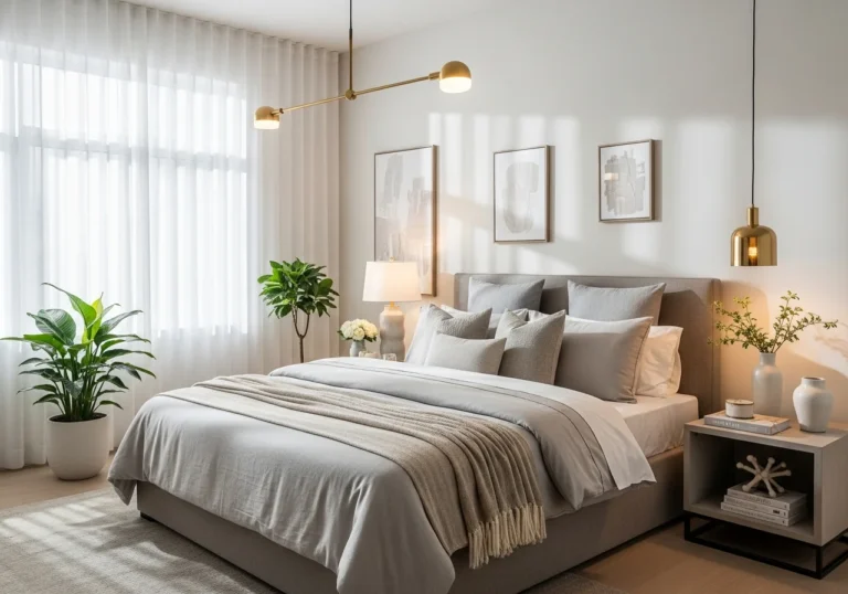
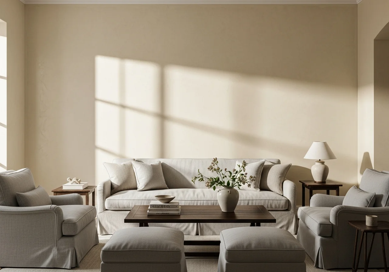
Soft Gray and Blush Accents
Gray continues to dominate neutral palettes, but adding blush pink accents transforms it from potentially cold to genuinely inviting. Choose warm gray tones with slight brown undertones rather than cooler grays with blue bases. Use gray as your primary neutral on walls and larger furniture, then introduce blush through pillows, throws, artwork, and decorative objects. Texture variations become essential here: smooth gray linen on a sofa, a plush blush velvet accent chair, and a nubby gray-and-pink patterned rug.
Bold and Dramatic Texture Ideas
Deep Navy with Brass and Leather
Navy blue offers sophistication and depth without the severity of pure black. When combined with warm brass metallic finishes and rich leather, it creates spaces that feel both elegant and welcoming. Consider navy walls or a navy velvet sofa as your anchor, then layer in brass lighting fixtures, picture frames, and decorative objects. Add a caramel leather ottoman or chairs to introduce warmth. The contrast between smooth velvet, gleaming brass, and supple leather provides textural richness.
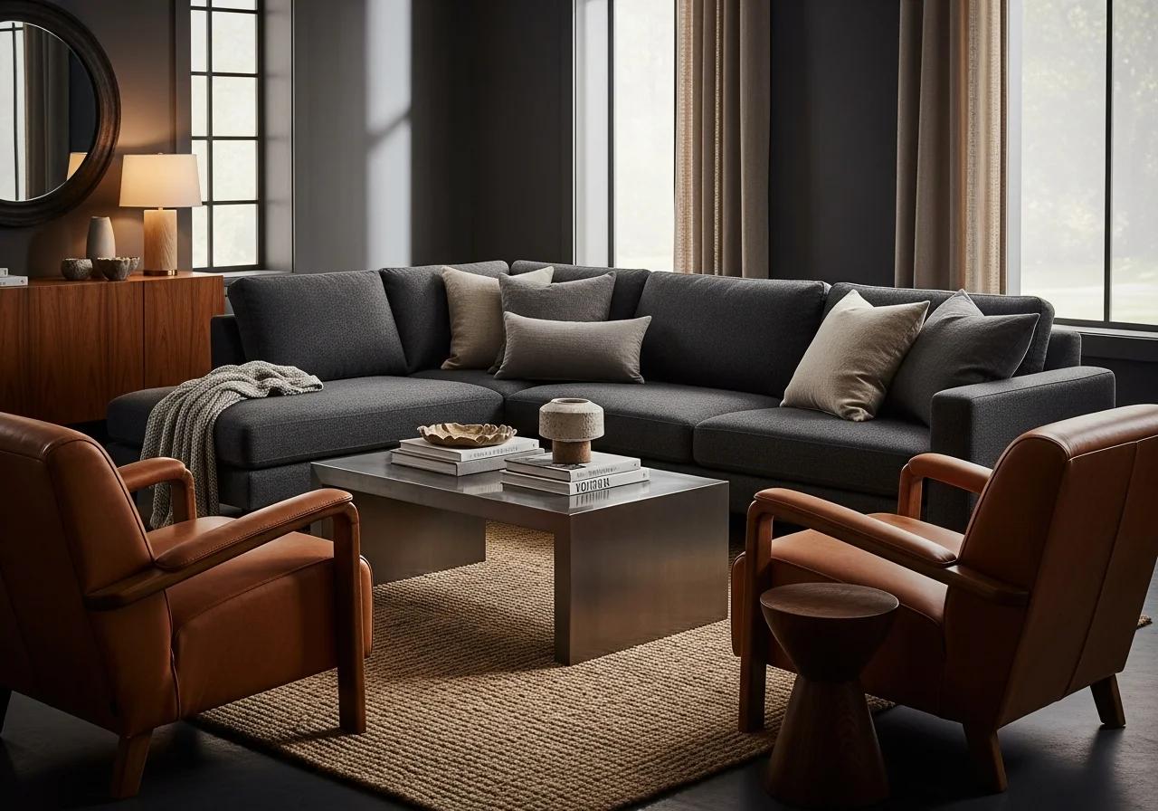
Charcoal Gray and Cognac Warmth
For dramatic yet cozy spaces, charcoal gray paired with cognac creates striking balance. The near-black quality of charcoal provides modern edge, while cognac leather or fabric introduces essential warmth. Paint one accent wall in charcoal or choose a charcoal sectional sofa, then balance with cognac leather chairs or a cognac-toned area rug. Add texture through materials like brushed metal, rough linen, and smooth lacquered wood.
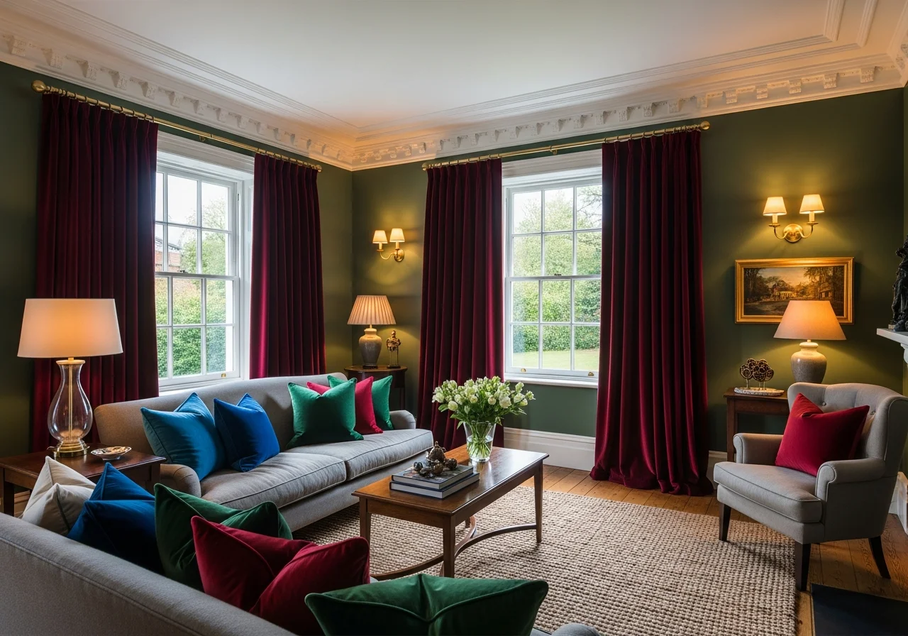
Forest Green and Burgundy Richness
Traditional yet timeless, forest green combined with burgundy accents creates living rooms filled with warmth and character. These jewel tones work particularly well in rooms with architectural details like crown molding or built-in shelving. Use forest green as your primary color on walls or major upholstery pieces, adding burgundy through smaller elements like throw pillows, curtains, or artwork. Vary textures with smooth painted walls, plush velvet upholstery, and woven wool textiles.
Neutral Layering Techniques
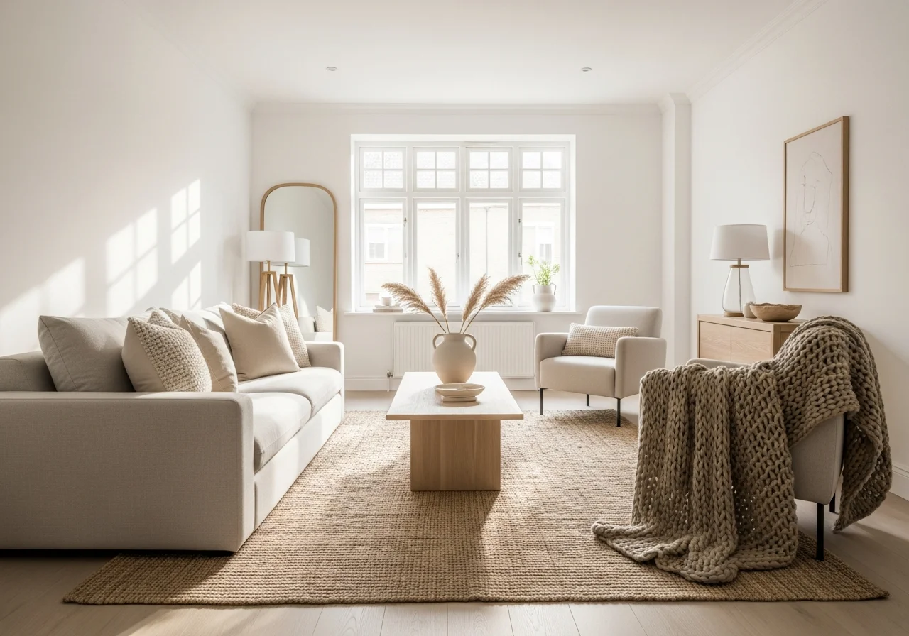
Warm White on White Variations
Creating interest within a white color scheme requires thoughtful attention to texture and subtle tonal variations. Rather than using a single white throughout, incorporate warm whites, ivory, and cream tones. Texture becomes paramount: pair smooth painted walls with linen curtains, boucle upholstery, a jute rug, and wool throw blankets. Add visual texture through white-on-white patterns in pillows or wallpaper. The result feels light and airy while remaining cozy through material variety.
Beige and Tan Spectrum Layering
Beige earns its classic status through remarkable versatility, but preventing blandness requires deliberate texture mixing. Start with walls in a medium beige, then layer furniture in various tan and beige shades. Crucial to success: ensure each beige element features distinct texture. Smooth leather, rough burlap, soft chenille, sleek painted wood, and nubby linen all register as different despite similar color families. This approach creates subtle sophistication that feels collected rather than matchy.
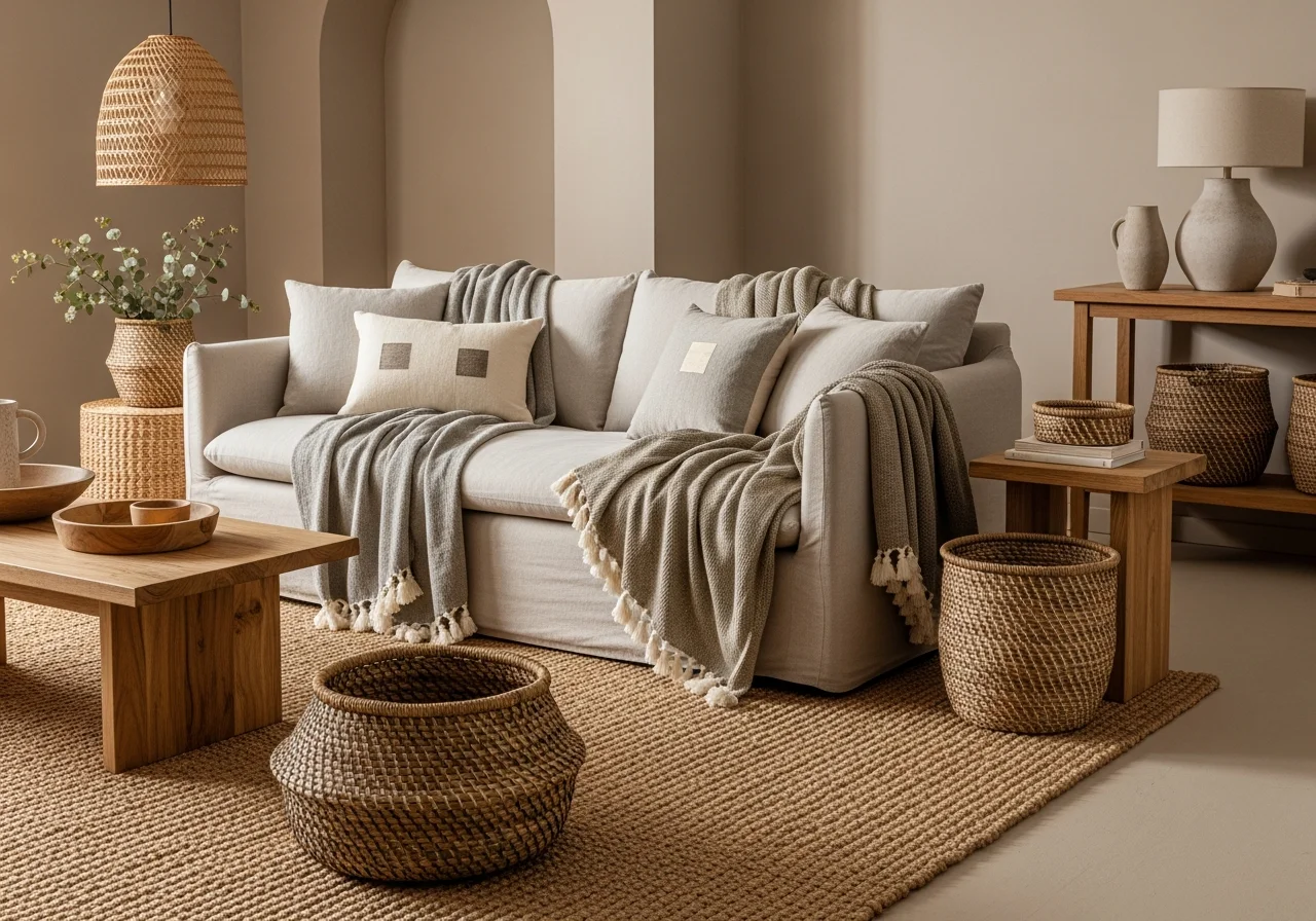
Greige with Natural Fiber Emphasis
Greige, the beloved gray-beige hybrid, provides the perfect neutral backdrop for natural fiber textures. Paint walls in a warm greige tone, then build your room with natural materials: a sisal or jute area rug, linen upholstery, cotton throw blankets, wooden furniture, and woven baskets for storage. The beauty emerges from the interplay between the smooth painted walls and the organic, irregular textures of natural fibers. Add interest with varied weave patterns in pillows, throws, and window treatments.
Textural Wall Treatments
Grasscloth Wallpaper in Warm Tones
Grasscloth wallpaper introduces immediate texture and organic beauty to living room walls. Available in numerous colors, choosing warm tones like honey, sand, or warm gray maintains coziness while adding visual interest. The natural variation in grasscloth creates subtle pattern that engages the eye without overwhelming. Pair grasscloth walls with smooth leather or linen upholstery to create textural contrast. The slightly rough surface of grasscloth also helps with acoustics, making rooms feel more intimate.
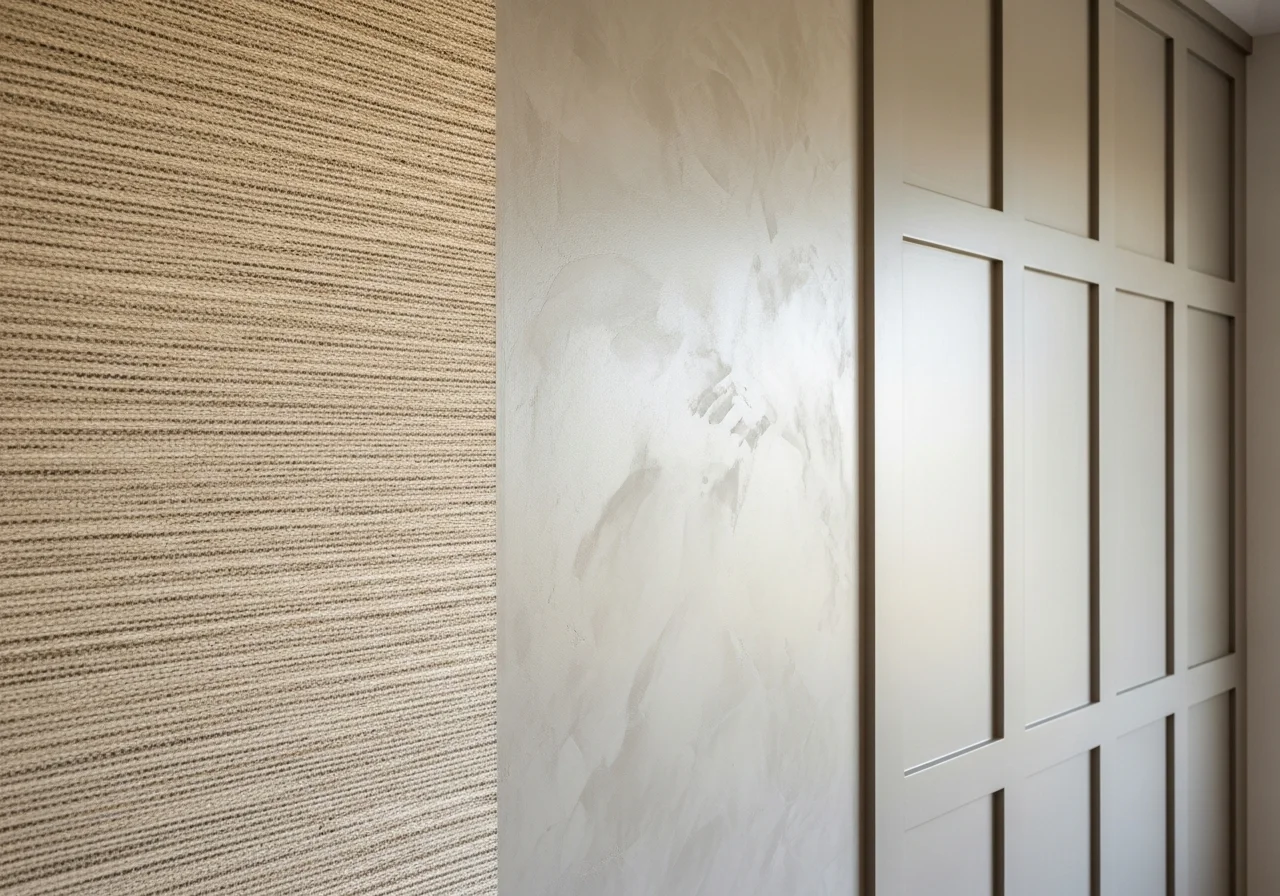
Venetian Plaster Finish
Venetian plaster creates sophisticated depth through its subtle shine and dimensional quality. This finish works particularly well in warm neutrals like cream, tan, or soft gray where light can play across the textured surface. The smooth yet irregular finish adds elegance without formality. Balance the refined wall texture with more casual furniture fabrics like cotton, linen, or denim to maintain approachability.
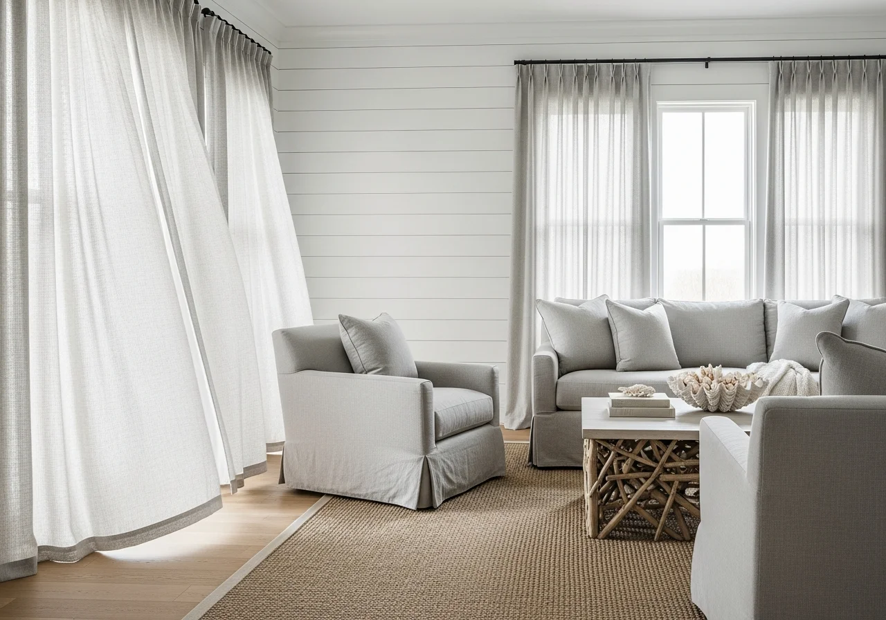
Shiplap or Board and Batten Texture
Architectural wall treatments like shiplap or board and batten add physical dimension that creates shadow lines and visual interest. Painted in soft whites, warm grays, or even bold colors like navy or sage, these treatments provide classic texture. They work particularly well in farmhouse, coastal, or transitional design styles. Balance the structured wall texture with softer furniture elements: plush upholstery, flowing curtains, and organic accessories.
Fabric and Textile Combinations
Velvet and Linen Contrast
Combining luxurious velvet with casual linen creates perfect textural balance in living rooms. The visual richness and softness of velvet provides comfort and elegance, while linen’s organic, slightly rough texture keeps the space grounded. Consider a velvet sofa in a jewel tone like emerald or sapphire, paired with linen throw pillows and linen curtains in complementary neutral tones. This combination works across design styles from traditional to contemporary.
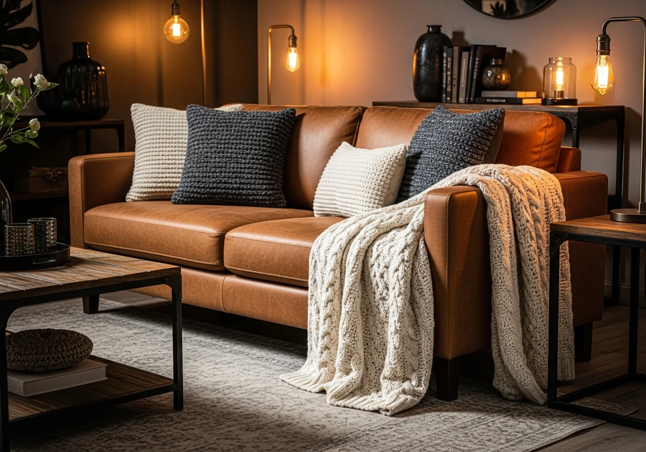
Leather and Chunky Knits
The smooth, cool quality of leather finds its perfect complement in the warm, soft texture of chunky knit textiles. A leather sofa, whether in rich brown, cognac, or even black, gains coziness when layered with cable-knit throw blankets and textured pillows. This pairing works exceptionally well in modern, industrial, or masculine-leaning living room designs. Add a wool area rug to further the textural variety.
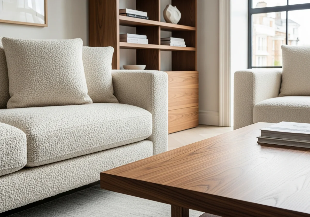
Bouclé and Smooth Wood
Bouclé fabric, with its nubby, looped texture, creates instant visual and tactile interest. When paired with smooth wood finishes on coffee tables, side tables, and shelving, it balances softness with structure. Bouclé works beautifully in neutral colors like cream, tan, or soft gray, allowing the texture itself to become the statement. The contrast between the irregular fabric surface and sleek wood grain creates sophisticated visual dialogue.
Pattern Integration with Color
Geometric Patterns in Warm Neutrals
Geometric patterns add visual texture while maintaining clean, modern sensibility. Choose patterns in warm neutral color palettes to keep spaces feeling inviting. Incorporate geometric patterns through area rugs, throw pillows, or wallpaper in one section of the room. The angular quality of geometric patterns benefits from being balanced with curved furniture pieces and organic accessories.
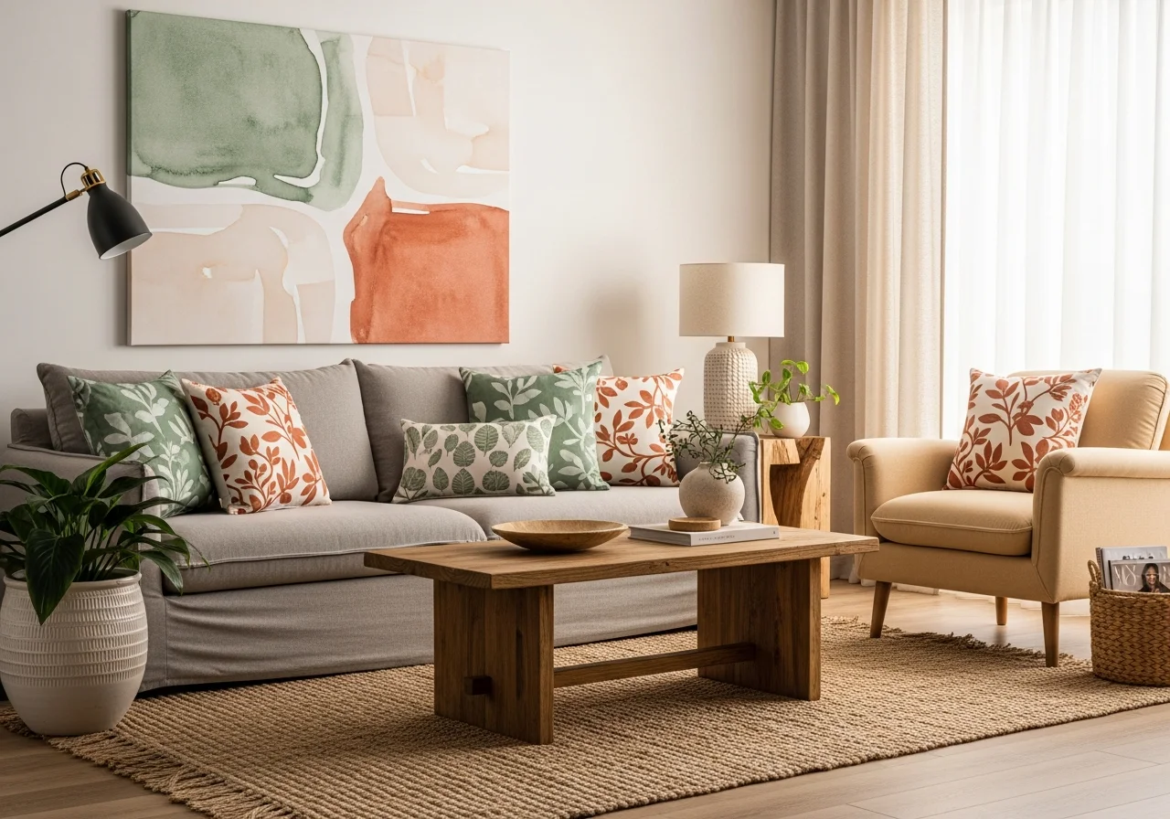
Organic Patterns with Earth Tones
Patterns inspired by nature, including botanical prints, abstract organic shapes, or watercolor effects, create gentle visual interest when rendered in earth tone colors. These patterns feel less structured than geometrics, contributing to relaxed, comfortable atmospheres. Use organic patterns in artwork, upholstery fabric, or window treatments. Pair with solid-colored furniture to prevent visual overwhelm.
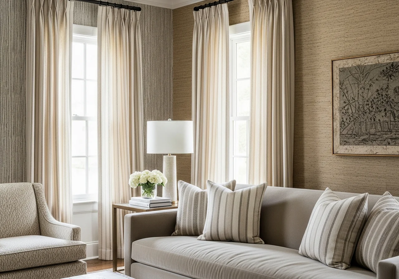
Subtle Stripes and Texture Mixing
Stripes offer classic visual texture that works across design styles. For cozy living rooms, choose subtle stripes in tonal colors rather than high-contrast versions. Combine striped elements with varied textures: a striped linen pillow on a velvet sofa, or striped curtains framing a textured grasscloth wall. This approach adds sophistication without sacrificing warmth.
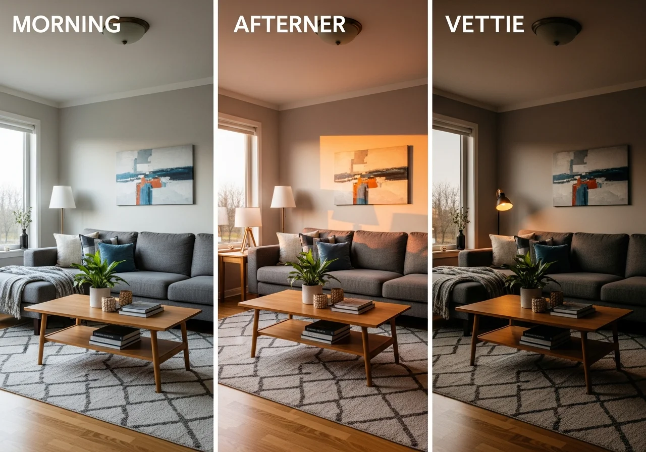
Lighting and Color Temperature
Understanding how lighting affects color and texture perception proves essential for creating truly inviting spaces. Natural daylight reveals colors and textures most accurately, while warm artificial lighting enhances cozy feelings during evening hours. Layer your lighting with ambient fixtures, task lighting, and accent lights to showcase your color and texture choices throughout the day.
Choose bulbs with warm color temperatures between 2700K and 3000K to enhance warm color palettes and make textures more visible. Position table lamps and floor lamps to cast light across textured surfaces, creating shadow play that emphasizes dimension. Dimmer switches allow you to adjust ambiance for different times and activities.
Conclusion
Creating a truly cozy living room requires thoughtful attention to both color selection and texture application. The most successful spaces layer multiple textures within cohesive color palettes, building visual and physical warmth that invites relaxation and connection. Whether you prefer subtle neutral schemes, bold dramatic colors, or comfortable earth tones, the principle remains constant: combine colors that resonate with your aesthetic while incorporating diverse textures through fabrics, finishes, and materials.
Start with your color foundation, then systematically add textural elements through upholstery choices, window treatments, area rugs, throw blankets, pillows, and decorative accessories. Remember that texture creates depth even within monochromatic color schemes, while varied colors gain sophistication through textural consistency. The interplay between color and texture transforms houses into homes, creating living rooms where memories are made and comfort is paramount.
Your living room should reflect your personality while serving your practical needs. Use these 23 ideas as inspiration rather than prescription, adapting concepts to suit your space, lifestyle, and preferences. The most inviting living rooms emerge from authentic choices that honor both aesthetic vision and daily reality, creating spaces that feel as good as they look.
Frequently Asked Questions
What colors make a living room feel most cozy?
Warm earth tones including terracotta, caramel, soft browns, and warm whites create the coziest atmospheres. These colors evoke natural elements and provide psychological warmth. However, cool colors like sage green and dusty blue can also feel cozy when paired with warm wood tones and soft textures. The key lies in choosing colors with warm undertones rather than cool bases, and balancing any color choice with appropriate lighting and textural elements.
How do I layer textures without making my living room look cluttered?
Successful texture layering requires editing and intentionality. Choose three to five distinct textures maximum, ensuring each serves a purpose. For example, combine smooth leather furniture with a chunky knit throw, linen pillows, a jute rug, and wooden accents. Maintain a cohesive color palette to unify disparate textures. Avoid covering every surface, instead allowing some elements to remain simple and clean. The goal is variety without chaos.
Can I mix warm and cool colors in the same living room?
Absolutely, and doing so often creates the most interesting spaces. The secret lies in letting one temperature dominate while using the other as accent. For instance, if your room features warm neutrals and earth tones as the foundation, introduce cool blue or green accents through artwork, pillows, or a single furniture piece. This approach provides visual interest while maintaining overall cohesion. Neutral bridges like greige, taupe, or warm white help unite warm and cool elements.
What is the best neutral color for living room walls?
Warm white remains the most versatile choice, providing a clean backdrop that makes other colors and textures shine. Specifically, whites with slight cream, beige, or gray undertones work better than stark pure white. Greige offers another excellent option, providing subtle color while maintaining neutral flexibility. The best choice depends on your lighting conditions, with south-facing rooms handling cooler whites and north-facing rooms benefiting from warmer tones. Always test paint samples in your specific space before committing.
How important is lighting when working with color and texture?
Lighting dramatically impacts how colors appear and how visible textures become. Natural daylight reveals true colors and emphasizes texture through shadow and highlight. Warm artificial lighting enhances cozy feelings and makes warm colors richer while potentially dulling cool tones. Layer multiple light sources at different heights to create dimension and properly illuminate textured surfaces. Consider both color temperature of bulbs and positioning of fixtures when planning your lighting scheme.