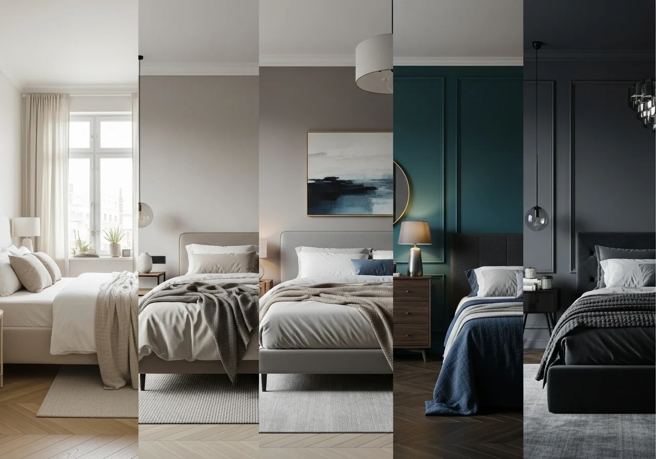
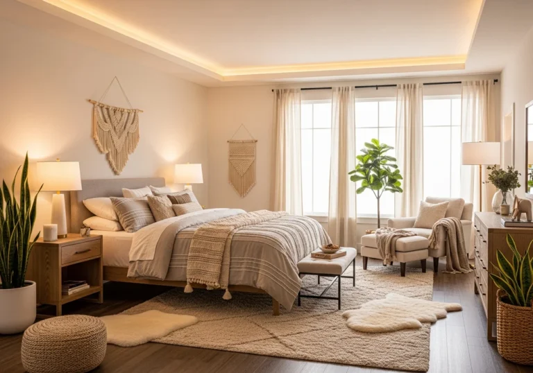
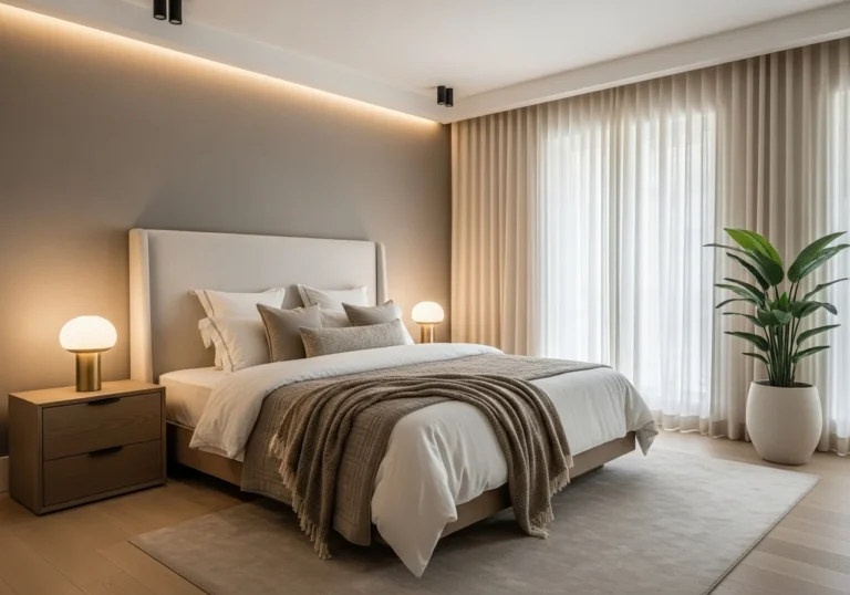
Bedroom Paint Colors 2026 Guide with 15 Cozy Neutral Moody Ideas for Primary Guest and Master Rooms
The bedroom serves as your personal sanctuary, a space where paint color choices profoundly influence mood, sleep quality, and overall comfort. As we move through 2026, bedroom paint trends reflect a decisive shift away from stark whites and cool grays toward colors that feel grounded, expressive, and deeply connected to the natural world. Homeowners are embracing hues that bring warmth, texture, and emotional depth to sleeping spaces.
This comprehensive guide explores fifteen carefully curated bedroom paint color ideas spanning cozy neutrals and moody sophisticated tones perfect for primary bedrooms, guest rooms, and master suites. Whether you prefer the subtle warmth of oatmeal beige or the dramatic intimacy of deep plum, these color selections offer something for every aesthetic preference while maintaining the timeless appeal that ensures your bedroom remains stylish for years to come.
Understanding which colors create the atmosphere you desire transforms the paint selection process from overwhelming to empowering. The following recommendations combine current design trends with enduring appeal, helping you create a bedroom that feels both contemporary and personally meaningful.
Warm Neutral Bedroom Paint Colors
Warm Brown and Tobacco Tones
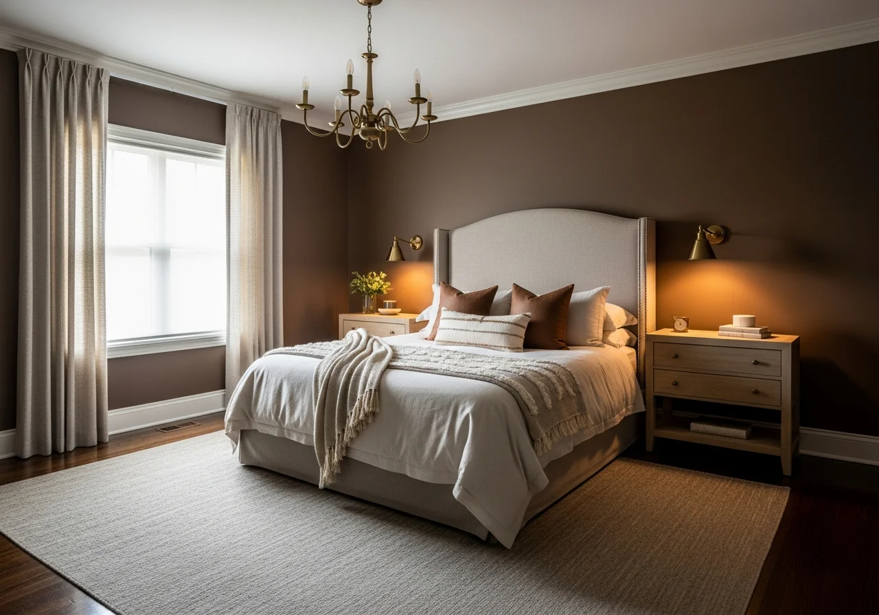
Warm brown emerges as the standout neutral for 2026 bedrooms, offering richness without heaviness. This sophisticated shade creates an instant cocooning effect that makes bedrooms feel grounded and inviting. Unlike the cool grays that dominated recent years, warm brown connects us to nature while providing a versatile backdrop for various design styles.
Tobacco brown works particularly well in primary bedrooms where you want to establish intimacy and elegance. The color delivers depth without overwhelming the space, especially when paired with soft textiles in cream, blush, or muted blue. Consider using warm brown on all four walls for a truly enveloping atmosphere, or apply it to a single accent wall behind the bed to create a sophisticated focal point.
For those hesitant about committing to darker tones, start with medium-depth browns that shift beautifully between brown and gray depending on lighting conditions. These adaptable shades respond to both natural daylight and evening lamplight, creating dynamic visual interest throughout the day.
Greige and Warm Taupe
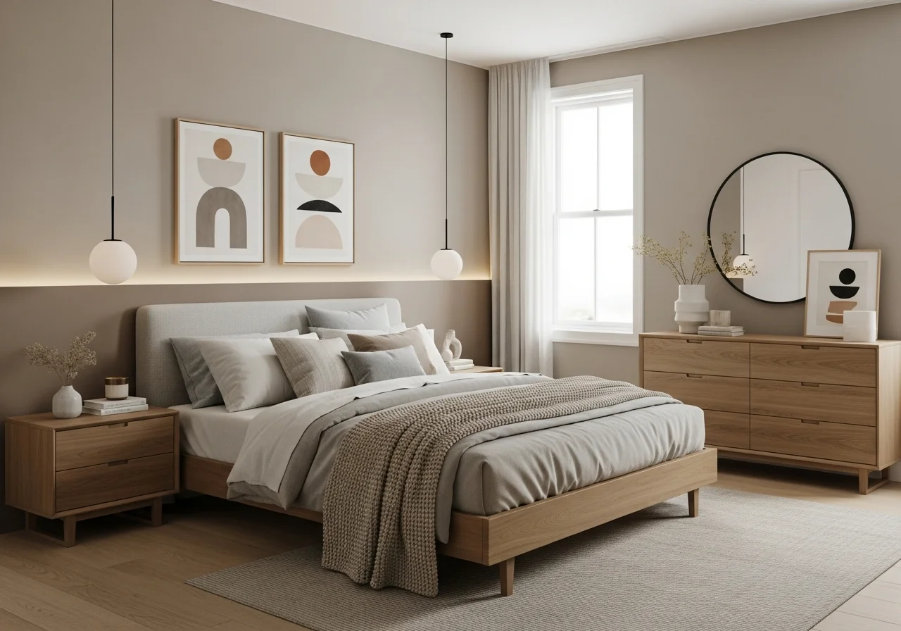
Greige continues its reign as a reliable bedroom neutral, but the 2026 iterations lean decidedly warmer with stronger beige undertones. These contemporary neutrals combine the sophistication of gray with the warmth of beige, creating colors that feel current without being trendy. Light warm grays with soft beige undertones add instant depth and warmth while remaining versatile enough to complement any palette.
Warm taupe offers another excellent option for creating peaceful bedroom environments. This color family includes shades ranging from light sandy beiges to deeper teddy bear taupes, all sharing the common trait of warm undertones that make spaces feel lived-in and inviting. Taupe works beautifully in bedrooms of any size and pairs effortlessly with both natural wood furniture and upholstered pieces.
The beauty of greige and taupe lies in their chameleon-like quality. These colors serve as perfect backdrops for layering textures through bedding, window treatments, and decorative accessories. They allow you to introduce bolder accent colors through artwork and textiles without overwhelming the restful quality essential to bedroom design.
Oatmeal and Creamy Beige
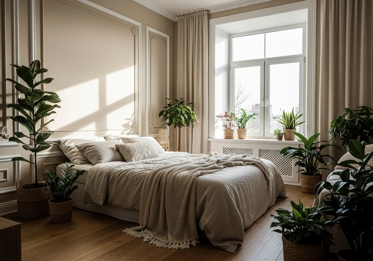
Oatmeal represents the cozy neutral winning hearts in 2026. This warm, understated shade features soft red undertones that make rooms instantly exhale. Unlike stark whites that can feel sterile, oatmeal creates warmth while maintaining the airy, spacious feeling that lighter colors provide. This rare neutral feels simultaneously warm, modern, and quietly sophisticated.
Creamy beige tones with warm undertones transform bedrooms into inviting retreats. These colors work particularly well in rooms that receive abundant natural light, where they can shift subtly throughout the day. The slight yellow or pink undertones in creamy beiges catch and reflect light beautifully, adding dimension without demanding attention.
Pair oatmeal and creamy beige with natural woods, soft whites, or muted blues to create a calm backdrop that showcases your personal style. These neutrals excel in guest bedrooms where you want to create a welcoming atmosphere that appeals to various tastes. The versatility of these shades means they work equally well in traditional, modern, or transitional design schemes.
Soft Butter Yellow and Warm Cream
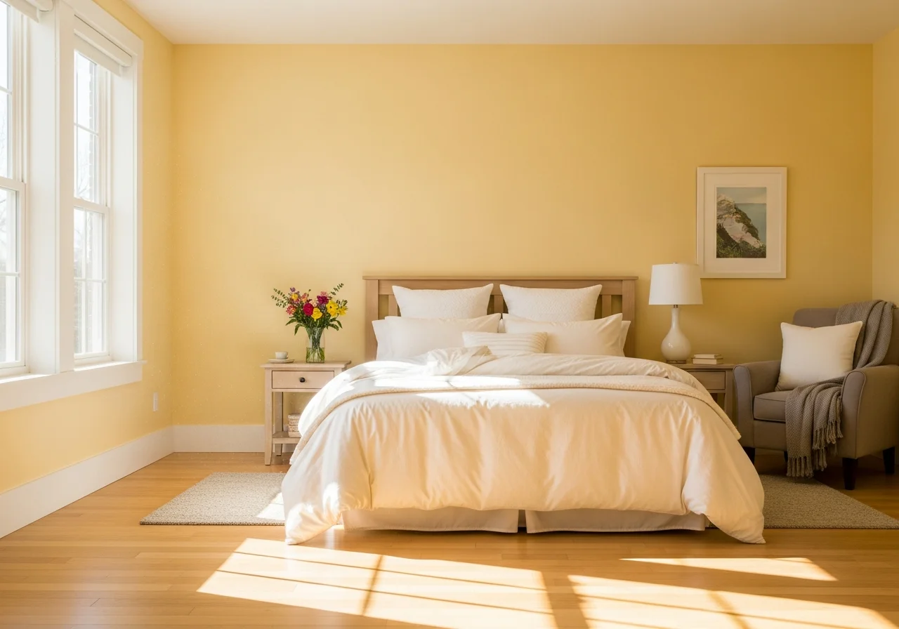
Soft butter yellow brings warmth that plain white never achieves. This color has an easy brightness that makes rooms feel more welcoming without the overwhelming intensity of saturated yellows. Butter yellow works especially well in bedrooms that face north or receive limited natural light, where it compensates for the lack of sunshine with its inherent warmth.
Warm cream colors create timeless comfort and meaningful connection in bedroom spaces. These soft, creamy beiges with warm undertones represent a departure from the dominance of cool tones, offering instead a gentle embrace that promotes relaxation. Cream works beautifully as an all-over wall color or as a complementary shade to deeper accent walls.
The key to successfully incorporating these warmer light neutrals lies in choosing shades with subtle color rather than pure white bases. Look for creams and butter yellows that have depth and character, avoiding anything that reads too bright or artificial. These colors create cheerful environments without feeling overwhelming, making them ideal for spaces where you want to wake up feeling refreshed and positive.
Moody and Sophisticated Bedroom Paint Colors
Deep Plum and Burgundy Tones
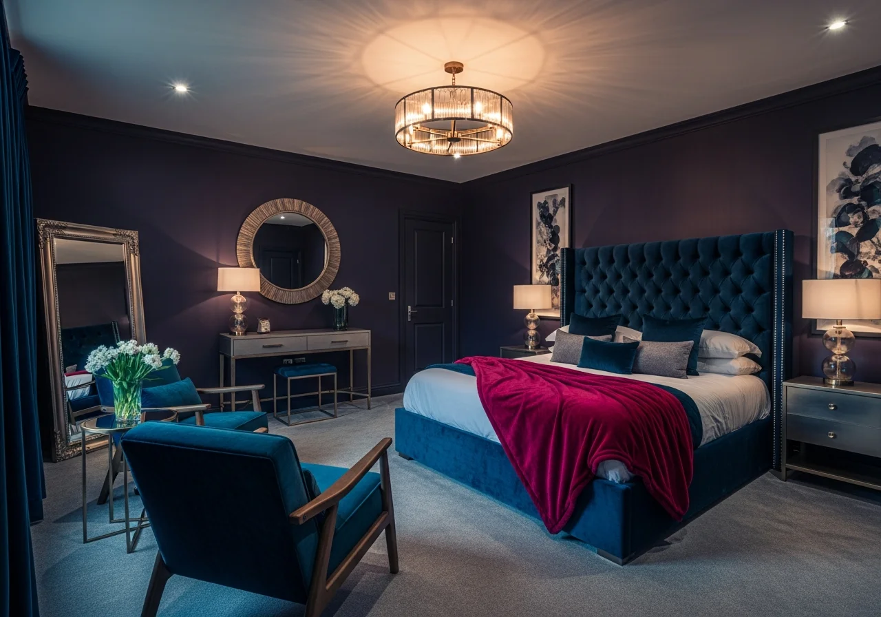
Deep jewel tones continue gaining momentum in 2026, with plum and burgundy leading the way. These regal colors represent a natural progression toward deeper, more saturated hues as homeowners demonstrate increasing color confidence. Rich plum with dark cherry tones adds depth and polish to bedrooms, creating sophisticated, intimate spaces that feel luxurious yet tranquil.
Plum works exceptionally well in primary bedrooms where you want to create a cocooning effect. The color provides richness and drama without the starkness of pure black, offering instead a complex, layered appearance that changes beautifully with different lighting throughout the day. Burgundy tones bring similar sophistication with slightly warmer undertones that pair beautifully with cream, blush, and metallic accents.
When working with these deeper jewel tones, consider the room’s natural light. South-facing bedrooms with abundant sunlight can absorb rich colors without feeling too dark, while rooms with limited light benefit from using plum or burgundy on a single accent wall paired with lighter complementary shades on remaining surfaces.
Navy Blue and Deep Blue-Gray
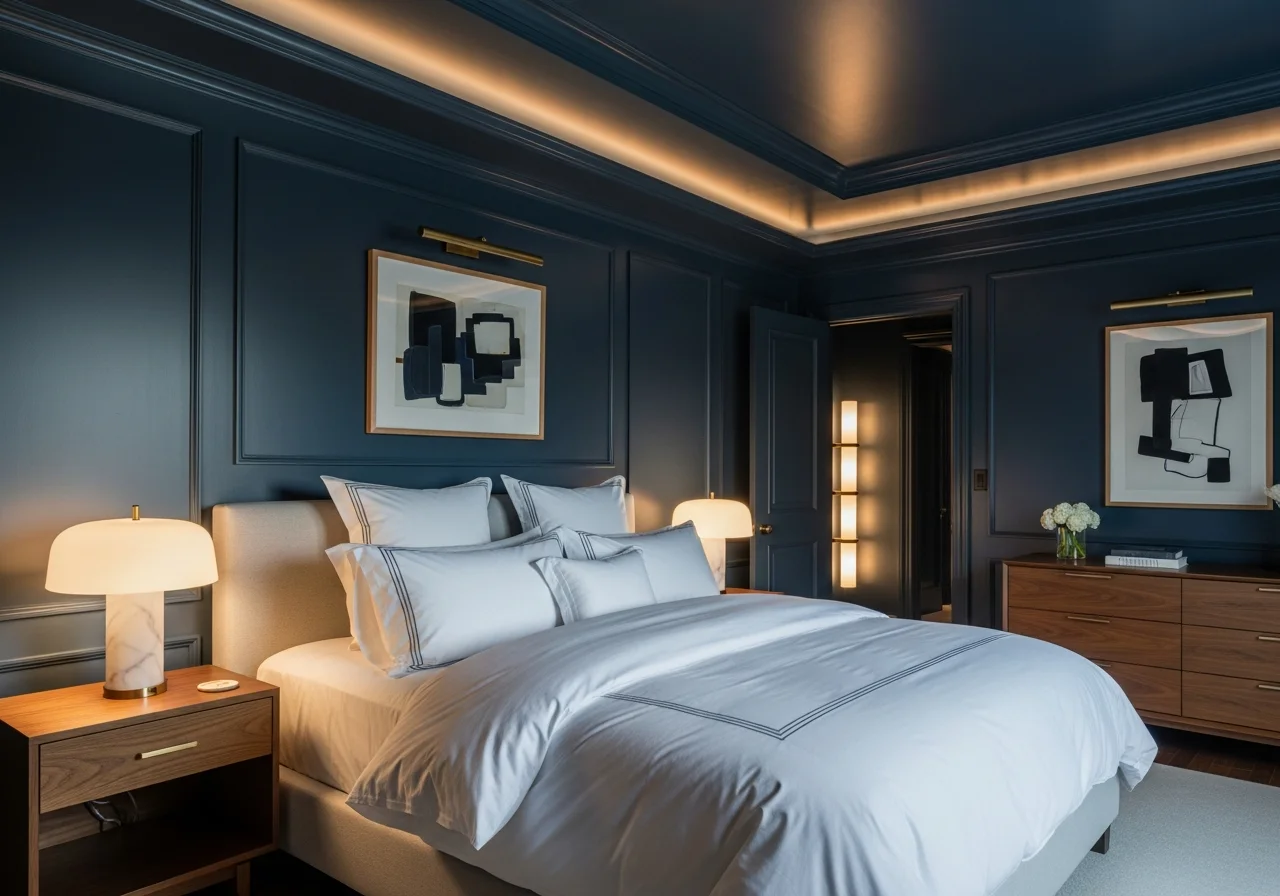
Navy blue remains a timeless choice for bedroom paint, offering depth and serenity simultaneously. Instead of common light blues, deeply saturated navy creates intimacy and sophistication in sleeping spaces. For truly moody effects, consider color drenching the entire room including trim and ceilings in the same dark blue, creating a cohesive, enveloping atmosphere.
Deep blue-gray blends offer another excellent option for those seeking moody sophistication with slightly more versatility. These colors combine blue’s calming properties with gray’s neutrality, resulting in shades that feel both grounding and serene. Medium to darker blue-gray tones work beautifully as full-room colors or on accent walls, and they pair exceptionally well with brass hardware, warm wood tones, and cream textiles.
Blue bedrooms benefit from layered lighting that creates depth and warmth. Soft, warm bulbs make blue paint colors look richer and more inviting, while avoiding the cold feeling that blue rooms can sometimes develop. Add rust or terra cotta accents to warm up the palette and create visual interest against the cool blue backdrop.
Sage Green and Olive
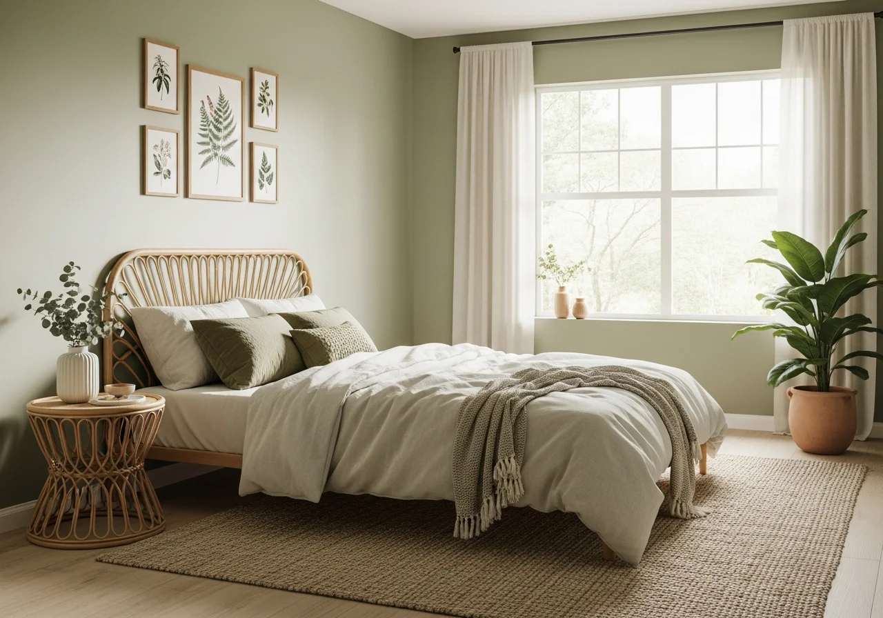
Muted greens lead the way in nature-inspired bedroom colors for 2026. Sage green with gray undertones creates calming, grounded spaces perfect for rest and relaxation. These colors offer refreshing energy while maintaining the tranquility essential to bedroom design. Darker sage greens have particularly strong appeal, providing cozy vibes without feeling heavy or overwhelming.
Olive green brings earthier tones to bedroom walls, evoking the natural world while creating sophisticated spaces. These colors work beautifully in rooms seeking a connection to nature and wellness-oriented design. Muted greens pair effortlessly with natural materials like rattan, white oak, and brass fixtures, as well as soft textiles in cream, white, or complementary earth tones.
Green bedrooms particularly benefit from rooms with good natural light, as the colors can shift between warm and cool depending on time of day and lighting conditions. Always sample green paint colors in your specific space, observing how they appear in morning light, afternoon sun, and evening lamplight before committing to the final shade
 .
.
Charcoal and Deep Gray
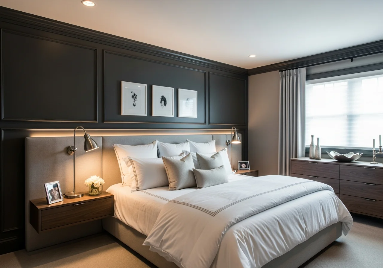
Charcoal and near-black tones with undertones of brown or metallic elements represent sophisticated alternatives to flat black. These rich, anchoring colors create dramatic bedroom spaces without the potential starkness of pure black. Elegant and grounding, charcoal works beautifully for accent walls, full-room applications in spaces with abundant light, or on architectural details like built-ins and millwork.
Deep gray tones create cozy, comfortable rooms that challenge the conventional wisdom suggesting dark colors make spaces feel smaller. Instead, moody grays create depth and soften room edges, actually making spaces feel larger through the illusion of receding walls. These colors work particularly well in primary bedrooms where you want to establish a sophisticated, mature atmosphere.
When incorporating charcoal and deep gray, balance the darkness with lighter elements in bedding, window treatments, and furniture. White or cream linens pop beautifully against dark walls, while metallic accents in brass or brushed nickel add glamour and reflect light throughout the space. Consider painting the ceiling in a lighter coordinating shade to maintain the room’s sense of height and prevent the space from feeling too enclosed.
Smoky Jade and Blue-Green
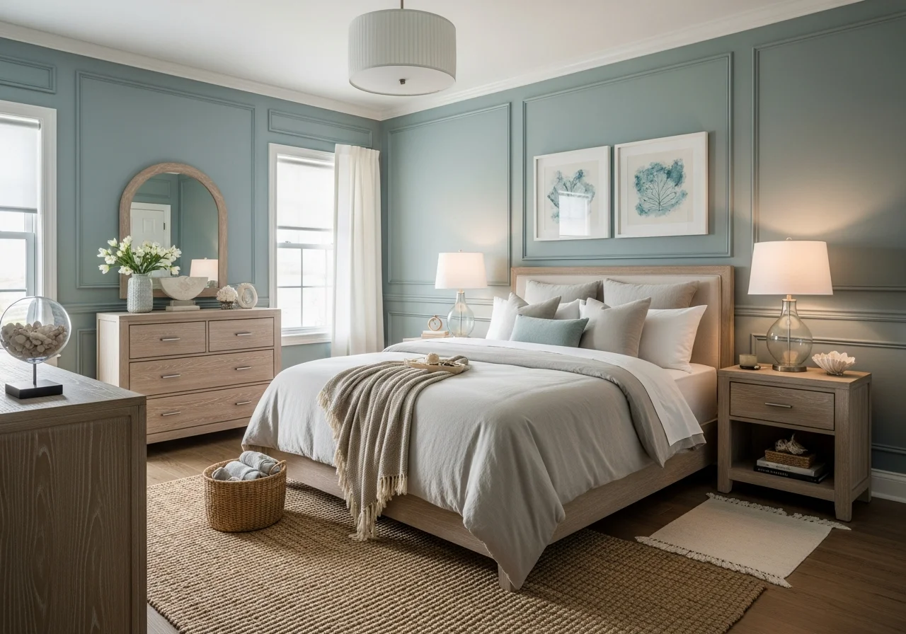
Smoky jade and blue-green tones combine the calming properties of both colors while adding dramatic sophistication to bedrooms. These colors feel both soothing and impactful, creating depth without heaviness. Smoky jade works especially effectively in bedrooms and personal spaces where it provides visual interest without feeling overdone.
Blue-green shades promote peace and relaxation while bringing atmospheric qualities to sleeping spaces. These colors work beautifully next to white trim and metal accents, standing out without overwhelming the space. The complexity of blue-green allows it to serve as both a neutral backdrop and a statement color, depending on the surrounding decor and lighting.
For coastal or spa-inspired bedrooms, lighter blue-green tones create tranquil, elevated environments reminiscent of peaceful retreats. Deeper versions of these colors bring more drama and intimacy, perfect for primary bedrooms seeking sophisticated, cocooning atmospheres. Pair blue-greens with natural textures, warm woods, and soft neutrals to create balanced, harmonious spaces.
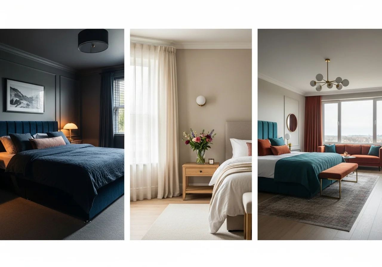
Bedroom-Specific Color Considerations
Primary Bedroom Paint Colors
Primary bedrooms deserve colors that reflect personal style while promoting restful sleep. Deeper, richer hues work particularly well in these private spaces, creating intimate atmospheres that feel sophisticated and mature. Consider warm browns, deep plums, navy blues, or rich sage greens for primary bedrooms where you can embrace bolder color choices without worrying about broad appeal.
The primary bedroom offers the perfect opportunity to use color drenching techniques, where walls, trim, and even ceilings receive the same color treatment. This approach creates seamless, cocooning effects that elevate the entire room’s atmosphere. Choose colors with depth and character rather than safe, conventional neutrals to create spaces that feel truly personal and retreat-like.
Lighting plays a crucial role in primary bedroom color success. Layer ambient lighting with task lighting and accent fixtures to create depth and warmth. Warm bulbs make paint colors appear richer and more inviting, essential for creating the relaxing atmosphere primary bedrooms require. Consider dimmer switches to adjust lighting intensity based on time of day and activity.
Guest Bedroom Paint Colors
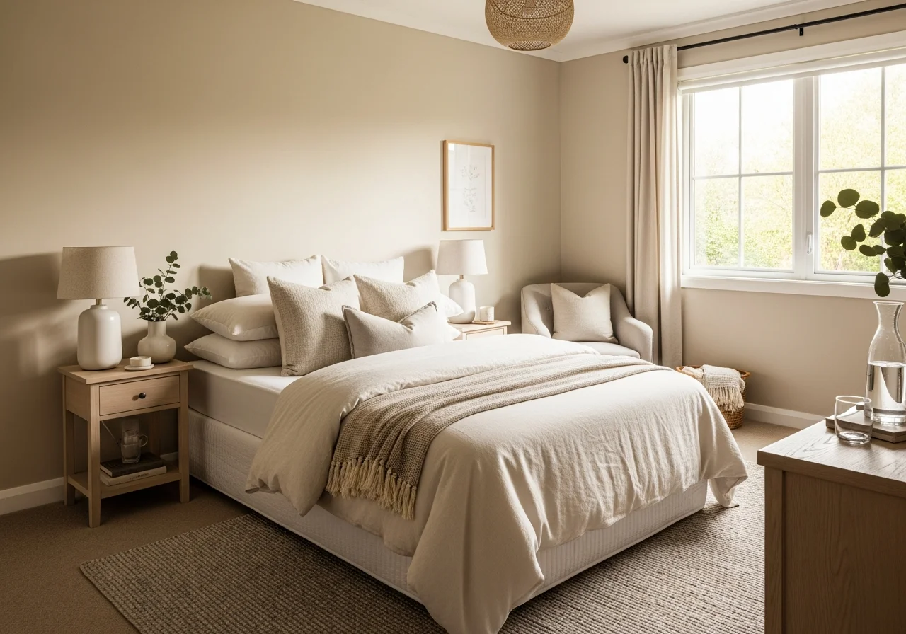
Guest bedrooms benefit from colors that feel welcoming and appeal to various tastes. Warm neutrals like oatmeal, creamy beige, and soft greige create inviting spaces without imposing strong personal preferences on visitors. These colors provide restful backdrops that help guests feel comfortable and at ease.
For guest rooms seeking more personality, consider muted versions of bolder colors. Soft sage green, dusty blue-gray, or warm mushroom tones add character while maintaining the versatility guest spaces require. These colors feel distinctive without being overwhelming, striking the balance between personality and broad appeal.
Keep guest bedroom paint colors slightly lighter and brighter than you might choose for your primary bedroom. Guests appreciate spaces that feel airy and cheerful, particularly in rooms where they may be unfamiliar with the lighting patterns and daily rhythms. Lighter colors also photograph well, a consideration for guests who might want to share their accommodations on social media.
Master Suite Color Strategies
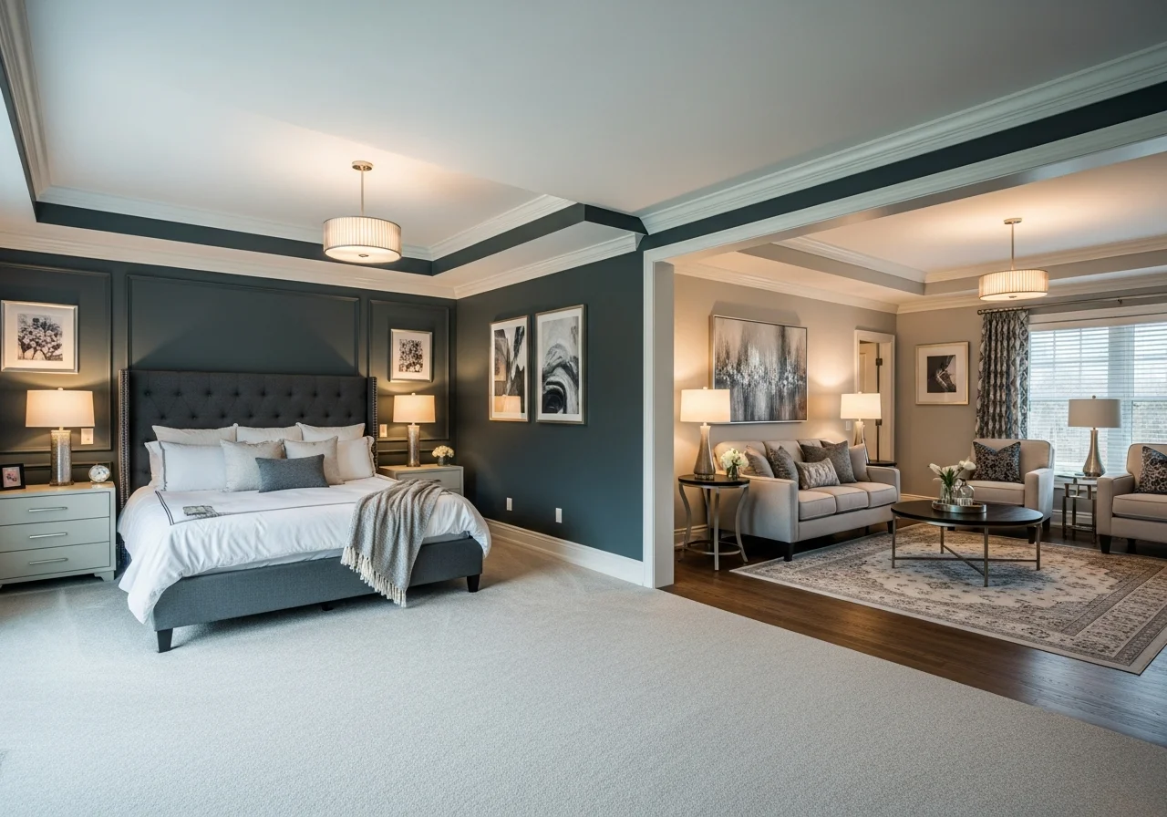
Master suites encompass both sleeping and sitting areas, requiring thoughtful color strategies that create cohesion while allowing for different functional zones. Consider using varying shades of the same color family throughout the suite, with deeper tones in the sleeping area for intimacy and lighter versions in sitting areas for energy and clarity.
Two-tone approaches work beautifully in master suites, particularly when architectural features like half-walls, wainscoting, or distinctive millwork create natural divisions between colors. Use deeper, moodier shades below chair rails or on accent walls, paired with lighter coordinating colors on remaining surfaces to create visual interest without overwhelming the space.
Master suites with abundant natural light can successfully incorporate the darkest, most dramatic colors in the 2026 palette. These spaces can absorb deep plums, charcoals, and navy blues without feeling oppressive, instead creating luxurious, hotel-like atmospheres. Balance dark walls with lighter ceilings and plentiful soft furnishings in cream, white, or soft pastels.

Creating Cohesive Color Schemes
Complementary Color Pairings
Successfully pairing bedroom paint colors with accent shades creates cohesive, professionally designed spaces. Warm browns pair beautifully with blush pinks, muted blues, and cream tones that lighten the palette while maintaining calm, refined atmospheres. Navy blues work well with rust, terra cotta, and warm metallics that add warmth and prevent rooms from feeling too cool.
Sage and olive greens find perfect partners in warm woods, cream textiles, and deeper earth tones like burnt orange or terra cotta. These combinations create grounded, nature-inspired palettes that feel collected and intentional. Plum and burgundy tones shine when paired with cream, soft gray, and metallic accents in gold or brass that enhance their luxurious qualities.
The key to successful color pairing lies in balancing warm and cool tones to create dynamic yet harmonious spaces. If your main wall color leans warm, introduce cooler accents to prevent the room from feeling too heavy. Conversely, cool wall colors benefit from warm accent colors in textiles, artwork, and accessories that add approachability and comfort.
Accent Wall Techniques
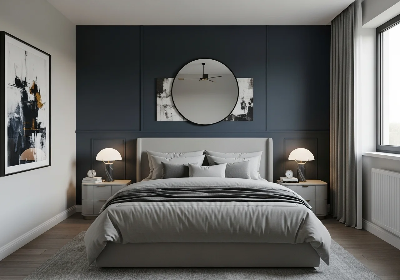
Accent walls offer excellent opportunities to experiment with bolder colors without fully committing to dramatic full-room applications. Choose the wall behind your bed as the natural focal point for deeper, moodier colors like charcoal, plum, or navy. This technique draws attention to the bed while keeping remaining walls in lighter, complementary shades that maintain the room’s sense of space.
Color capping represents an advanced accent wall technique where you use one color in various shades throughout the room. The accent wall and ceiling might share the same deeper tone, while other walls use lighter versions of the same color family. This approach creates sophisticated, layered environments that feel cohesive and intentional.
When creating accent walls with moody colors, extend the color to trim, built-ins, or architectural details on that wall to create a comprehensive statement. This technique prevents the accent wall from feeling disconnected from the rest of the room’s design, instead establishing it as an integral part of the overall color story.
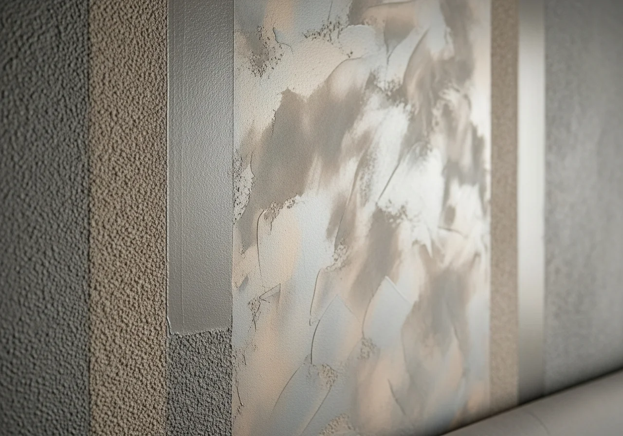
Texture and Finish Considerations
Paint finish significantly impacts how bedroom colors appear and feel. Matte and eggshell finishes work best for most bedroom walls, creating soft, non-reflective surfaces that promote relaxation. These finishes also hide wall imperfections better than glossier options, important in older homes or spaces with textured walls.
For architectural details, trim, and accent walls where you want added dimension, consider using different sheens of the same color. This technique adds visual interest through light reflection rather than color contrast, creating sophisticated, tonal spaces. Satin finishes on trim against matte walls create subtle definition, while high-gloss accents bring glamour to specific architectural features.
Textured paint applications like limewash, venetian plaster, or faux techniques add depth and character to bedroom walls. These approaches work particularly well with earth tones and warm neutrals, enhancing their organic qualities and creating surfaces that feel collected and timeworn rather than freshly applied. Texture also helps distribute light across walls in interesting ways, adding movement and life to solid colors.
Conclusion
Bedroom paint colors in 2026 reflect a thoughtful shift toward hues that ground us, comfort us, and express personal style. The movement away from stark whites and cool grays toward warm neutrals and sophisticated moody tones represents our collective desire for spaces that feel authentic, lived-in, and deeply personal. Whether you gravitate toward the subtle warmth of oatmeal and creamy beige or the dramatic intimacy of deep plum and navy blue, the colors trending this year offer lasting appeal that transcends temporary fashion.
Successful bedroom color selection requires considering how colors appear in your specific lighting conditions, how they complement your existing furnishings and architectural features, and most importantly, how they make you feel. Your bedroom should serve as a true sanctuary, a space that welcomes you at day’s end and supports restorative rest.
Take time to sample colors in your actual bedroom environment, observing them at different times throughout the day and in various lighting conditions. Trust your instincts while remaining open to colors you might not initially consider. The perfect bedroom paint color creates the atmosphere you desire while standing the test of time, making your space feel both current and timeless for years to come.
Frequently Asked Questions
What are the most popular bedroom paint colors for 2026?
The most popular bedroom paint colors for 2026 include warm browns, oatmeal neutrals, deep plum, sage green, and navy blue. These colors reflect the broader trend toward warm, grounded tones that create cozy, intimate spaces. Warm neutrals with beige undertones and sophisticated moody colors like charcoal and smoky jade also feature prominently in trending palettes.
Should I choose light or dark colors for a small bedroom?
Both light and dark colors can work in small bedrooms depending on the effect you want to create. Light warm neutrals like oatmeal or creamy beige make small spaces feel more open and airy. However, deep moody colors actually create depth and soften room edges, making small bedrooms feel cozy rather than cramped. Consider the room’s natural light and your personal preference for either spacious or cocooning atmospheres.
What bedroom paint colors promote better sleep?
Colors that promote better sleep include soft sage green, warm neutral tones like oatmeal and taupe, muted blue-gray, and deeper colors like navy or charcoal that create darkness-conducive environments. Avoid overly bright or highly saturated colors that stimulate rather than calm. The key is choosing colors with warm or neutral undertones that create peaceful, restful atmospheres.
How do I choose between warm and cool bedroom paint colors?
Choose warm colors if you want your bedroom to feel cozy, inviting, and intimate. Warm tones work particularly well in rooms with northern exposure or limited natural light. Cool colors create calming, serene environments and work well in rooms that receive abundant southern light or tend to feel warm. Consider testing both warm and cool options in your space to see which feels most comfortable and aligns with your desired atmosphere.
Can I use bold colors in a master bedroom?
Absolutely. Master bedrooms represent personal spaces where you can embrace bolder color choices without worrying about broad appeal. Deep plums, rich browns, navy blues, and charcoal all create sophisticated, intimate master bedroom environments. The key is ensuring adequate lighting through layered fixtures and balancing dark walls with lighter textiles and furnishings to prevent spaces from feeling too enclosed.

