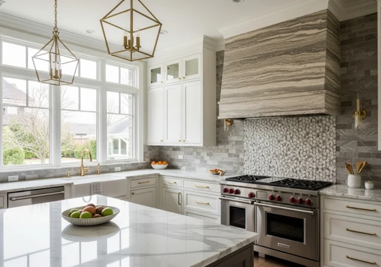

25 White Kitchen Cabinet Paint Colors
White kitchen cabinets have remained a cornerstone of interior design for decades, and there is a very good reason for that enduring appeal. They brighten a space, create a sense of openness, and pair effortlessly with nearly every countertop material, backsplash style, and flooring option on the market. But here is where many homeowners get tripped up: white is not just one color. It is a universe of undertones, warmth levels, and light-reflective properties that can make the same room feel entirely different depending on which white you choose.
Whether you are repainting dated oak cabinets, designing a kitchen from scratch, or simply looking for inspiration before a renovation, this guide covers 25 standout white kitchen cabinet paint colors, what makes each one unique, and how to choose the right one for your specific space.
Understanding White Paint Before You Choose
Before diving into the list, it helps to understand a few core concepts that will shape your final decision.
Undertones Matter More Than You Think
Every white paint carries an undertone, even when it appears perfectly neutral on the chip. Warm whites lean toward yellow, cream, or beige. Cool whites pull toward blue, gray, or green. True whites sit in the middle, though even these tend to read slightly warm or cool depending on surrounding light. Pairing a warm-toned countertop with a cool white cabinet, for example, can create an unintentional clash that only becomes obvious once the paint dries.
Light Reflectance Value
Light Reflectance Value, commonly referred to as LRV, measures how much light a paint color reflects on a scale from 0 to 100. A higher LRV means more light is reflected back into the room. Most white paints for cabinets fall between 75 and 92. Spaces with limited natural light benefit from paints with an LRV above 85, while rooms flooded with sunlight can handle softer, lower LRV whites without feeling dim.
Test Before You Commit
Lighting is the single most transformative factor in how a white will read on your cabinets. Morning light, afternoon light, artificial overhead lighting, and even the color of trees visible through your kitchen window all affect how white appears. Always test samples in your actual space before making a final decision.
25 White Kitchen Cabinet Paint Colors
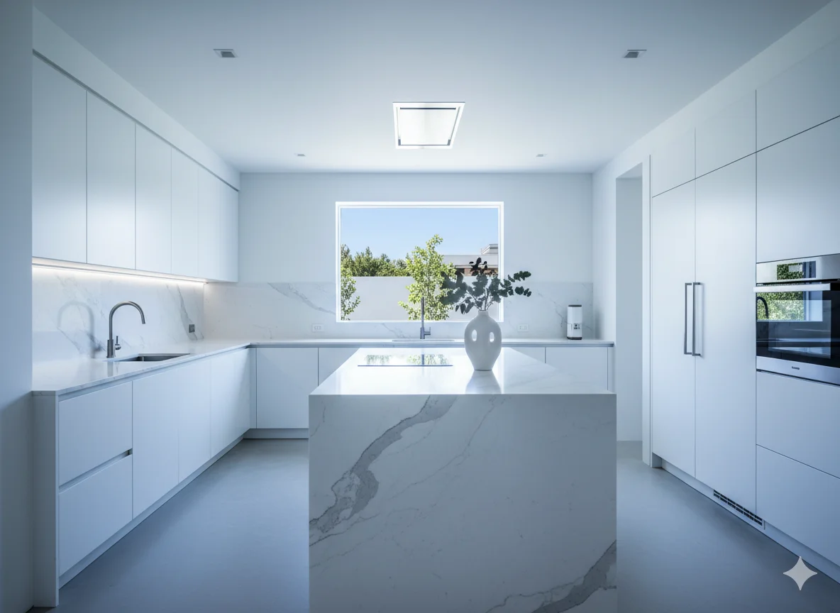
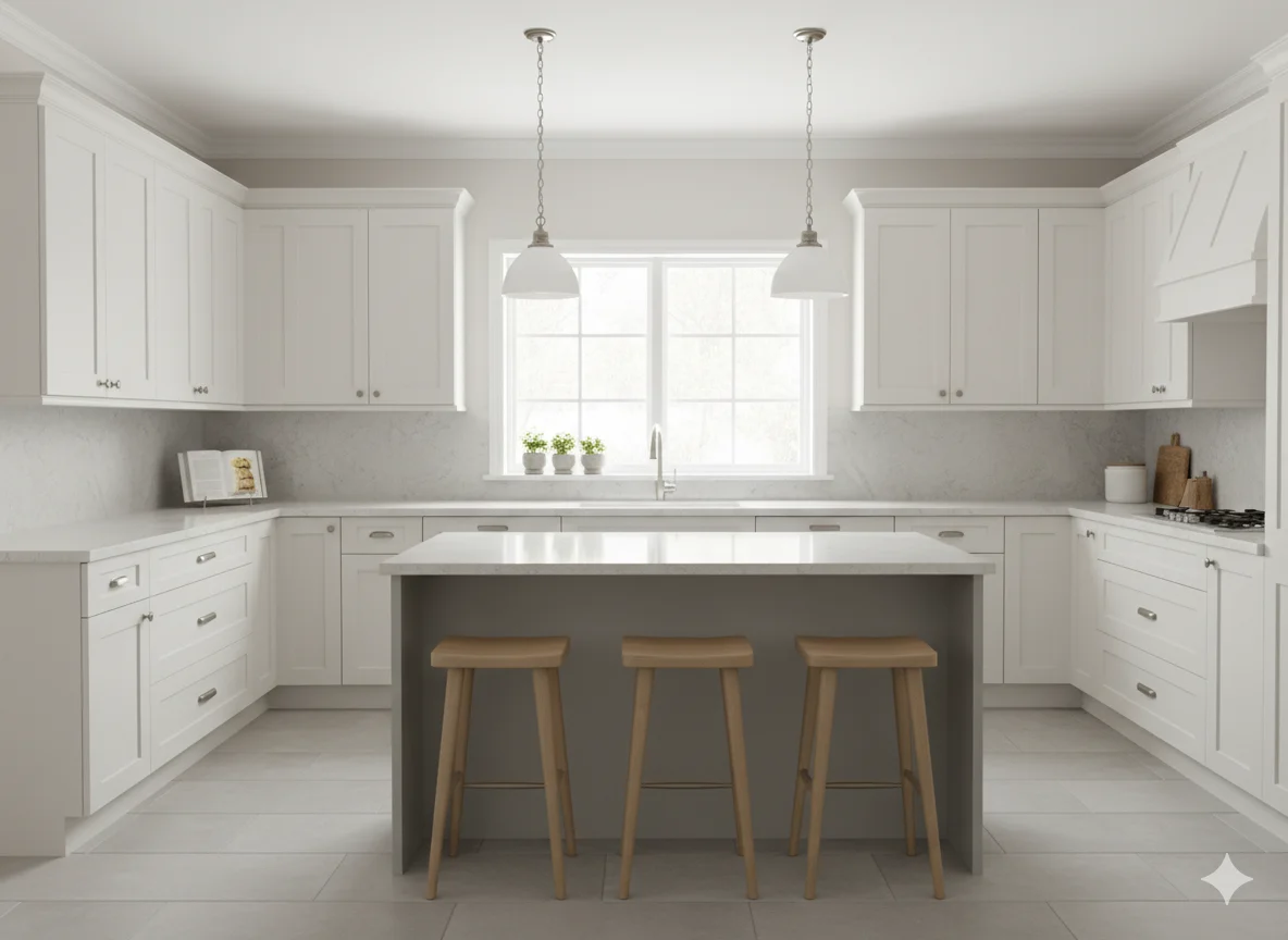
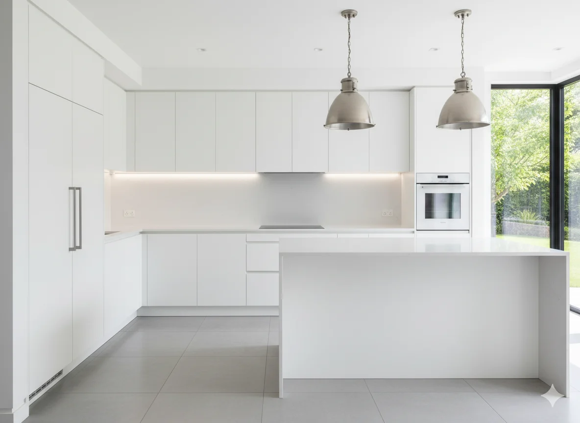
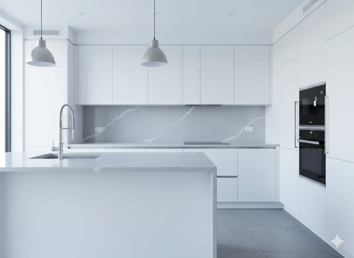
Crisp and Bright Whites
These are the clean, high-contrast whites that feel fresh and modern. They work beautifully in kitchens with cool-toned hardware, marble countertops, and contemporary or minimalist design styles.
Chantilly Lace by Benjamin Moore
is consistently ranked among the most popular cabinet whites in the country. It has a subtle softness that prevents it from feeling harsh under bright light, yet it reads as a clean, undeniably white shade. It pairs well with bold black hardware and cool-toned quartz countertops.
Decorators White by Benjamin Moore
is a neutral to cool white that sits comfortably alongside a wide range of finishes. It avoids the starkness of true white while still delivering a crisp, polished look. This shade is especially popular in open-concept kitchens where the cabinets need to hold their own next to multiple design elements.
Extra White by Sherwin Williams
lives up to its name. It reflects a significant amount of light and carries no obvious undertone in most lighting conditions. Designers often recommend it for small kitchens or north-facing spaces that need every bit of brightness they can get.
Pure White by Sherwin Williams
is one of the cleanest-looking options from the Sherwin Williams line. It has very little undertone, reads as a true white in most settings, and works equally well with warm and cool accent colors. Many designers consider it one of the most versatile whites available.
Snowbound by Sherwin Williams
carries a faint greige undertone that keeps it from feeling cold or sterile. It works particularly well in kitchens that incorporate green, blue, or sandy tones elsewhere in the room.
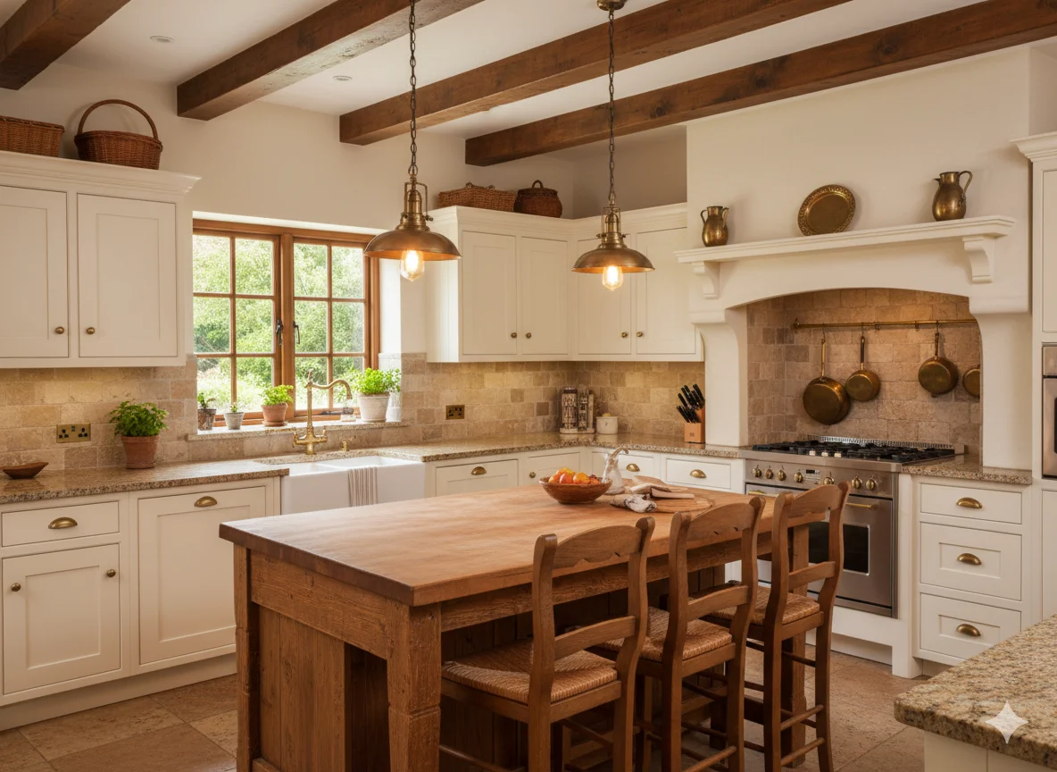
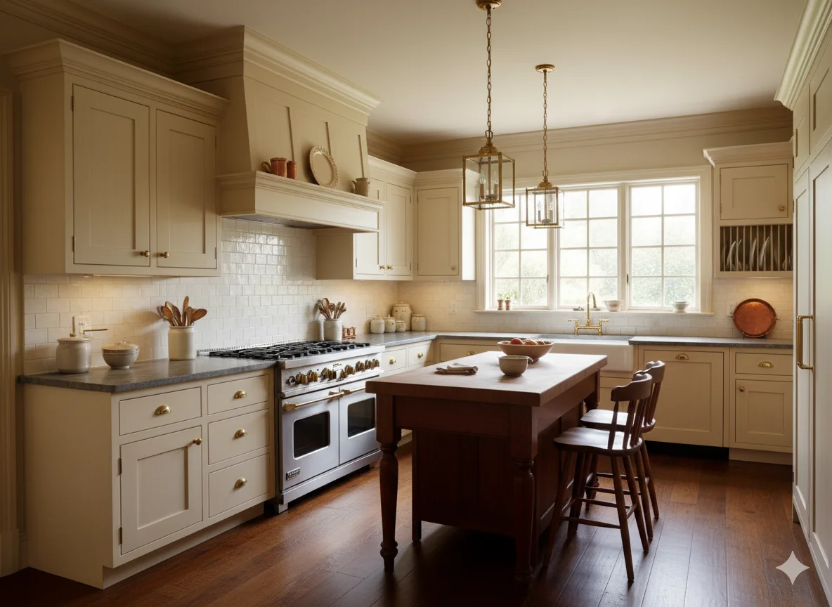
Warm and Creamy Whites
Warm whites bring comfort and character to a kitchen. They suit traditional, farmhouse, transitional, and Tuscan-inspired designs, and they pair especially well with natural wood elements, stone countertops, and brass or gold hardware.
White Dove by Benjamin Moore
is one of the most beloved cabinet whites of the past two decades. It carries a warm, slightly yellow undertone that reads as soft and inviting without ever veering into cream territory. It was the color of the year pick for Benjamin Moore back in 2017 and has never really gone out of style. It works exceptionally well with warm wood tones and natural stone.
Simply White by Benjamin Moore
is brighter than White Dove but still carries noticeable warmth. The yellow undertone is present, especially in bright light, which makes it a natural choice for kitchens with abundant natural light where the warmth can shine without feeling overwhelming.
Alabaster by Sherwin Williams
is one of the softest, warmest whites in the Sherwin Williams collection. With an LRV of 82, it reads as a gentle, creamy white that works best in spaces where you want warmth and coziness rather than a high-contrast, clean look. It is particularly popular in homes from the 1990s and early 2000s where existing finishes tend to lean warmer.
Cloud White by Benjamin Moore
sits between a warm white and a soft off-white. It carries enough warmth to feel cozy without crossing the line into a noticeably cream color. In bright light, it can read almost as a true white, but next to a stark white it will reveal its warmth clearly.
Shoji White by Sherwin Williams
is a warm off-white that can read as tan or gray depending on the light conditions in your space. It is a more complex white, which means it is best suited to kitchens with a defined design direction where that complexity adds depth rather than confusion.
Swiss Coffee by Benjamin Moore
is a timeless warm white with a soft cream undertone. It has been a go-to choice for traditional and transitional kitchens for many years and holds up beautifully alongside natural wood cabinetry on an island or in open shelving.
Warm White by KraftMaid
carries an ivory undertone that brings out the natural richness of hardwood floors and stone countertops. It is a dedicated cabinet finish that has been refined specifically to suit kitchen environments.
Navajo White by Benjamin Moore
is a slightly deeper warm white with a touch of peach or beige. It feels layered and rich, and it suits farmhouse or cottage-style kitchens especially well.
Soft and Neutral Whites
These whites occupy the middle ground between warm and cool. They tend to be highly versatile, making them excellent choices when the surrounding finishes in your kitchen do not lean strongly in either direction.
White Dove OC-17 by Benjamin Moore
(referenced again here specifically for cabinet use as distinct from wall use) behaves somewhat differently on a full cabinet surface than it does on walls, appearing slightly richer due to the density of paint on a flat cabinet door. It remains one of the most recommended neutrals for this reason.
Chantilly Lace OC-65 by Benjamin Moore
(notable for its use as a cabinet paint specifically) delivers a reliable neutral white that pairs seamlessly with both warm and cool adjacent colors. Designers consistently return to it because of its predictability across a wide range of lighting environments.
Blank Canvas by Behr
was Behr’s Color of the Year for 2024, and its popularity on cabinets has grown substantially since. It is a warm, cozy shade of white that works with everything from tan beiges to soft greens and even warm grays.
Swiss Coffee OC-45 by Benjamin Moore
earns a second mention here for its versatility as a neutral. While warm, it is soft enough to read as a near-neutral in certain lighting, making it a bridge color for kitchens that mix both warm and cool elements.
Repose Gray by Sherwin Williams
is not traditionally white, but it is so light that it functions as a white in most kitchens. Its soft gray undertone gives cabinets a quiet, modern elegance that appeals to homeowners who want the cleanliness of white without committing fully to it.
Timeless Off-Whites and Near-Whites
Off-whites carry more visible undertone than standard whites, which makes them feel warmer, more layered, and often more historically appropriate in certain architectural styles.
Linen White by Benjamin Moore
lives in the warm off-white category with a pronounced soft beige undertone. It suits traditional kitchens and pairs beautifully with antique brass fixtures, aged bronze hardware, and natural stone countertops with golden veining.
Antique White by Sherwin Williams
has a creamy, slightly golden tone that feels reminiscent of vintage European kitchens. It suits cabinetry in homes with traditional millwork or classical architectural details.
Pale Oak by Benjamin Moore
straddles the line between white and beige so gracefully that it works as either depending on the surrounding finishes. On cabinets in a well-lit kitchen, it reads as a warm white with real character.
White Heron by Benjamin Moore
is a slightly cooler soft white that works well in kitchens with gray or blue accents. It avoids the sterility of a true cool white while offering a cleaner look than the warm off-whites.
Aesthetic White by Sherwin Williams
is a warm, slightly rosy white that brings a subtle complexity to cabinet surfaces. It is a more adventurous choice but rewards those willing to commit to it with a kitchen that feels genuinely distinctive.
Best Whites for Specific Kitchen Styles
For Modern Kitchens:
Chantilly Lace, Extra White, Pure White, and Decorators White all deliver the clean contrast that suits flat-panel, handleless cabinetry and polished surfaces.
For Farmhouse and Cottage Kitchens:
Alabaster, Swiss Coffee, Linen White, and Antique White all bring the warmth and softness that make these styles feel authentic and lived-in.
For Traditional and Transitional Kitchens:
White Dove, Simply White, Cloud White, and Navajo White strike the balance between refinement and approachability that these styles require.
For Scandinavian and Minimalist Kitchens:
Snowbound, White Heron, and Pure White all offer the quiet simplicity these aesthetics demand.
Tips for Choosing the Right White for Your Cabinets
Start by identifying the dominant undertone in your countertops and backsplash. If they lean warm, gravitate toward warm whites. If they lean cool or gray, choose a neutral or cool white.
Assess your natural light situation before making a shortlist. Rooms with abundant south or west-facing light can handle softer, warmer whites without feeling dark. North-facing kitchens with limited natural light benefit from higher LRV whites that push back against the dimness.
Order sample pots and paint them onto large pieces of foam board or directly onto a cabinet door. Observe the samples at multiple points throughout the day, and note how they look under your specific overhead lighting at night.
Consider the finish. Cabinets should always be painted in a semi-gloss or satin finish for durability, ease of cleaning, and a subtle sheen that makes white look intentional rather than flat. Matte finishes on cabinets show every fingerprint and scuff, so they are generally not recommended.
Conclusion
Choosing a white paint color for kitchen cabinets is one of the most impactful decisions in any kitchen renovation, and the breadth of options available today ensures there is a perfect white for every home, every style, and every lighting scenario. Whether you lean toward the clean precision of Chantilly Lace, the inviting warmth of White Dove, the soft sophistication of Alabaster, or the timeless elegance of Swiss Coffee, each of the 25 whites covered here has a distinct personality that can transform the heart of your home. The key is to test thoughtfully, observe patiently, and trust that the right white will reveal itself once you see it in your own space.
Frequently Asked Questions
What is the most popular white paint color for kitchen cabinets?
Chantilly Lace by Benjamin Moore and White Dove by Benjamin Moore are consistently ranked among the most popular choices by designers and homeowners alike. Both offer versatility across a wide range of kitchen styles and lighting conditions.
Should I use warm or cool white for kitchen cabinets?
The answer depends on the existing finishes in your kitchen. If your countertops, floors, or backsplash lean warm (beige, tan, gold, brown tones), a warm white will create harmony. If your finishes are cool (gray, blue, chrome), a cooler or neutral white will look more intentional.
What paint finish is best for kitchen cabinets?
Semi-gloss and satin finishes are the most recommended for kitchen cabinets. They are durable, easy to wipe clean, and provide just enough sheen to make white look polished without being overly shiny.
How do I know if a white paint will look yellow on my cabinets?
Whites with high yellow or cream undertones, such as Alabaster or Swiss Coffee, will tend to read warmer and slightly more yellow, especially in rooms with warm lighting or limited natural light. Testing the paint on your actual cabinet surface in your specific lighting is the only reliable way to preview this effect before committing.
Can I use the same white on my cabinets and walls?
You can, but many designers recommend using a slightly different shade on walls versus cabinets to create subtle visual definition. Using the same white on both surfaces can sometimes make a kitchen feel flat. A common approach is to use the slightly warmer or softer version of your cabinet white on the walls, allowing the cabinets to stand out gently.