20 Kitchen Cabinet Color Trends Designers Love This Year
The kitchen remains the heart of every home, and nothing transforms this essential space quite like the right cabinet color. While white cabinets dominated kitchens for years, we are witnessing a remarkable shift toward bolder, more expressive hues that reflect personality and create atmosphere. Designers are embracing colors that bring warmth, depth, and character to kitchens, moving away from sterile aesthetics toward spaces that feel nurturing and grounded.
This year marks a turning point where homeowners are choosing cabinet colors that connect them to nature, provide emotional comfort, and stand the test of time. From earthy greens that echo the outdoors to rich burgundies that add sophistication, the palette has expanded dramatically. Whether you are planning a complete kitchen renovation or simply refreshing your existing cabinets, understanding these color trends will help you create a space that feels both current and timeless.
Earthy Greens Take Center Stage
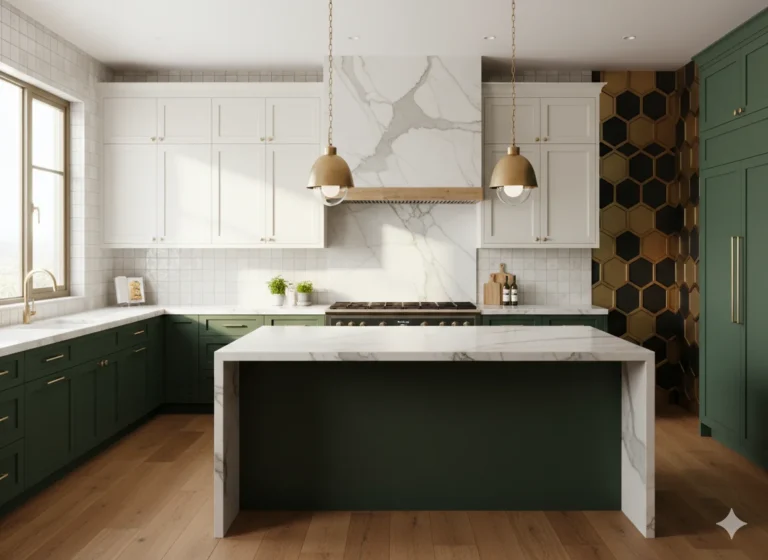
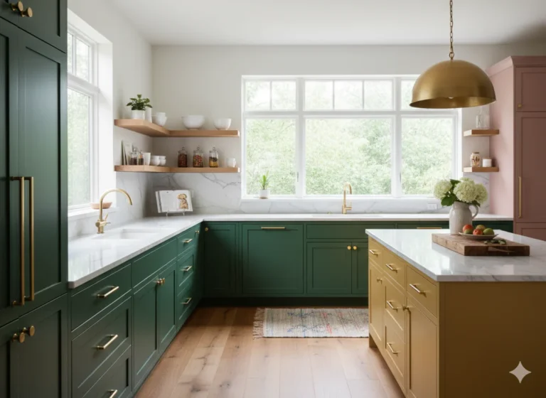
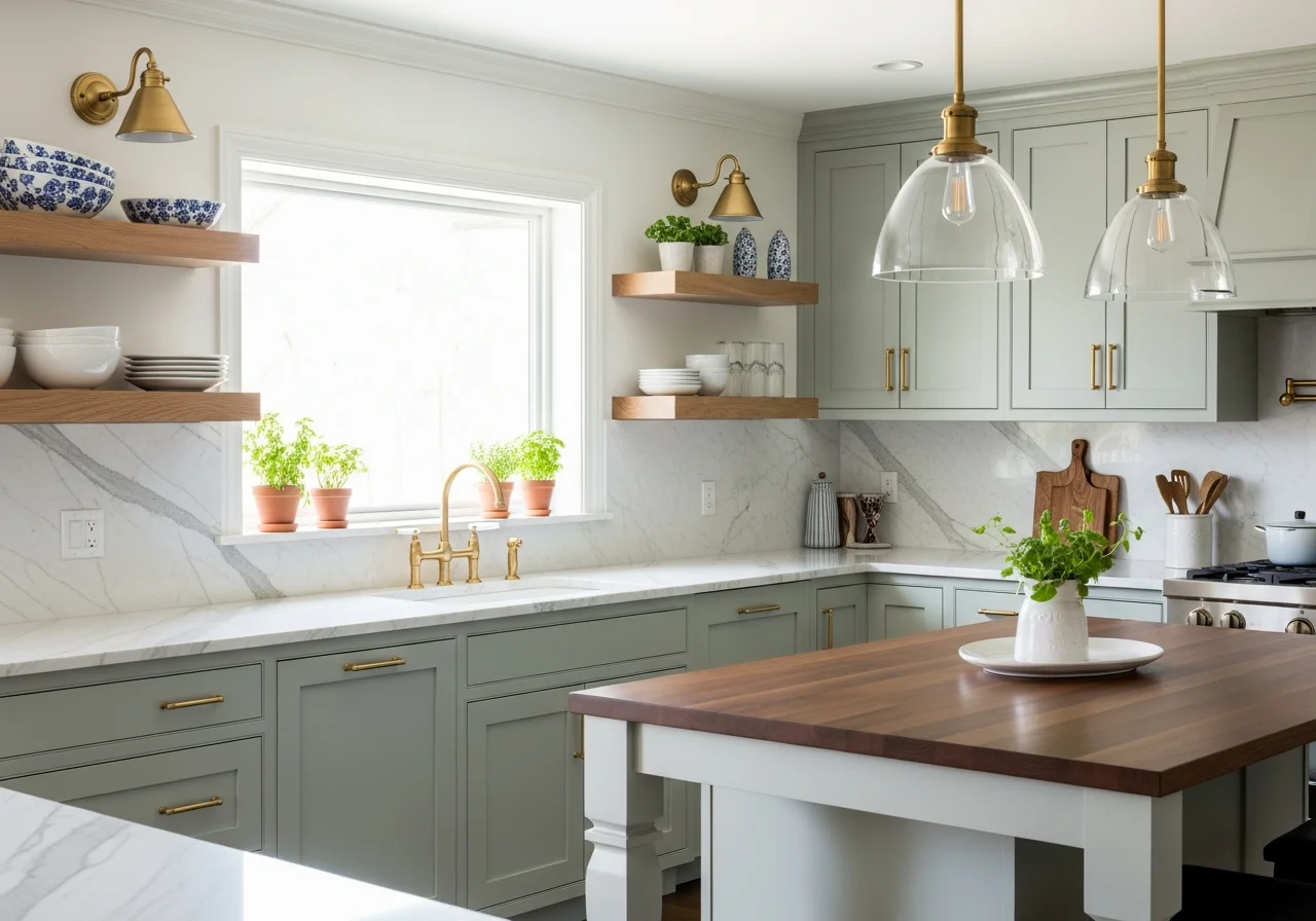
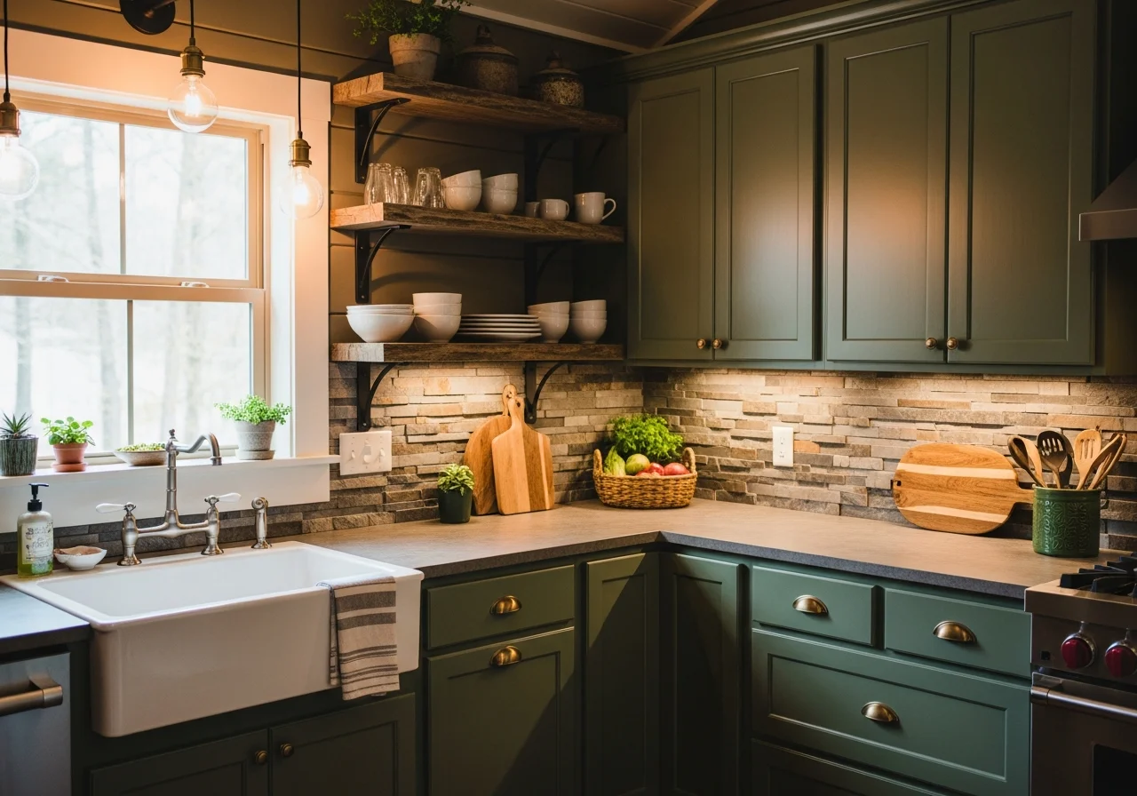
Green has firmly established itself as the neutral of choice for kitchen cabinets. Sage green leads the pack, offering a soft, calming presence that works beautifully in cottage, farmhouse, and modern kitchens alike. This muted tone brings tranquility without overwhelming the space, pairing effortlessly with natural wood accents, marble countertops, and brass hardware.
Olive and moss greens are equally popular, providing slightly deeper tones that ground the kitchen while maintaining that connection to nature. These earthy greens work particularly well when combined with wood cabinetry to create contrast and texture. Forest green offers the boldest option in this family, delivering drama and richness for those who want a more moody, sophisticated atmosphere.
Designers recommend pairing green cabinets with butcher block countertops, stone backsplashes, and woven accessories to enhance the natural aesthetic. The versatility of green allows it to adapt to various design styles, from rustic farmhouses to sleek contemporary spaces.
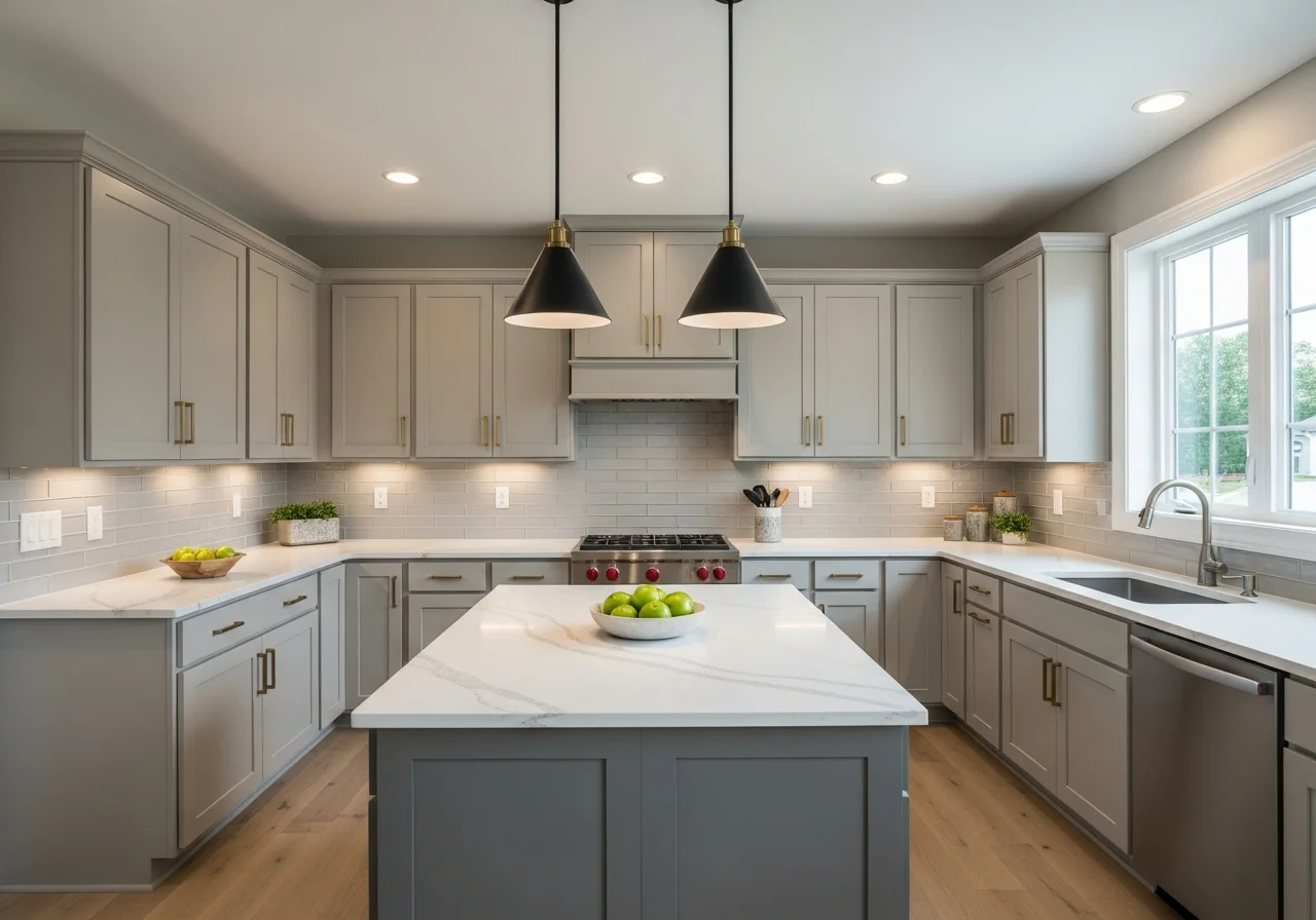
Warm Neutrals Replace Cool Grays
The era of cool gray and stark white kitchens is giving way to warmer, more inviting neutrals. Creamy off-whites, soft beige, and taupe are dominating kitchen designs, creating spaces that feel cozy rather than clinical. These warm neutrals provide a sophisticated backdrop that complements both traditional and modern design elements.
Greige, that perfect marriage of gray and beige, continues to hold strong appeal for homeowners seeking a balanced neutral that works with virtually any decor. These warmer tones make kitchens feel lived-in and welcoming, perfect for the gathering spaces they are meant to be.
Warm mushroom taupe deserves special mention as an emerging favorite. This earthy neutral brings subtle warmth and depth to cabinetry, working beautifully in transitional kitchens that blend traditional and contemporary elements. The color reads as calming and grounded without appearing too stark or too dark, making it ideal for busy family kitchens.
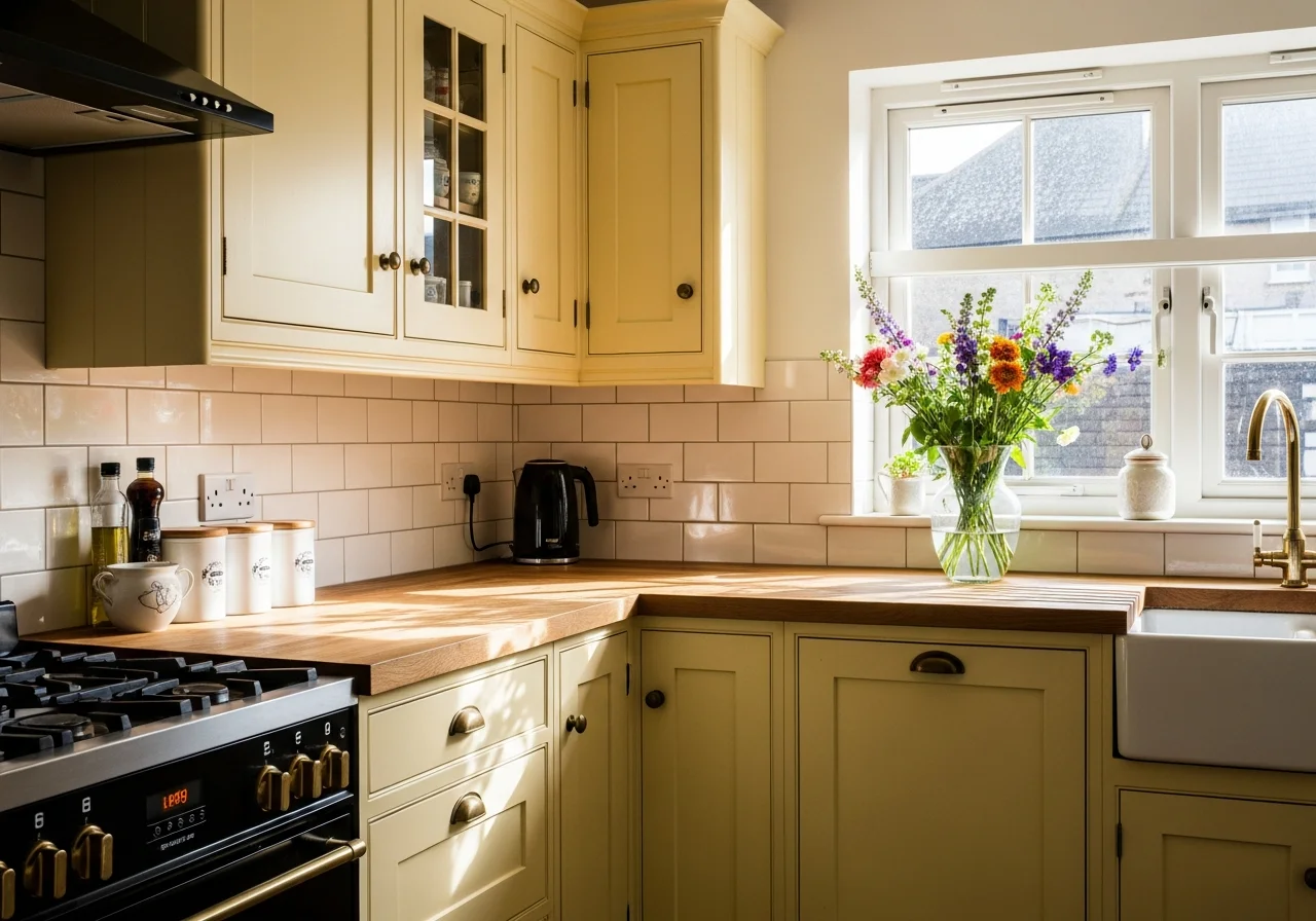
Butter Yellow Brings Sunshine Inside
Butter yellow has emerged as a surprising frontrunner in kitchen cabinet trends. This soft yet saturated hue creates a warming atmosphere without feeling overwhelming. Unlike the bright yellows of decades past, today’s yellow cabinets are more subdued, offering the perfect middle ground between neutral and colorful.
This cheerful shade works exceptionally well in galley kitchens or spaces with limited natural light, where it can brighten and energize the room. When paired with white walls and natural wood elements, butter yellow creates a timeless scheme that feels fresh and optimistic. The color brings an airy, breezy aesthetic that makes cooking and gathering feel more joyful.
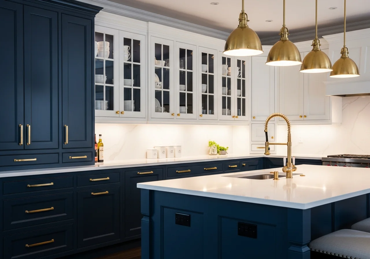
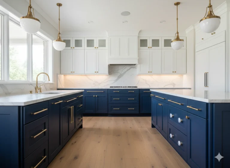
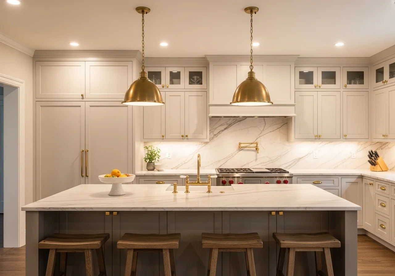
Navy Blue Adds Timeless Elegance
Navy blue and deep cobalt shades continue to captivate designers and homeowners alike. These rich blues offer sophistication and depth without the severity of black, creating a bold yet approachable look. Navy works beautifully in both traditional and contemporary kitchens, demonstrating remarkable versatility across design styles.
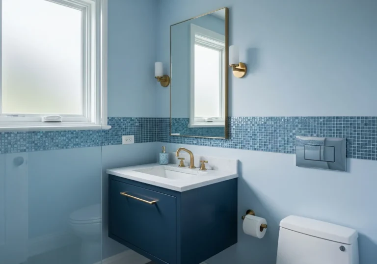
The elegance of navy blue pairs wonderfully with gold or brass hardware, which is experiencing its own moment in kitchen design. When combined with white or marble countertops, navy cabinets create striking contrast while maintaining a sense of refinement. Powder blue offers a lighter alternative, providing serenity and working beautifully with warm wood tones and both cool chrome and brass finishes.
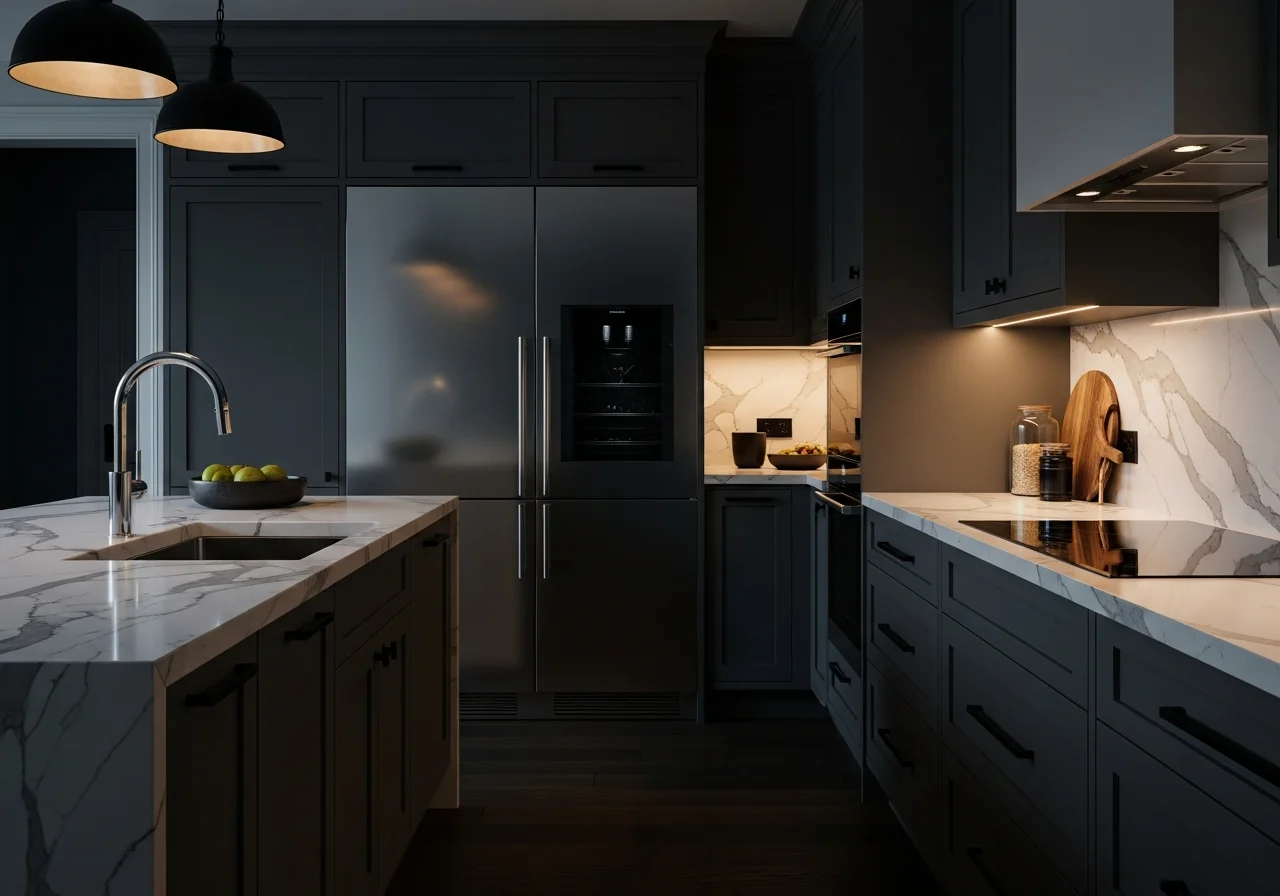
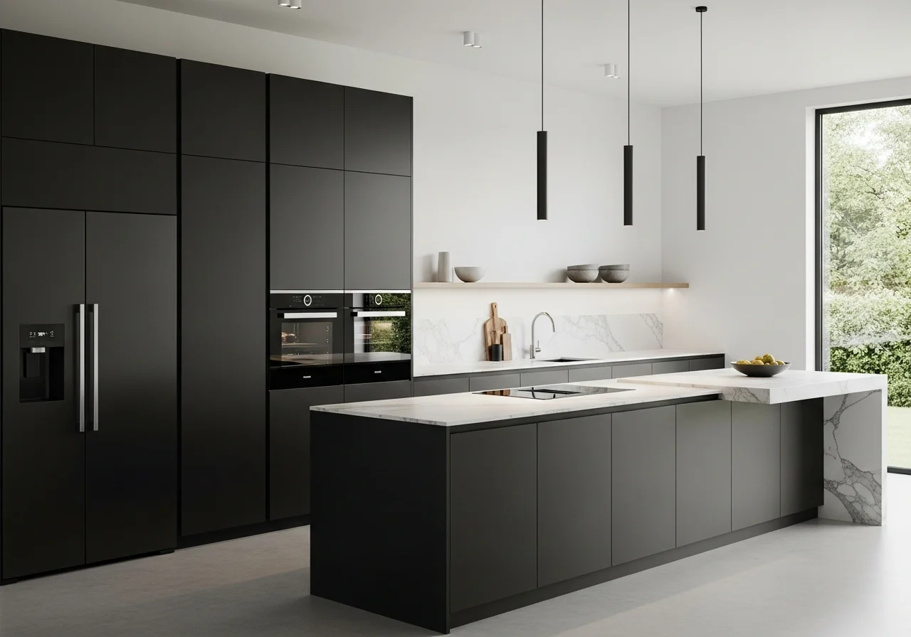
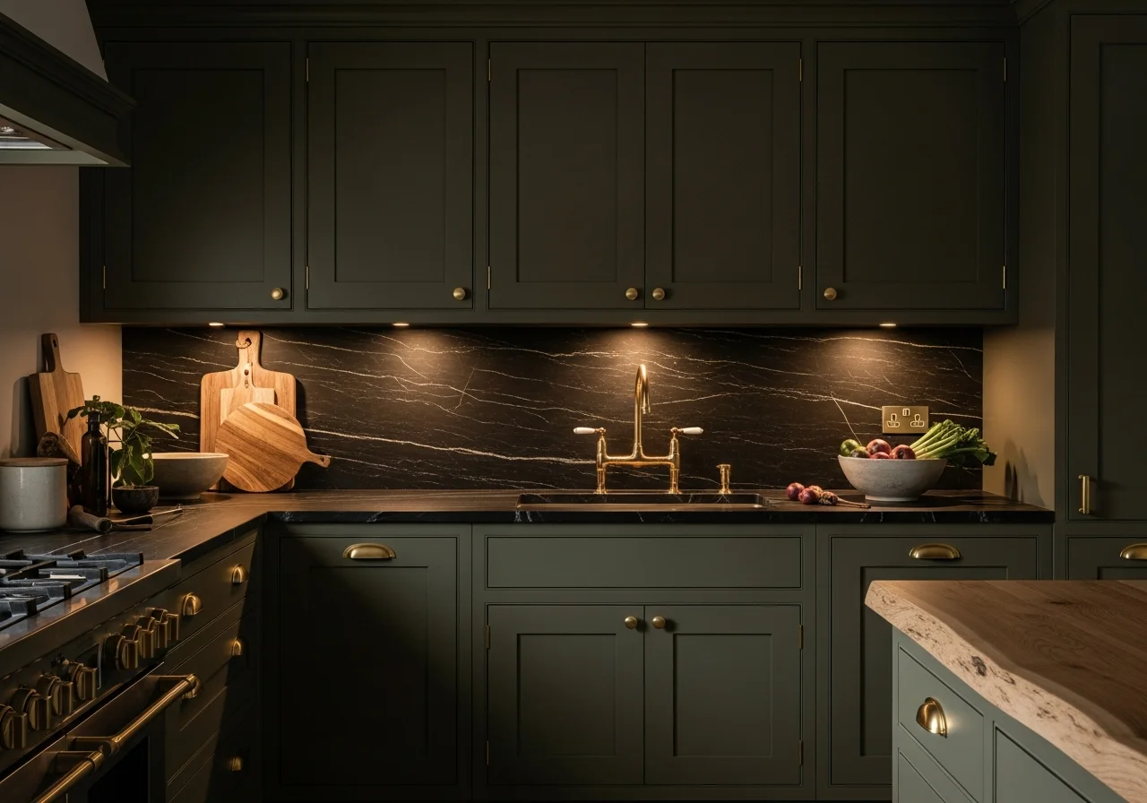
Dark and Dramatic Cabinets Make Bold Statements
Dark cabinets are experiencing a significant comeback, bringing unparalleled depth and drama to kitchen spaces. Charcoal, espresso brown, and matte black create luxurious, grounding elements that transform kitchens into sophisticated retreats. These darker tones work exceptionally well in larger kitchens where they can make a statement without overwhelming the space.
Matte black finishes offer a sleek, understated alternative to traditional high-gloss cabinetry. This bold yet sophisticated shade works particularly well in modern and industrial-style kitchens with stainless steel appliances, where clean lines and dramatic contrasts are essential design elements.
Dark wood tones, including rich walnut and deep oak, bring natural beauty alongside the drama. These finishes add both sophistication and warmth, connecting the kitchen to organic materials while maintaining a modern sensibility. Pair darker cabinets with lighter countertops and backsplashes to maintain balance and prevent the space from feeling too enclosed.
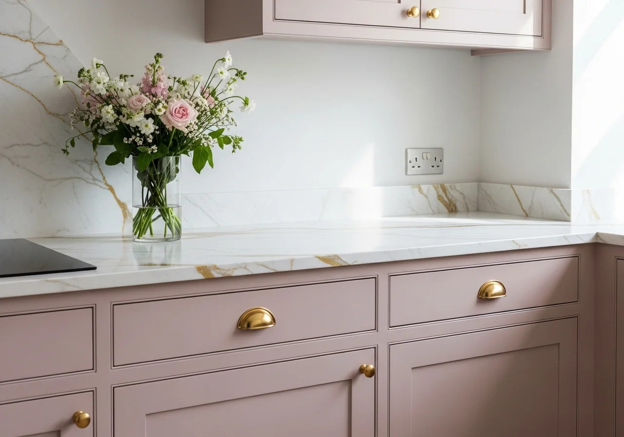
Soft Pink Brings Unexpected Sophistication
Pink cabinets might sound bold, but executed properly, they bring a grown-up, feminine elegance to kitchens. Dusty rose and soft blush tones create warmth and personality without overwhelming the space. These subtle pinks work beautifully when paired with marble countertops and gold hardware, creating a refined aesthetic that feels both classic and contemporary.
The versatility of pink surprises many homeowners. It pairs wonderfully with green for a bold, colorful scheme, or combines with warm whites for classically elegant designs. Pink cabinets work particularly well in butler’s pantries and smaller kitchen spaces where a touch of color adds character without dominating.
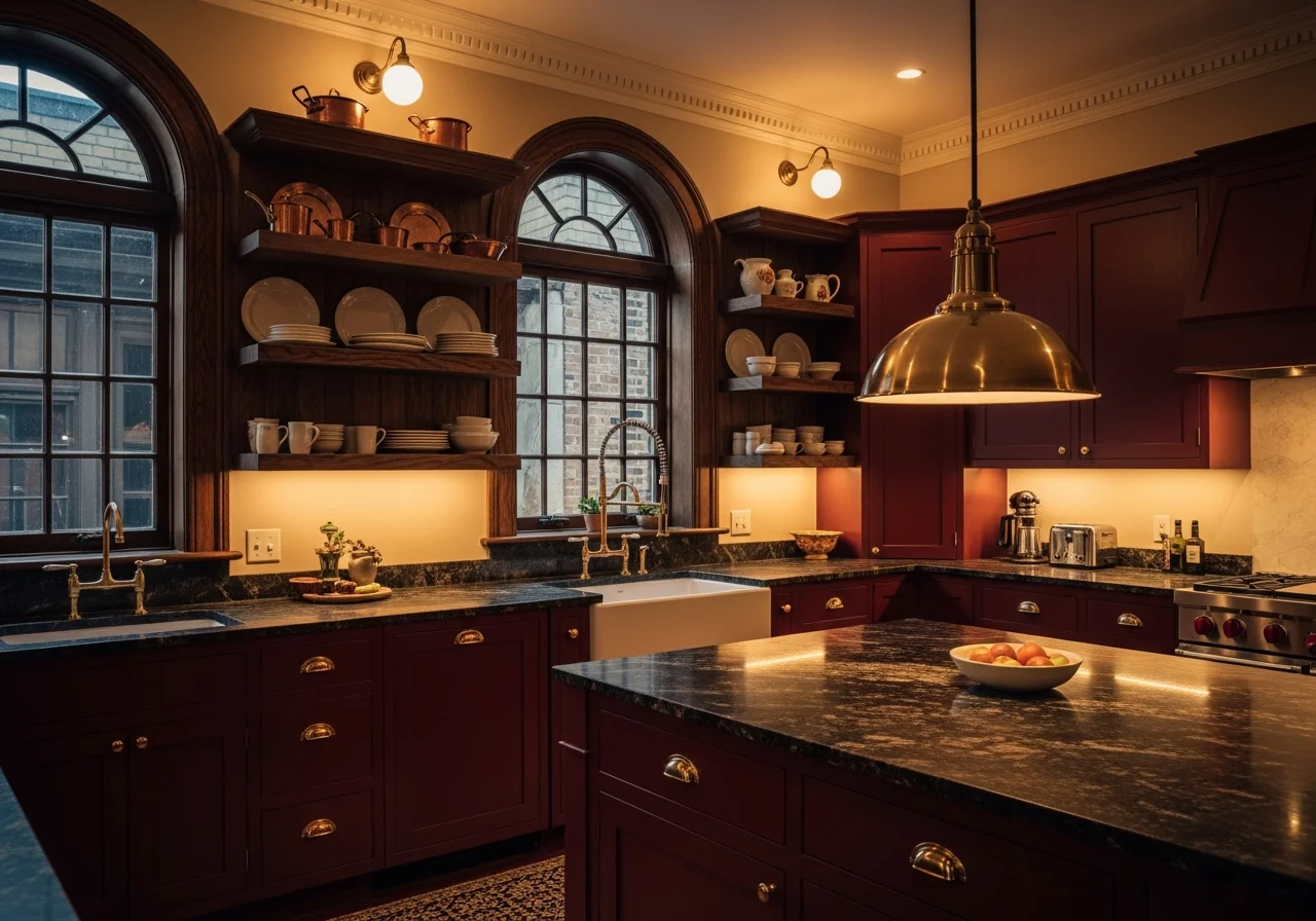
Burgundy and Wine Tones Add Richness
Rich, wine-toned hues represent the new frontier in bold kitchen design. Burgundy, merlot, and deep plum bring warmth and expressiveness to cabinetry, offering sophisticated alternatives to more traditional bold colors. These tones feel modern yet timeless, especially when combined with natural wood accents.
Designers note that these deeper reds work particularly well in older, historic homes where bold architectural moves feel appropriate. The richness of wine tones creates an enveloping, intimate atmosphere perfect for kitchens designed as true gathering spaces. Pair these dramatic hues with brass hardware and natural stone countertops for maximum impact.
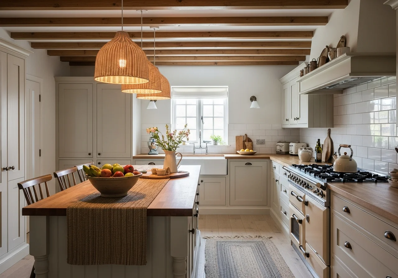
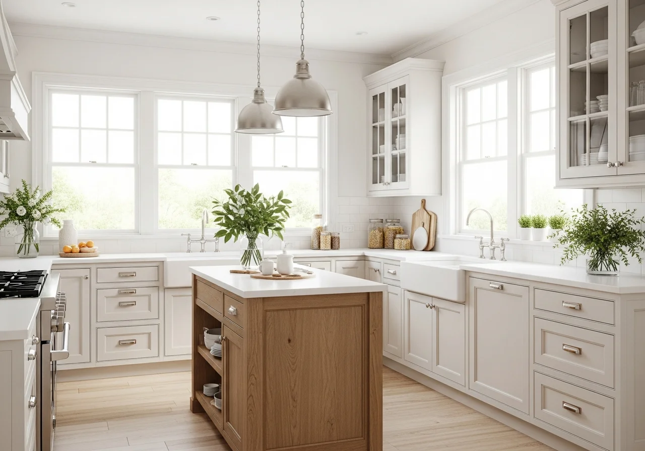
Cream Cabinets Offer Soft Sophistication
Cream has emerged as the neutral of choice for those seeking warmth without stark brightness. Often described as clotted cream, these pale, rich hues work subtly alongside muted butter yellow tones and natural wood elements. Cream provides a softer alternative to pure white while maintaining the light, airy quality that makes kitchens feel spacious.
These soft off-whites create a soothing backdrop that blends seamlessly with various design elements. Cream cabinets work beautifully in farmhouse kitchens, traditional designs, and even modern spaces seeking a warmer aesthetic. The color adds dimension without drawing too much attention, allowing other design elements to shine.
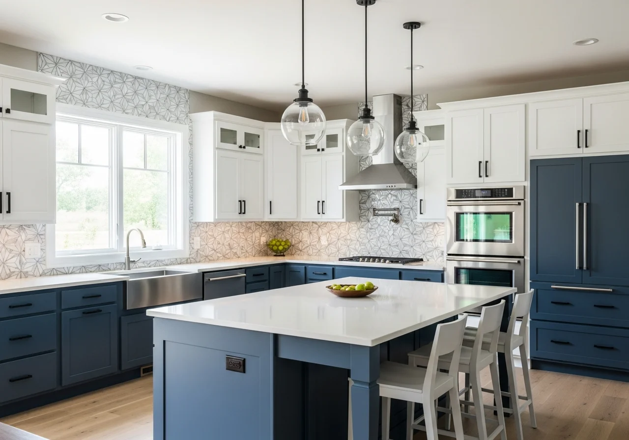
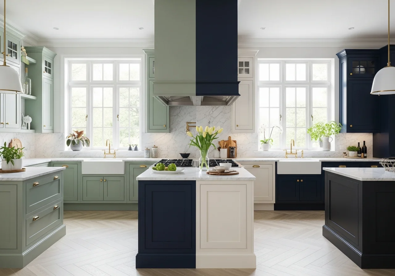
Two-Tone Combinations Create Visual Interest
Two-tone kitchen cabinets remain a dominant trend, allowing homeowners to add personality and depth without committing to a single bold color throughout. The most popular combinations include classic white upper cabinets paired with navy lower cabinets, creating crisp, timeless contrast that always feels fresh.
Sage green combined with natural oak brings an earthy, organic mix that feels particularly current. Charcoal base cabinets with white uppers create dramatic balance, adding style without becoming overwhelming. The two-tone approach works because it creates visual interest while maintaining harmony in the space.
This design strategy also offers practical benefits. Darker lower cabinets help conceal wear and tear in high-traffic areas while lighter upper cabinets keep the kitchen feeling bright and open. The contrast adds dimension and flow, making kitchens feel more dynamic and thoughtfully designed.
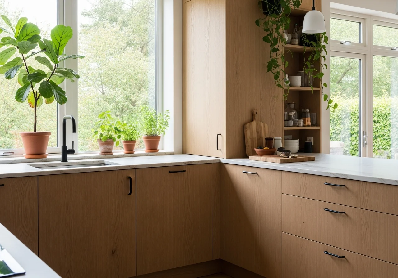
Natural Wood Finishes Return to Prominence
Natural wood cabinetry is experiencing renewed popularity, with homeowners embracing the warmth and authenticity of visible grain patterns. Light oak, walnut, and natural maple bring organic beauty to kitchens while offering remarkable versatility in styling.
The trend toward natural wood reflects a broader emphasis on sustainability and biophilic design. These finishes celebrate the inherent character of wood grain rather than covering it with paint, creating connections to nature within the home. Matte wood finishes have replaced high-gloss styles, with subtle tactile surfaces that enhance the grain’s natural character.
Wood tones pair beautifully with the earthy color palettes dominating kitchen design. Light wood cabinets work wonderfully with darker painted islands, while rich walnut cabinetry creates stunning contrast with lighter walls and countertops.
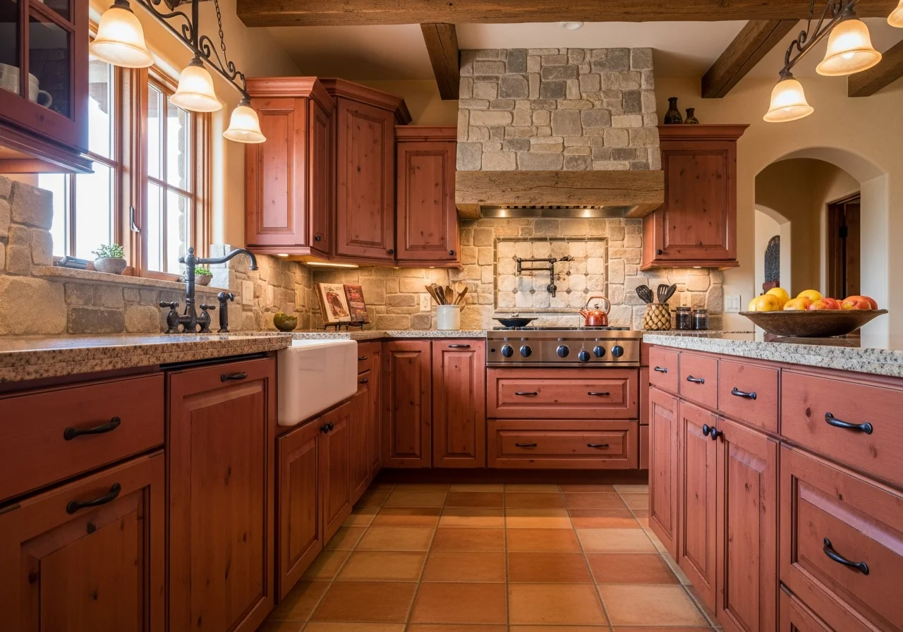
Terracotta and Clay Tones Add Rustic Warmth
Terracotta and warm clay colors bring rustic charm and earthy warmth to kitchen cabinets. These reddish-brown hues connect spaces to natural earth elements while adding distinctive character. Though less common than greens or blues, these warm tones create incredibly inviting atmospheres in the right settings.
These colors work particularly well in Mediterranean-inspired kitchens, southwestern designs, or any space seeking a connection to organic, earth-based aesthetics. Pair terracotta cabinets with natural stone countertops and wrought iron hardware for a cohesive, warm look.
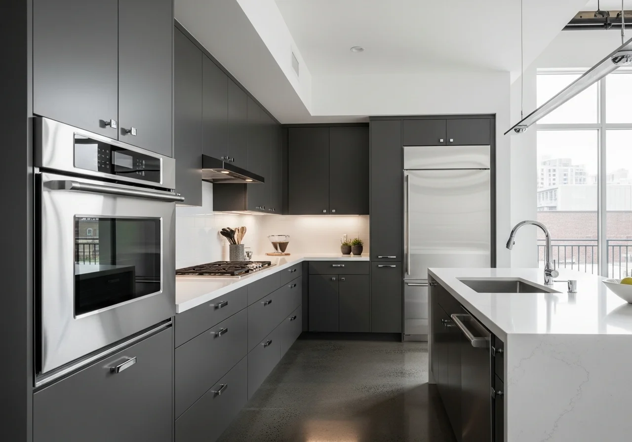
Charcoal Gray Provides Modern Sophistication
Charcoal gray offers a middle ground between black and lighter grays, providing modern sophistication without excessive drama. This versatile shade works across design styles, from industrial lofts to contemporary suburban homes. Charcoal brings grounding presence while maintaining enough lightness to prevent kitchens from feeling too dark.
The beauty of charcoal lies in its neutrality. It serves as an excellent backdrop for colorful accessories, stainless appliances, and various countertop materials. When paired with white or light-colored walls, charcoal cabinets create striking contrast without overwhelming the space.
Evergreen Delivers Bold Natural Appeal
Evergreen represents a deeper, more vibrant alternative to sage or forest green. This rich, nature-inspired shade brings dramatic yet grounding presence to kitchens. More saturated than lighter greens but not as dark as forest tones, evergreen makes bold design statements while maintaining organic appeal.
This color shines in kitchens seeking a cozy, sophisticated feel with either classic moody aesthetics or rustic, cabin-inspired designs. Antique brass or matte gold hardware enhances the vintage appeal, while pairing evergreen lower cabinets with cream uppers softens the boldness.
Soft Matte Black Creates Sleek Impact
Soft matte black has replaced glossy black finishes as the preferred dark option for kitchen cabinets. This understated finish provides sleek elegance without the maintenance challenges and visual heaviness of high-gloss black. The matte surface creates depth and sophistication while remaining practical for daily use.
This shade works exceptionally well in modern kitchens with clean lines and minimal ornamentation. Pair matte black with white countertops, stainless appliances, or natural wood accents to create balance and prevent the space from feeling too monochromatic.
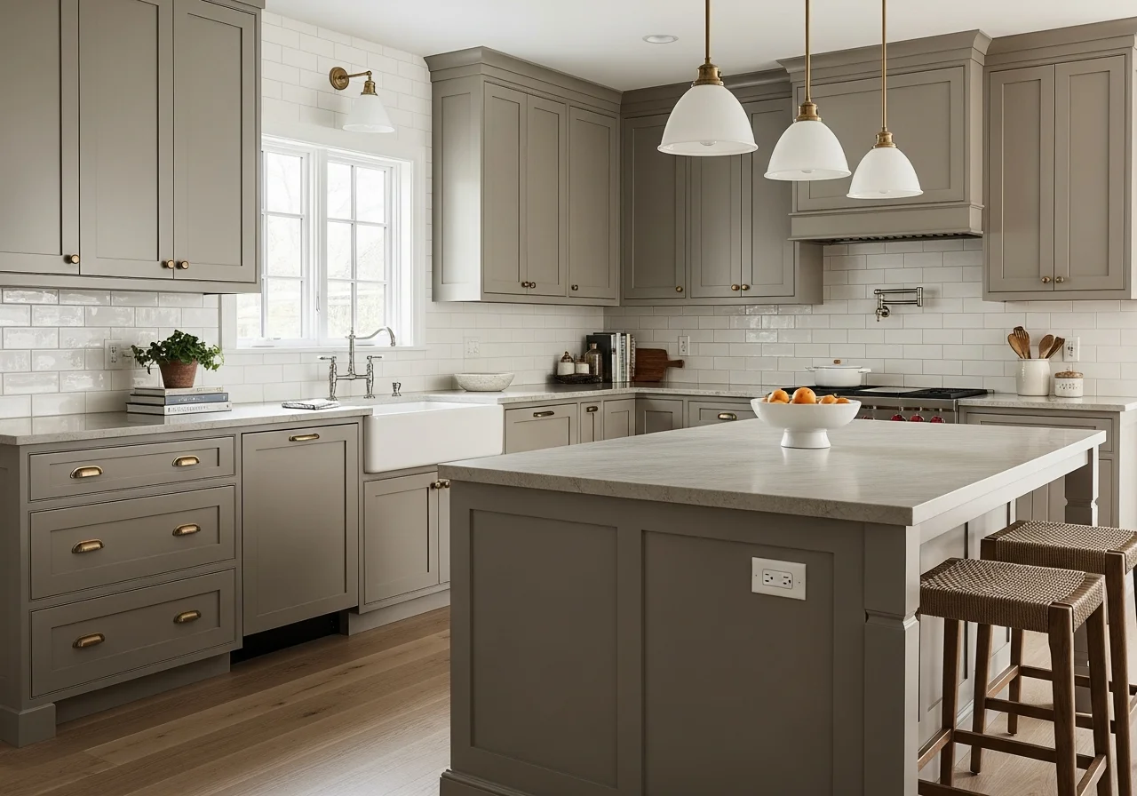
Warm Taupe Offers Grounded Versatility
Warm taupe provides subtle warmth and remarkable versatility for kitchen cabinetry. This balanced blend of beige, gray, and brown tones creates calming atmospheres without appearing too stark or too dark. Taupe works beautifully as a whole-kitchen color or as part of two-tone designs.
The neutrality of taupe makes it an excellent long-term choice for homeowners concerned about color trends changing. It provides enough warmth to feel inviting while maintaining the flexibility to work with evolving decor and accessories.
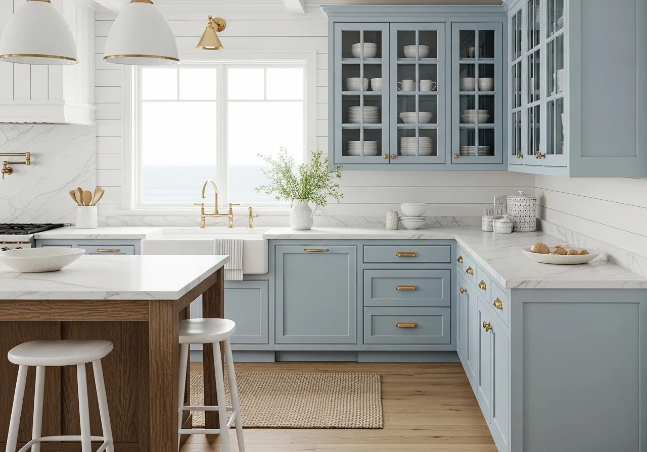
Powder Blue Brings Serene Calm
Powder blue and icy blue tones offer serene alternatives to darker blue cabinets. These soft hues create tranquil atmospheres without feeling juvenile or overly sweet. Blues with hints of green and gray provide sophisticated color that works beautifully with white walls and warm wood elements.
These lighter blues excel in creating airy, open feelings in kitchens. They pair wonderfully with brass fixtures, marble countertops, and natural textures, offering timeless appeal that transcends fleeting trends.
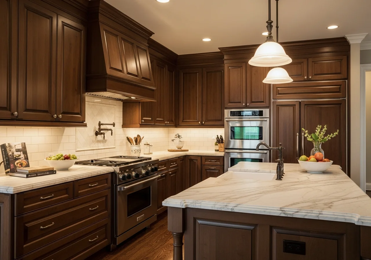
Deep Brown Creates Warm Neutrality
Deep chocolate brown and espresso tones act as sophisticated neutrals in kitchen design. These rich browns bring warmth and depth while maintaining versatility across various design styles. Brown cabinets pair beautifully with natural stone, brass hardware, and lighter walls.
The warmth of brown makes kitchens feel immediately more welcoming and grounded. This color choice nods to classic timber kitchens while feeling thoroughly contemporary, especially when paired with modern hardware and fixtures.
Greige Maintains Balanced Appeal
Greige continues its reign as one of the most popular kitchen cabinet colors. This perfect combination of gray and beige offers balanced neutrality that works with virtually any design style. Greige provides enough warmth to feel inviting while maintaining the contemporary edge of gray.
The staying power of greige reflects its remarkable versatility. It complements both warm and cool accents, works with various countertop materials, and provides a sophisticated backdrop that never feels dated or trendy.
Soft Whites with Character
Rather than stark, bright white, today’s white cabinets feature subtle undertones that bring character and warmth. Sun-bleached aesthetics and snow-covered tones offer sophistication with slight hints of gray or tan. These softer whites create perfect canvases for colorful accents while maintaining the brightness and openness white cabinets provide.
The evolution of white cabinets reflects a broader desire for warmth and livability in kitchen design. These gentler whites feel cozy rather than clinical, creating inviting spaces that still benefit from white’s timeless appeal.
Palmer Green and Olive Tones
Palmer green and deeper olive hues represent moodier alternatives to sage green. These darker greens create drama and depth while maintaining the natural, earthy quality that makes green so appealing. These shades work as chameleons, reading almost gray in soft lighting but showing their green character in brighter conditions.
These deeper greens pair well with both light and dark accents, making them remarkably versatile for various design schemes. They work beautifully in monochromatic palettes or as bold contrasts to lighter elements.
Selecting Your Perfect Cabinet Color
Choosing the right cabinet color involves considering several factors beyond personal preference. Natural lighting dramatically affects how colors appear in your kitchen. Rooms with abundant natural light can handle darker, bolder colors, while kitchens with limited light benefit from lighter, more reflective hues.
Your existing elements matter significantly. Countertops, backsplashes, and flooring should complement your cabinet choice. If these elements are neutral, you have more freedom to experiment with bold cabinet colors. If your counters and backsplash already feature color or pattern, more subdued cabinet tones often work better.
Consider the size of your kitchen. Lighter colors generally make small kitchens feel more spacious, while larger kitchens can accommodate darker, more dramatic hues without feeling cramped. However, two-tone approaches allow you to enjoy darker colors even in smaller spaces by using them strategically on lower cabinets or islands.
Think about longevity and resale value. While bold colors can transform your kitchen, extremely trendy choices might feel dated quickly. The colors highlighted here offer the best balance between current appeal and lasting style. Nature-inspired greens, warm neutrals, and classic blues provide staying power that transcends fleeting trends.
Hardware and fixtures play crucial roles in completing your cabinet color choice. Brass and gold finishes bring warmth to cooler cabinet colors, while matte black hardware creates striking contrast with lighter cabinets. The finish you choose for your cabinets matters too, with matte and satin finishes trending over high-gloss options.
Creating Cohesive Kitchen Design
Cabinet color represents just one element in creating beautiful, functional kitchens. The most successful designs consider how cabinets interact with walls, countertops, backsplashes, and flooring. Texture adds another dimension beyond color, with natural materials like wood, stone, and woven elements enhancing visual interest.
Many designers recommend using the color wheel to identify complementary pairings. If your countertops feature warm tones, cabinet colors with similar undertones create harmony. Conversely, strategic contrast between cool and warm elements adds dynamic energy to spaces.
The trend toward warmer, more personal kitchens reflects our evolving relationship with this essential space. We are moving away from kitchens as purely functional rooms toward spaces that nurture, comfort, and reflect our personalities. Cabinet colors play a crucial role in creating these emotionally resonant environments.
Final Thoughts
Kitchen cabinet color trends for this year celebrate warmth, nature, and personal expression. The shift from sterile whites and cool grays toward earthy greens, rich neutrals, and bold accent colors reflects our desire for homes that feel nurturing and authentic. Whether you gravitate toward the calming presence of sage green, the sophistication of navy blue, the drama of matte black, or the warmth of butter yellow, the current palette offers options for every style and preference.
The most important consideration in choosing cabinet colors remains creating a kitchen that resonates with you personally. Trends provide guidance and inspiration, but your kitchen should ultimately reflect your taste, lifestyle, and the atmosphere you want to create in your home. With proper planning and attention to how colors interact with existing elements, you can create a kitchen that feels both current and timelessly beautiful.
Frequently Asked Questions
What is the most popular kitchen cabinet color right now?
Sage green has emerged as the most popular kitchen cabinet color, with earthy green tones dominating design trends. Warm neutrals like cream and taupe follow closely, as homeowners shift away from stark white and cool gray toward colors that feel more inviting and connected to nature.
Are white kitchen cabinets going out of style?
White cabinets remain timeless, but the style is evolving toward softer, warmer whites with subtle gray or tan undertones rather than stark, bright white. These softer whites provide the same fresh, classic appeal while creating more inviting, less clinical-feeling spaces.
What cabinet colors hide dirt and wear best?
Darker colors like charcoal, forest green, navy blue, and dark brown are most effective at hiding dirt, fingerprints, and wear. Medium tones like sage green and taupe also perform well. Very light colors and stark white show dirt more readily, though they remain popular for their bright, clean appearance.
Should kitchen cabinets be lighter or darker than walls?
This depends on your kitchen size and lighting. In smaller or darker kitchens, lighter cabinets with darker walls create visual interest without making the space feel cramped. In larger, well-lit kitchens, darker cabinets against lighter walls create dramatic contrast and sophistication. Two-tone approaches allow you to use both light and dark elements effectively.
How do I choose a cabinet color that will not look dated?
Focus on nature-inspired colors like greens and blues, classic neutrals like cream and taupe, or timeless options like soft white and navy. Avoid extremely trendy colors or those tied to specific decades. Consider your home’s architecture and existing finishes, choosing colors that complement rather than clash with permanent elements like flooring and countertops.