24 Painted Kitchen Cabinet Ideas Inspired by Kait Style
Transforming your kitchen cabinets with paint stands as one of the most impactful and cost-effective home improvement projects you can undertake. The House of Kait approach to cabinet painting has inspired countless homeowners to tackle this rewarding DIY project, proving that dramatic kitchen makeovers do not require professional intervention or massive budgets. With the right techniques, quality materials, and thoughtful color choices, you can achieve stunning results that completely reimagine your cooking space.
The beauty of painting kitchen cabinets lies in its accessibility. Whether you are working with outdated honey oak cabinets from the 1990s or simply wanting to refresh your current setup, paint offers endless possibilities for customization. The House of Kait method demonstrates that patience, proper preparation, and attention to detail can yield professional-looking results that withstand daily use while dramatically improving your kitchen’s aesthetic appeal.
This comprehensive guide presents 24 painted kitchen cabinet ideas that capture the essence of the Kait style: practical, beautiful, and achievable for homeowners who want to invest sweat equity rather than thousands of dollars in complete cabinet replacement. Each idea reflects current design trends while maintaining timeless appeal, ensuring your investment remains relevant for years to come.
Classic White Cabinet Transformations
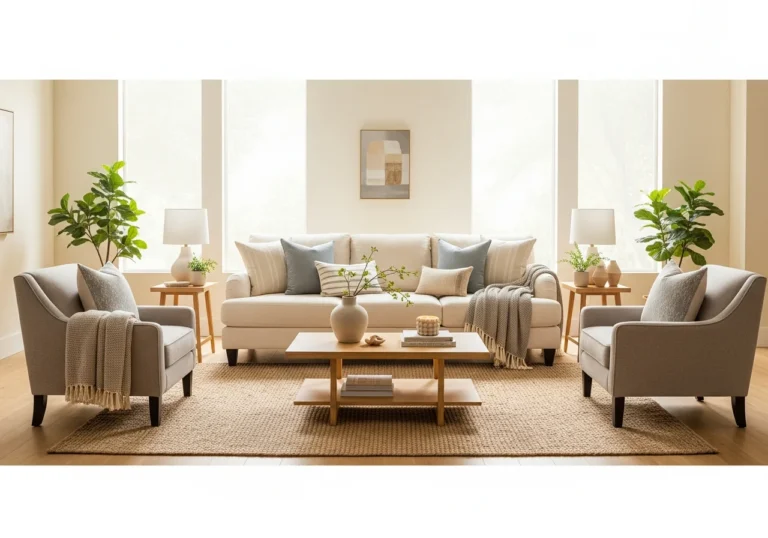
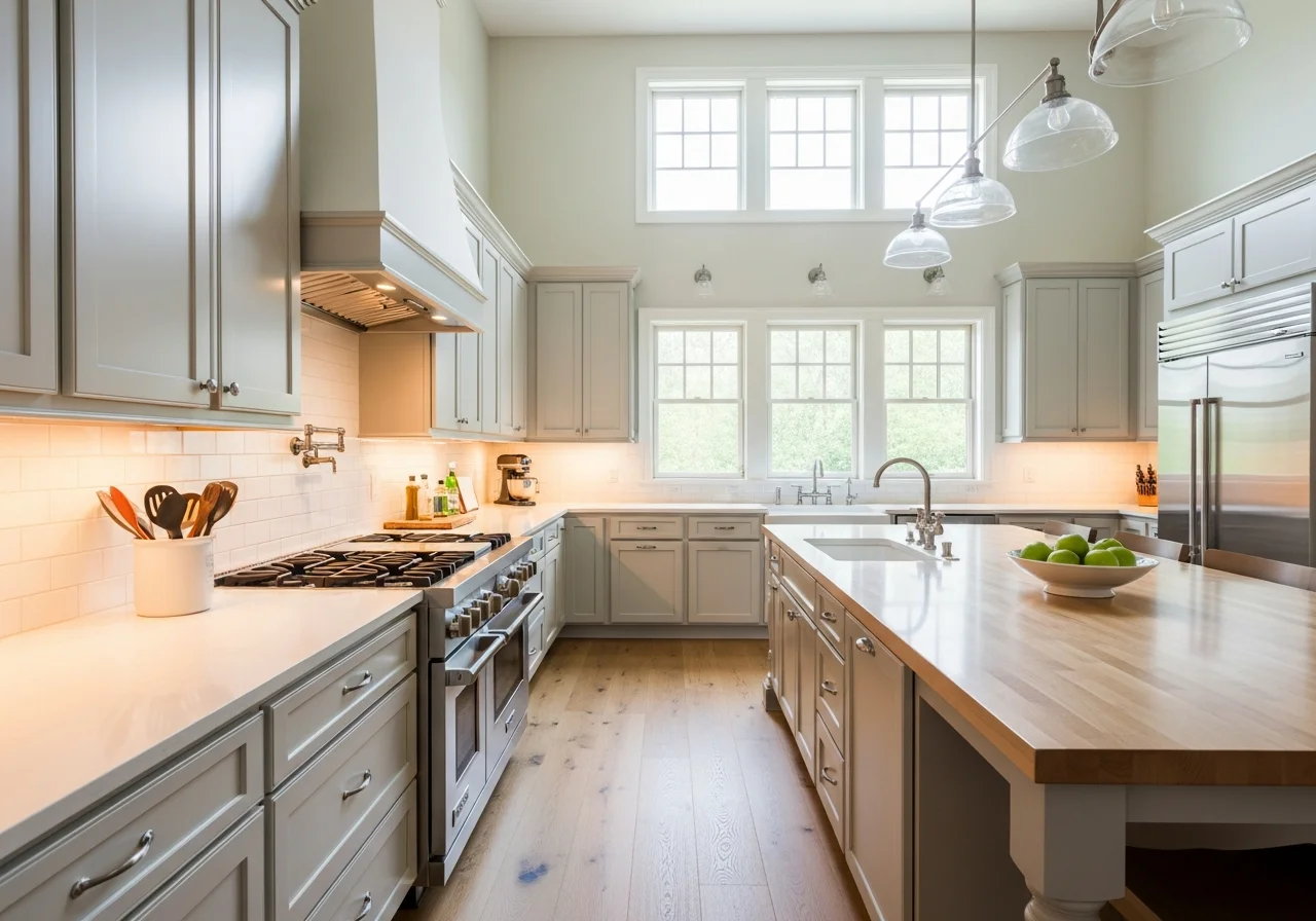
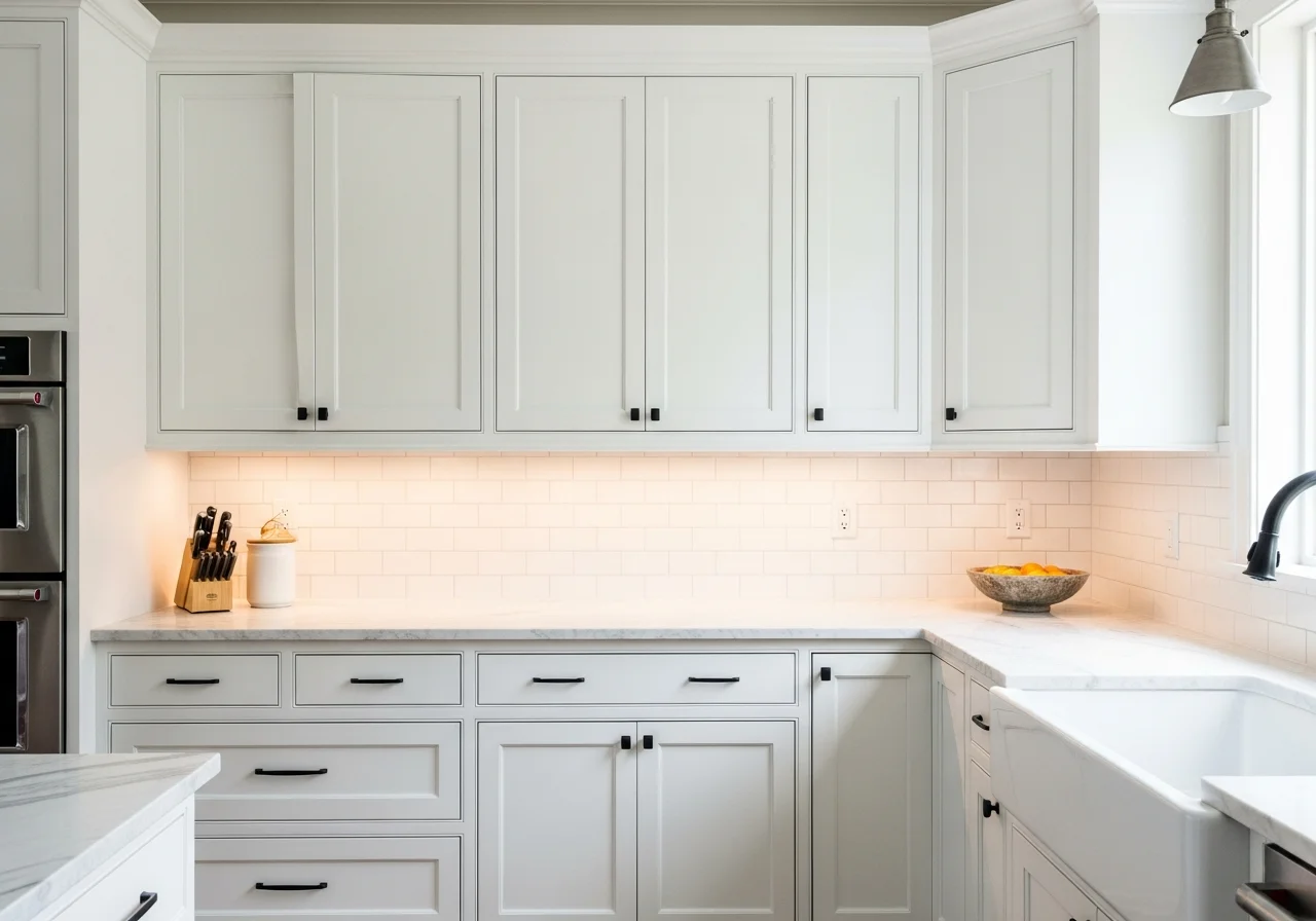
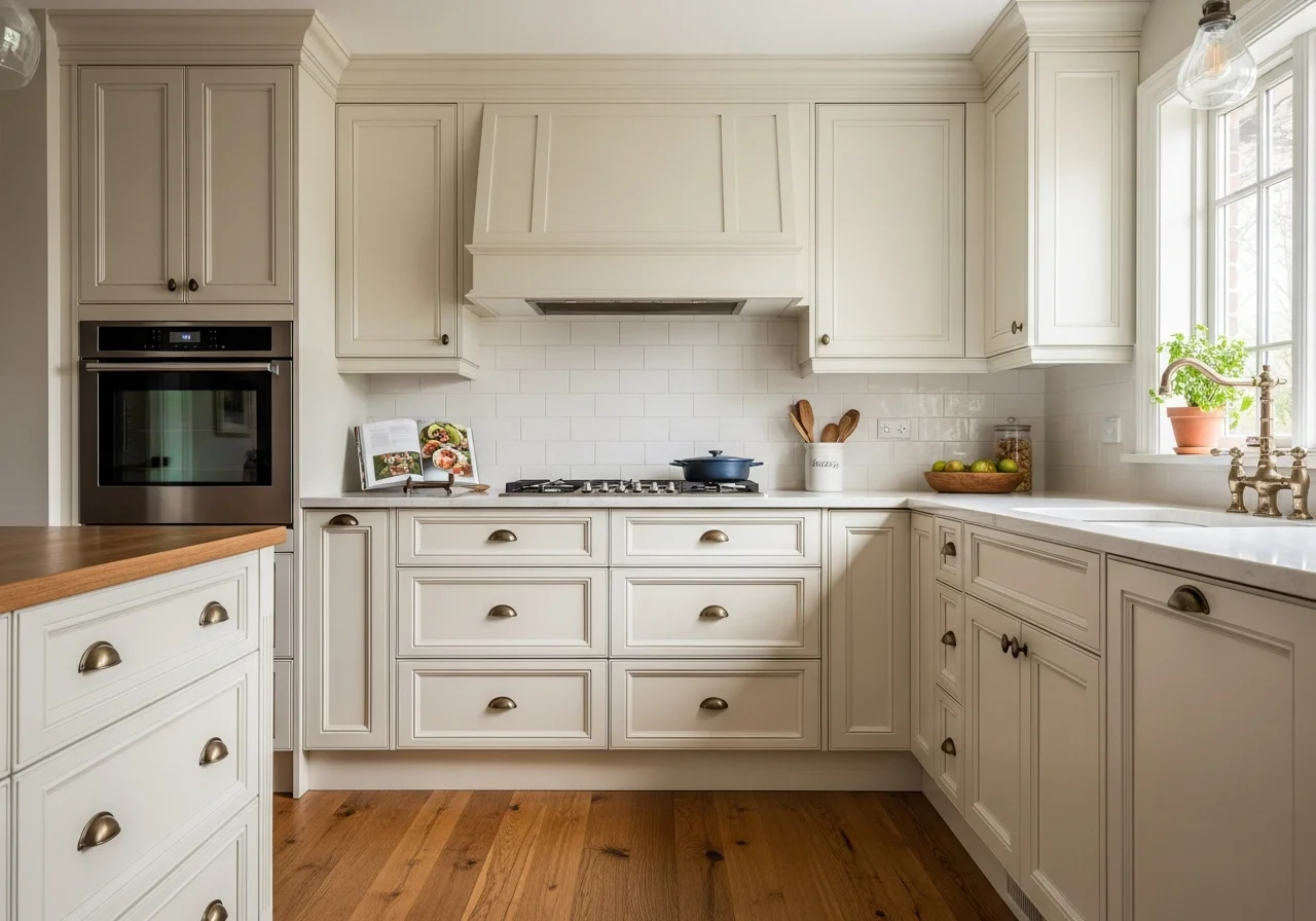
White kitchen cabinets continue to dominate kitchen design, and for good reason. The crisp, clean appearance of freshly painted white cabinets instantly brightens any space, making kitchens feel larger and more inviting. The House of Kait transformation famously showcased how painting dark wood cabinets white can completely eliminate that cave-like feeling that plagues many older kitchens.
When selecting white paint for cabinets, understanding undertones makes all the difference. Pure bright whites create a contemporary, almost clinical appearance, while warm whites with cream or beige undertones offer a softer, more traditional feel. Soft whites with subtle gray undertones work beautifully in transitional kitchens that blend modern and classic elements.
The application process for white cabinets often requires more coats than darker colors, particularly when covering wood grain or previous dark finishes. Most successful white cabinet projects require four to five coats to achieve that flawless, opaque finish without visible brushstrokes or color bleeding through. This commitment to multiple thin coats rather than fewer thick applications prevents drips and ensures even coverage.
Pairing white cabinets with updated hardware creates maximum impact. Switching from dated brass or wood knobs to modern matte black, brushed nickel, or oil-rubbed bronze hardware provides instant visual interest and helps anchor the fresh white cabinetry. The contrast between pristine white surfaces and darker hardware creates definition that prevents the space from appearing washed out.
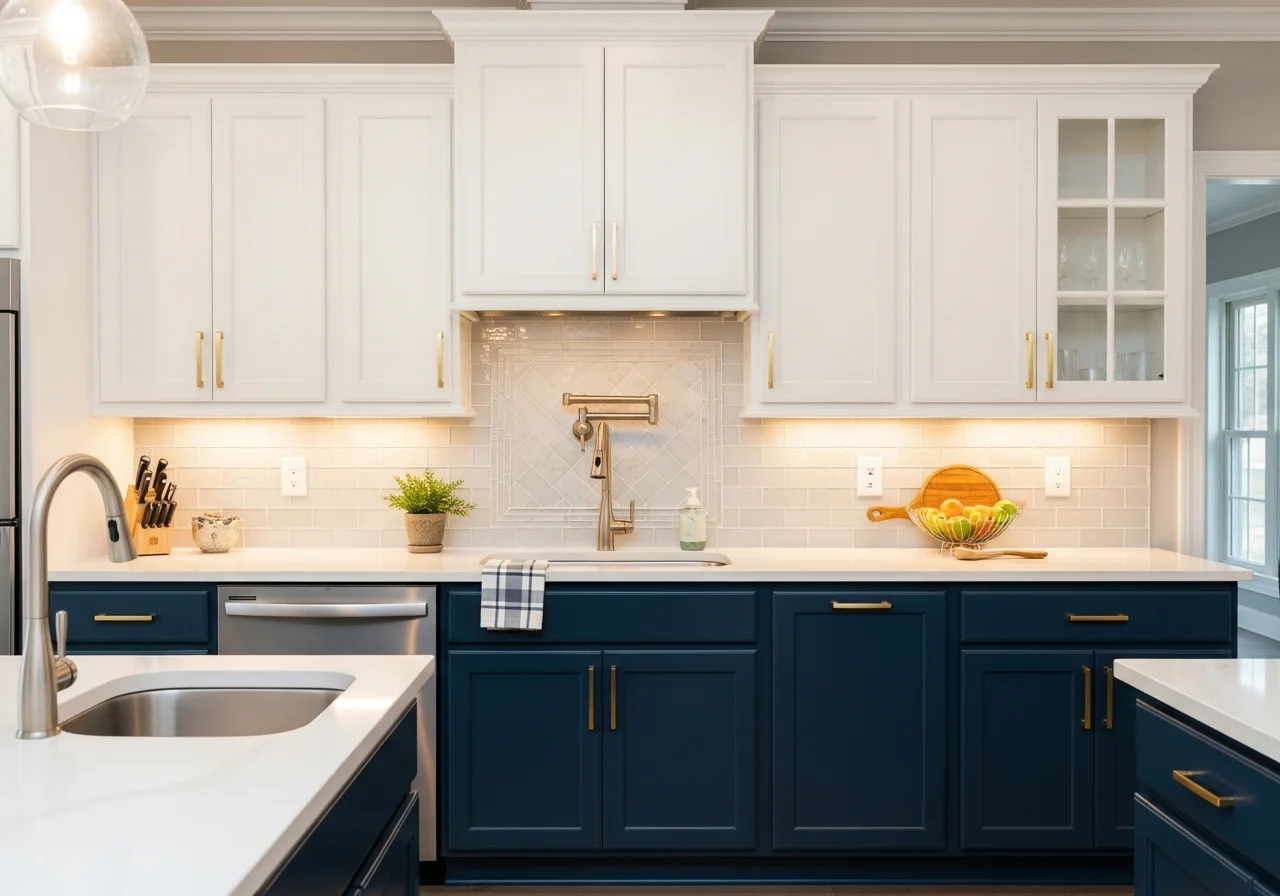
Two-Tone Cabinet Combinations
Two-tone kitchen cabinets have surged in popularity, offering visual interest and practical design solutions. This approach typically involves painting upper and lower cabinets in different colors, or creating an accent island that contrasts with perimeter cabinetry. The Kait style embraces this trend with thoughtful color pairings that feel intentional rather than chaotic.
Popular two-tone combinations include white upper cabinets paired with navy, sage green, or charcoal gray lower cabinets. This configuration grounds the kitchen while maintaining an open, airy feeling in the upper visual field. The contrast helps define different zones within the kitchen while adding depth and dimension to the overall design.
Another successful approach involves painting base cabinets in a warm neutral like greige or soft taupe while keeping upper cabinets or open shelving in crisp white. This maintains brightness at eye level while introducing warmth and richness below. The combination works particularly well in kitchens with limited natural light, where too much dark paint could feel oppressive.
Kitchen islands present perfect opportunities for bold color choices within two-tone schemes. A deep emerald green, rich burgundy, or classic black island surrounded by white or neutral perimeter cabinets creates a stunning focal point without overwhelming the entire space. This approach allows homeowners to experiment with trending colors on a smaller scale, making future updates easier and less expensive.

Sage Green Serenity
Sage green cabinets have emerged as one of the most sought-after kitchen cabinet colors, bringing natural tranquility into cooking spaces. This earthy, muted green works beautifully in farmhouse kitchens, transitional designs, and even modern spaces when paired with sleek hardware and minimalist styling. The color feels fresh and current while possessing timeless qualities that prevent it from appearing dated quickly.
The versatility of sage green allows it to complement various design elements. Natural wood countertops or butcher block islands pair beautifully with sage cabinetry, creating an organic, cohesive look. White subway tile backsplashes provide classic contrast, while marble or quartz in soft whites or creams maintains an elegant, sophisticated aesthetic.
Lighting significantly impacts how sage green appears throughout the day. In morning light, the color may appear more blue-toned and cool, while afternoon sun brings out warmer, yellower undertones. Testing paint samples in your specific kitchen environment helps ensure you select a shade that looks appealing under your particular lighting conditions.
Hardware selection plays a crucial role in the overall appearance of sage green cabinets. Brass or gold-toned hardware adds warmth and creates a traditional feel, while matte black provides modern contrast. Brushed nickel or chrome offers a cooler, more contemporary appearance. The Kait approach often favors mixing metals thoughtfully, perhaps using brass on upper cabinets and black on lower cabinets for subtle variation.
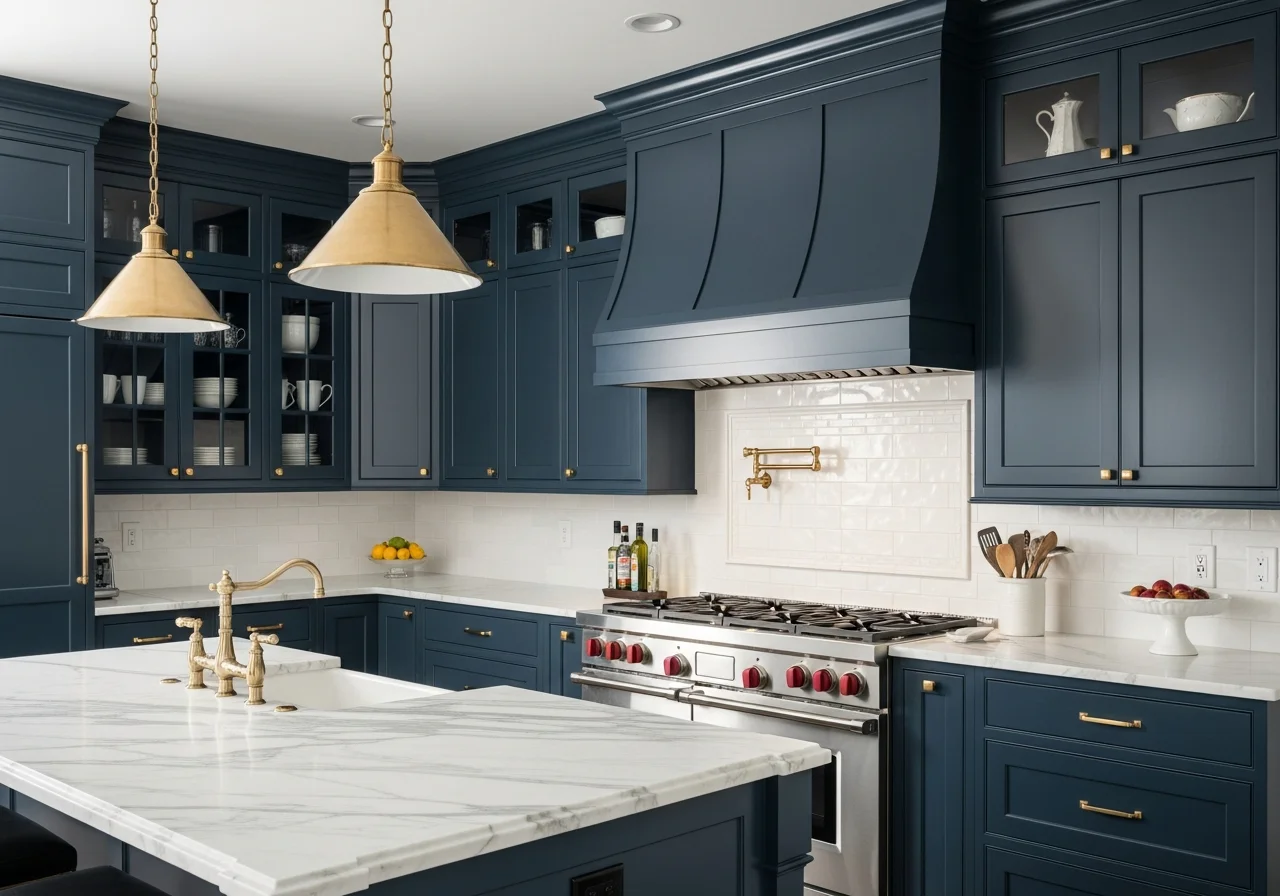
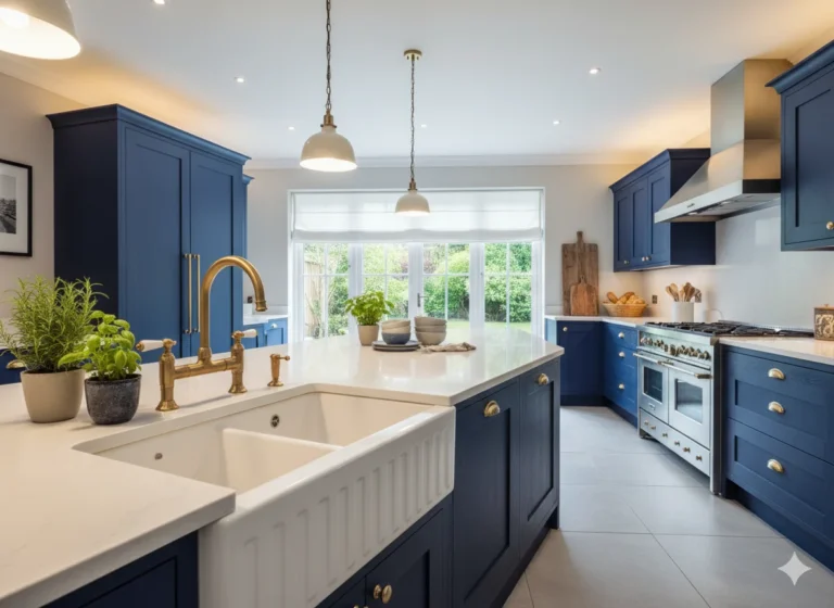
Navy Blue Sophistication
Navy blue cabinets bring depth and drama to kitchens while remaining surprisingly versatile and livable. This rich color works as an alternative to black, offering similar visual weight and sophistication without the potential harshness. Navy creates beautiful contrast with white walls, marble countertops, and stainless steel appliances, making it an excellent choice for updated traditional or transitional kitchens.
The key to successful navy cabinets lies in balancing the darkness with lighter elements. White or light gray walls prevent the space from feeling too enclosed, while adequate lighting ensures the kitchen remains functional and inviting. Under-cabinet lighting becomes particularly important with navy cabinets, illuminating work surfaces that might otherwise fall into shadow.
Navy cabinets pair exceptionally well with warm wood tones, whether in flooring, open shelving, or cutting boards and accessories. This combination prevents the blue from reading as cold or sterile, instead creating a cozy, collected appearance. The contrast between rich navy and warm wood feels both current and enduring.
For homeowners concerned about commitment to such a bold color, painting only the lower cabinets or island in navy while keeping upper cabinets white offers a balanced approach. This maintains brightness and prevents the space from feeling too dark while still incorporating the trending color. The result feels deliberate and custom rather than cautious.
Charcoal Gray Modern Edge
Charcoal gray cabinets deliver contemporary sophistication with slightly more warmth than black. This versatile color works beautifully in modern kitchens but can also ground transitional spaces when paired with traditional hardware and classic design elements. Charcoal provides the visual impact of dark cabinetry while remaining approachable and practical for everyday living.
The undertones in charcoal gray paint significantly affect the final appearance. Some grays lean blue, creating a cooler, more modern feel, while others contain brown or taupe undertones that add warmth. Testing samples alongside your flooring, countertops, and backsplash helps identify which undertone works best in your specific space.
Charcoal cabinets shine when paired with contrasting light elements. White or cream quartz countertops create stunning contrast, while light-colored backsplashes prevent the dark cabinets from overwhelming the space. Stainless steel appliances complement charcoal beautifully, maintaining a sleek, cohesive appearance.
Proper surface preparation becomes especially critical with dark colors like charcoal, as imperfections show more readily than on lighter cabinets. Thorough sanding, filling any dings or scratches, and applying quality primer ensures the smoothest possible finish. Dark colors require fewer coats than light colors when covering existing finishes, typically achieving full coverage in two to three applications.
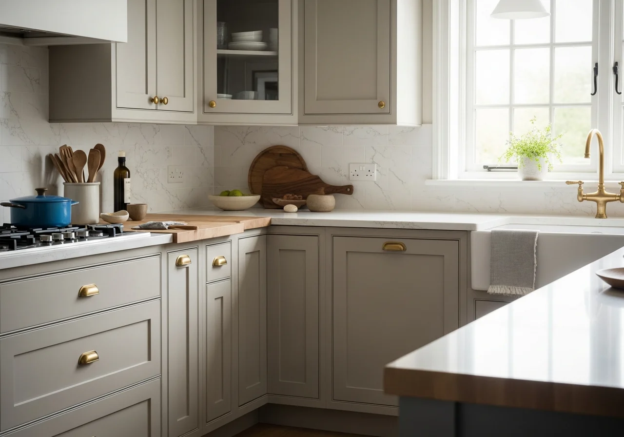
Warm Greige Neutrality
Greige, that perfect blend of gray and beige, offers neutral sophistication with more warmth than pure gray. This color family has gained tremendous popularity for its ability to complement virtually any design style while providing a backdrop that makes colorful accessories and decor pop. Greige cabinets feel current without being trendy, ensuring longevity in design relevance.
The spectrum of greige includes cooler shades that lean gray and warmer versions that favor beige. Cooler greiges work well in kitchens with abundant natural light or contemporary design aesthetics, while warmer versions suit traditional or transitional spaces. The balanced nature of greige makes it an excellent choice for homeowners who struggle to choose between warm and cool tones.
Greige cabinets pair beautifully with brass or gold hardware, which brings out the beige undertones and creates a warm, inviting appearance. They also work well with matte black hardware for a more modern look, or brushed nickel for understated elegance. The neutral quality of greige allows flexibility in hardware choices without clashing.
This color works particularly well in open-concept homes where the kitchen flows into living spaces. Greige cabinets coordinate seamlessly with neutral furniture and decor in adjacent rooms, creating visual continuity throughout the home. The understated nature of the color prevents the kitchen from competing with other design elements while still making a statement.
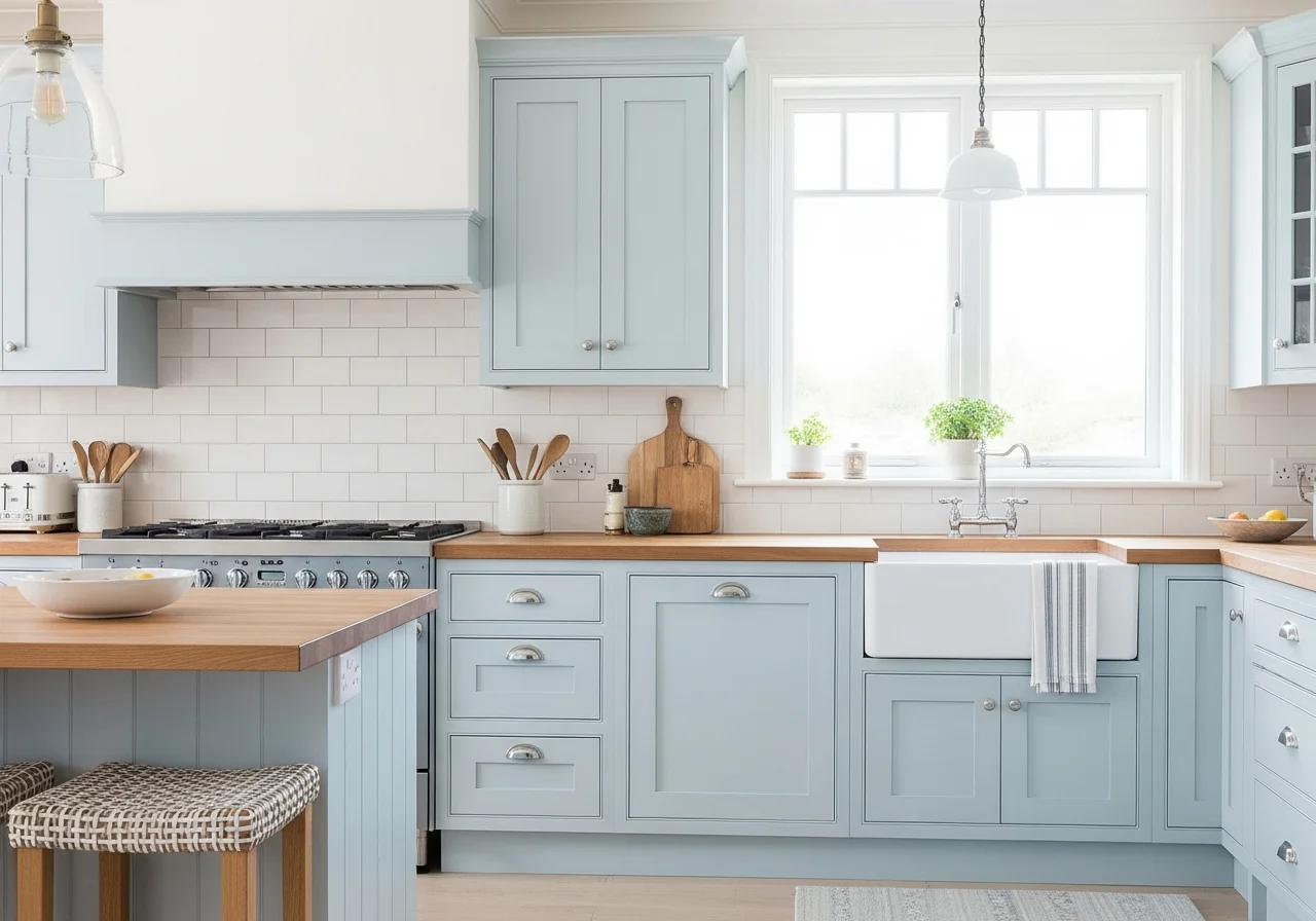
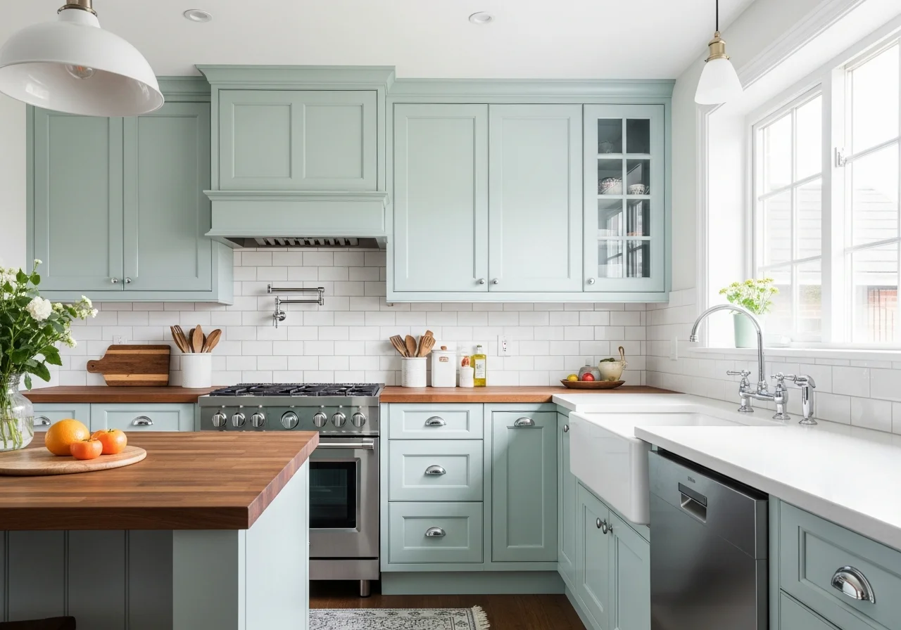
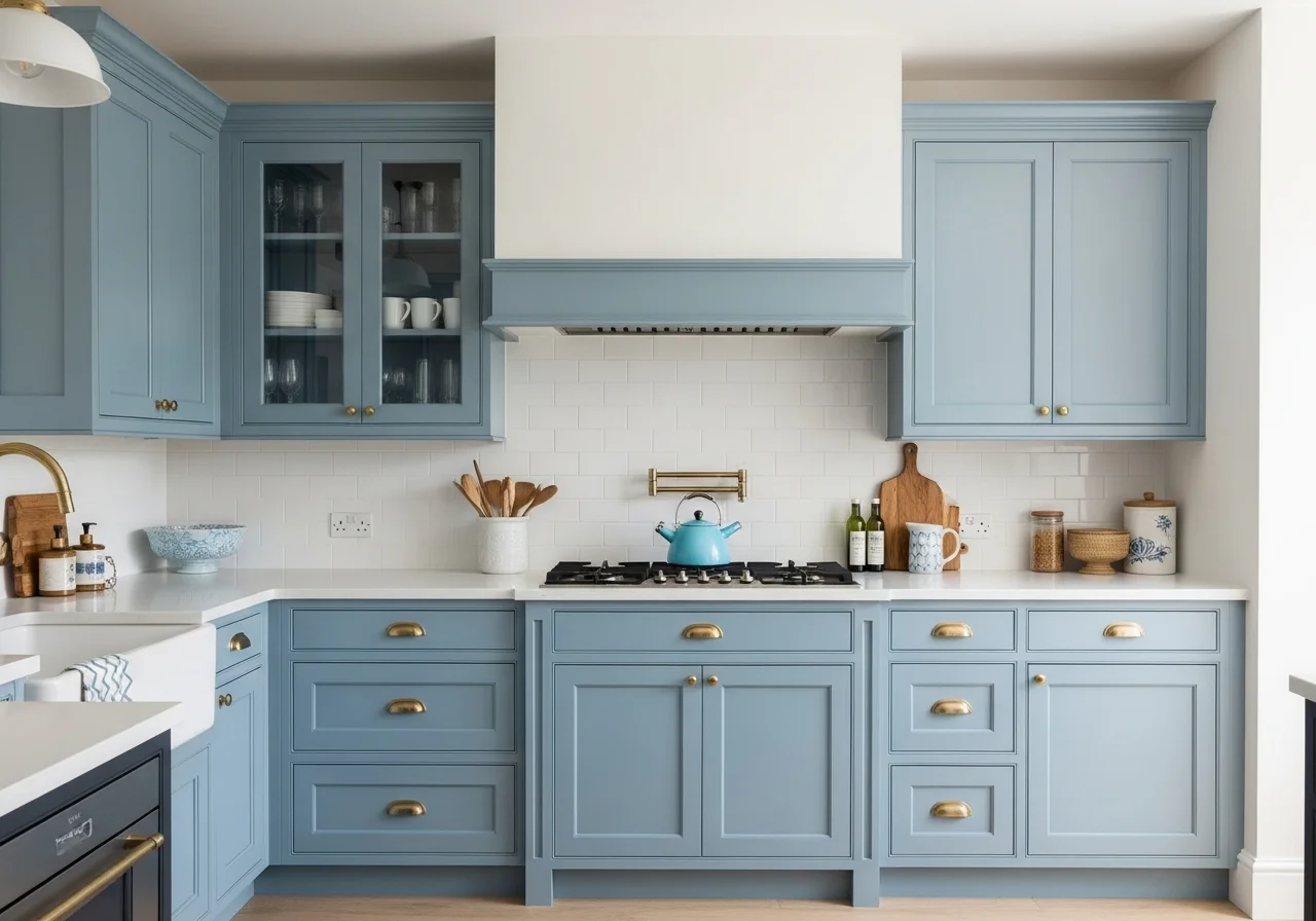
Soft Blue Coastal Vibes
Powder blue and soft blue cabinets bring a sense of calm and serenity reminiscent of coastal living. These gentle hues work beautifully in kitchens where you want to create a relaxed, informal atmosphere. Unlike navy, soft blues feel light and airy, making them suitable for smaller kitchens or spaces with limited natural light.
The key to successful soft blue cabinets lies in selecting a shade with enough saturation to make an impact without appearing juvenile or overly sweet. Look for blues with slight gray undertones that add sophistication and prevent the color from reading as too pastel or nursery-like. These muted blues feel grown-up and intentional.
Soft blue cabinets pair beautifully with white subway tiles, creating a classic combination that never feels dated. Natural wood countertops or butcher block islands add warmth that prevents the blue from feeling cold, while white or cream quartz provides clean contrast. The combination of soft blue and natural materials creates an organic, collected appearance.
Hardware in brass, copper, or gold tones brings warmth to soft blue cabinets and enhances the coastal aesthetic. For a more contemporary look, polished chrome or brushed nickel works well. The gentle nature of soft blue allows for playful hardware choices, including ceramic knobs with decorative patterns that would overwhelm stronger cabinet colors.
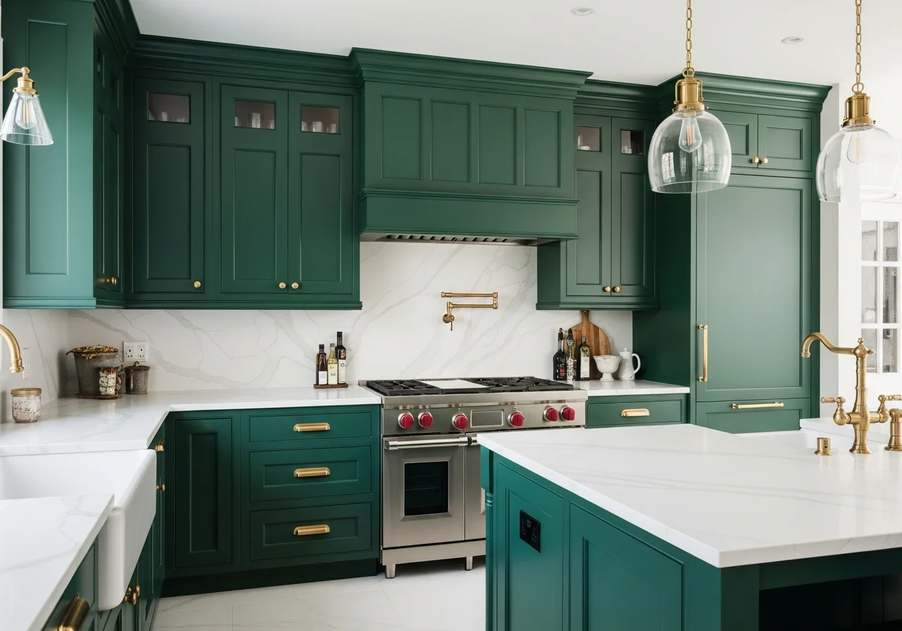
Emerald Green Bold Statement
Emerald and forest green cabinets make bold, confident statements perfect for homeowners ready to embrace color. These rich, saturated greens work particularly well in larger kitchens where the color has room to breathe, though they can also create dramatic impact in smaller spaces when balanced properly with lighter elements.
Deep greens pair exceptionally well with warm metals like brass, copper, and gold. The combination feels luxurious and slightly vintage, evoking the elegance of historic homes while remaining thoroughly contemporary. Matte black hardware also works beautifully, providing strong contrast that enhances the green’s intensity.
Countertop choices significantly impact the overall feel of emerald green cabinets. White marble with green veining creates a cohesive, elegant look, while white quartz provides clean contrast. Butcher block or warm wood countertops soften the intensity of the green and add organic warmth. Black or dark gray countertops create a moody, dramatic aesthetic.
Lighting considerations become crucial with dark green cabinets. Adequate task lighting under cabinets ensures work surfaces remain well-lit, while statement pendant lights over islands or eating areas become sculptural elements that complement the bold cabinet color. Natural light brings out different aspects of green throughout the day, from blue undertones in morning light to warmer, yellow-based hues in afternoon sun.
Creamy Off-White Warmth
Off-white cabinets with cream or yellow undertones offer the brightness of white with added warmth and softness. These shades work beautifully in traditional and farmhouse kitchens, creating a lived-in, comfortable aesthetic that pure white cannot achieve. Creamy whites feel welcoming and forgiving, hiding minor imperfections better than stark white.
The subtle nature of cream tones makes them incredibly versatile. They complement warm wood floors, brass hardware, and natural stone countertops while also working with cooler elements like stainless steel and white subway tile. This adaptability makes cream cabinets an excellent choice for homeowners who like to change accessories and decor seasonally.
Cream cabinets work particularly well in kitchens with warm lighting or oak or pine flooring. The yellow undertones coordinate with the warm tones in the wood rather than clashing, creating a cohesive appearance. In contrast, pure white cabinets can appear cold or clinical against warm wood elements.
When painting cabinets in creamy off-white shades, proper surface preparation ensures the warm undertones appear intentional rather than dingy. Starting with quality primer prevents any underlying wood tones from affecting the final color. Multiple thin coats build up rich, even coverage that looks expensive and professionally applied.
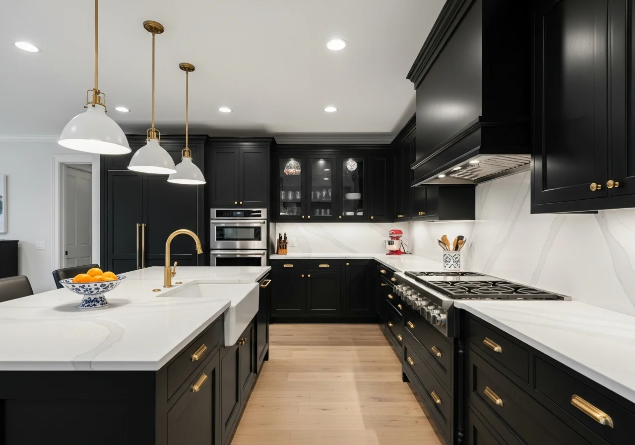
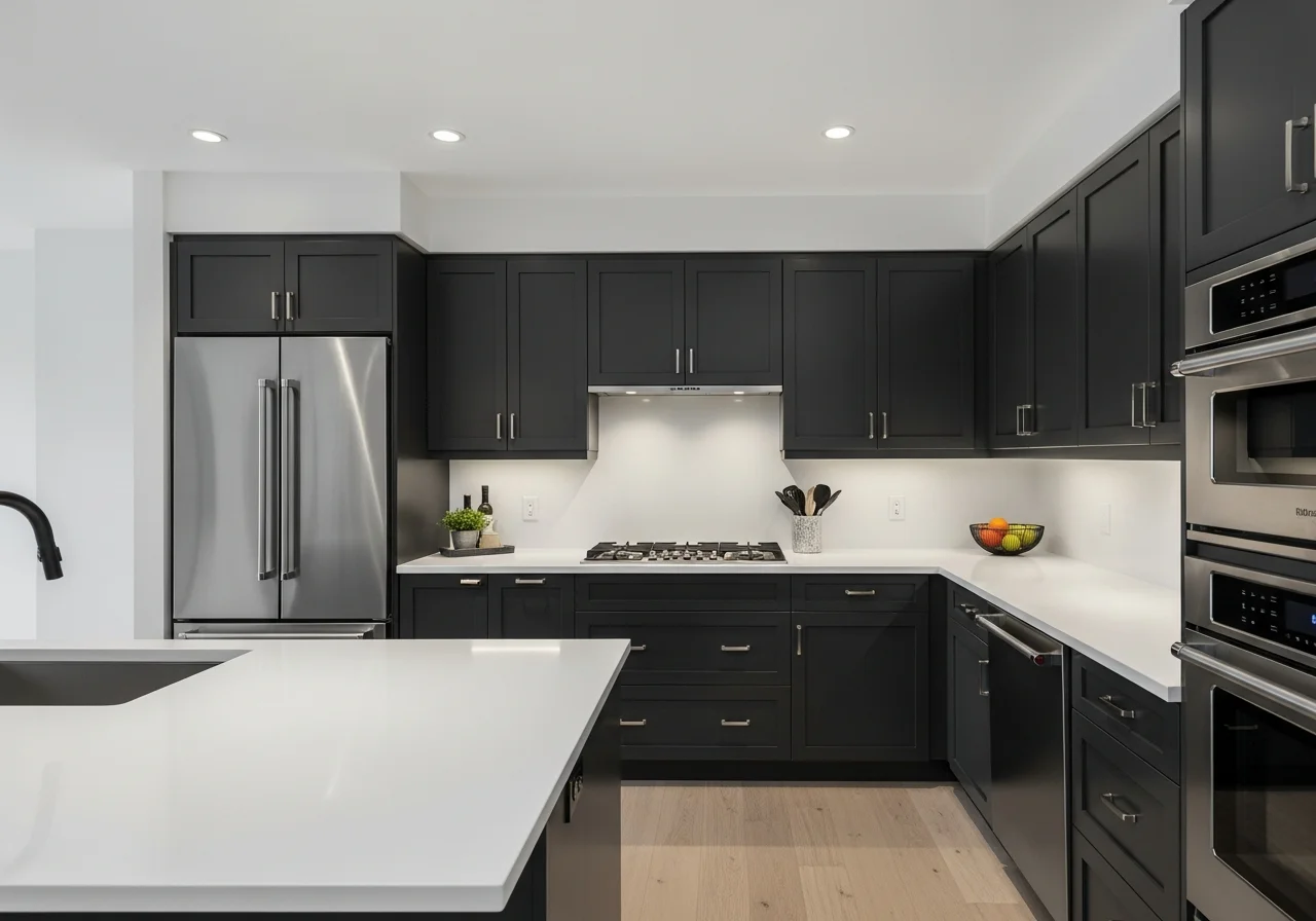
Black Cabinets Modern Drama
Black kitchen cabinets create maximum drama and sophistication, transforming kitchens into bold, statement-making spaces. While black requires careful planning to avoid feeling too dark or closed-in, when executed properly, it delivers unmatched elegance and contemporary edge. The Kait style would approach black cabinets thoughtfully, balancing darkness with strategic light elements.
Successful black kitchens require abundant light, both natural and artificial. Large windows, skylights, or well-placed recessed lighting prevent black cabinets from making the space feel cave-like. Under-cabinet lighting becomes essential, illuminating work surfaces and preventing the kitchen from feeling too dim for practical use.
Black cabinets pair beautifully with white or light-colored countertops, creating dramatic contrast. Carrara or Calacatta marble looks stunning against black cabinetry, as does white quartz or butcher block. The contrast between dark cabinets and light work surfaces makes the kitchen feel intentionally designed and visually striking.
Hardware choices range from sleek stainless steel for ultra-modern looks to warm brass for added richness and traditional appeal. Interestingly, black cabinets can even work with black hardware when the finishes differ, such as matte black cabinets with glossy black pulls. This monochromatic approach feels sophisticated and cohesive.
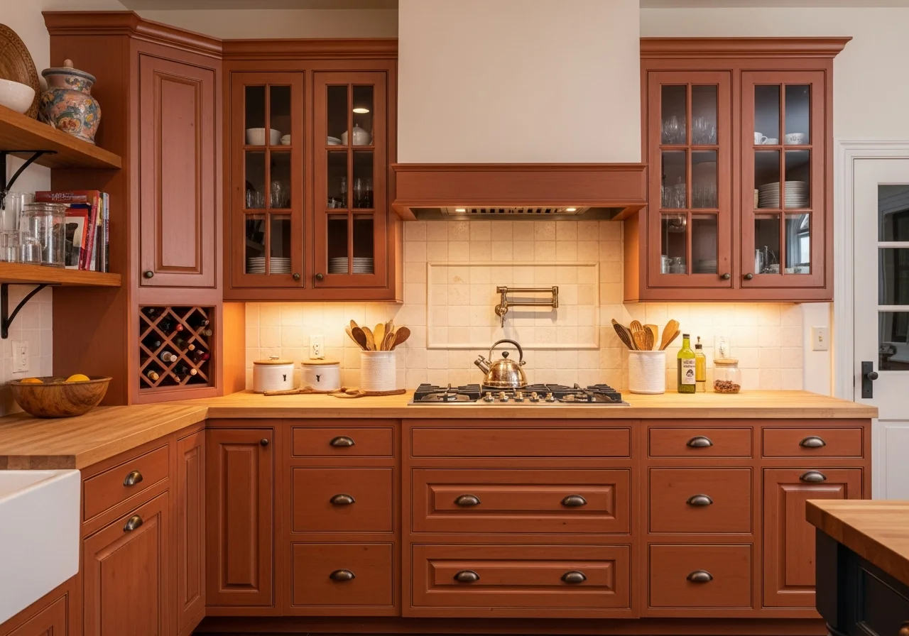
Terracotta Earthy Warmth
Terracotta and rust-colored cabinets bring earthy warmth inspired by Mediterranean and Southwestern design. These unexpected colors create kitchens that feel cozy, inviting, and unique. Terracotta works particularly well in homes with Spanish or Mission-style architecture but can also add interest to more contemporary spaces when balanced with modern elements.
The key to successful terracotta cabinets lies in selecting the right shade. Too orange appears dated and 1970s-inspired, while too brown loses the distinctive character that makes terracotta special. Look for balanced tones that read as warm but sophisticated, with enough gray or brown mixed in to prevent the color from appearing too bright or juvenile.
Terracotta pairs beautifully with natural materials including wood, stone, and ceramic tile. Cream or white subway tiles create classic contrast, while patterned cement tiles in complementary colors add visual interest. Natural wood countertops or butcher block islands enhance the organic, earthy quality of terracotta cabinets.
Hardware in oil-rubbed bronze, copper, or matte black complements terracotta without competing. Brass works well but requires the right shade; avoid anything too shiny or yellow-toned, which can clash rather than coordinate. The warm nature of terracotta allows for creative hardware choices that would overwhelm cooler cabinet colors.
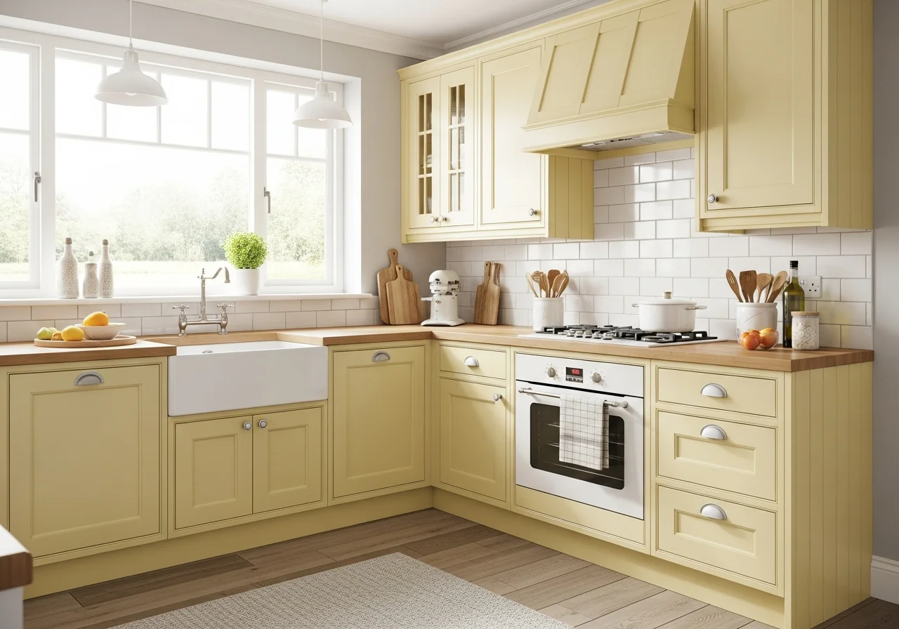
Pale Yellow Sunshine
Pale yellow cabinets bring unexpected cheerfulness to kitchens, creating spaces that feel sunny and optimistic. This color works particularly well in kitchens that lack natural light, as the yellow tones brighten the space and create a warm, inviting atmosphere. The key lies in selecting a pale, buttery yellow rather than bright or lemon-toned shades that can overwhelm.
Soft yellows with cream or white mixed in feel sophisticated rather than childish. These muted tones work in traditional, farmhouse, and even contemporary kitchens when paired with appropriate hardware and design elements. The color reads as neutral in certain lighting but provides subtle warmth and personality that pure white cannot deliver.
Pale yellow cabinets pair beautifully with white subway tiles, creating a fresh, clean appearance. Natural wood countertops add warmth without competing with the yellow, while white or cream quartz provides crisp contrast. The combination of soft yellow cabinets with white or cream elements creates a light, airy aesthetic perfect for smaller kitchens.
Hardware in brushed nickel, chrome, or even white ceramic knobs maintains the light, fresh feeling of pale yellow cabinets. For added contrast and definition, matte black hardware works surprisingly well, preventing the yellow from appearing too sweet or delicate. The gentle nature of pale yellow allows for playful yet sophisticated hardware combinations.
Burgundy Wine Elegance
Burgundy and wine-colored cabinets represent one of the boldest emerging trends, bringing richness and depth to kitchens. These deep reds work particularly well in traditional homes or spaces where you want to create a sense of history and established elegance. Burgundy feels sophisticated and slightly unexpected, making it perfect for homeowners who want their kitchens to stand out.
The success of burgundy cabinets depends heavily on undertones. Shades leaning purple can appear dated, while those with brown or orange undertones feel warmer and more approachable. Testing samples in your specific lighting helps identify which undertone works best, as burgundy can appear dramatically different under various lighting conditions.
Burgundy pairs beautifully with brass or gold hardware, creating a luxurious, vintage-inspired aesthetic. The warm metals enhance the richness of the burgundy and add visual interest. For a more contemporary look, matte black hardware provides strong contrast without competing with the intensity of the cabinet color.
Countertop selections require careful consideration with burgundy cabinets. White marble or quartz creates elegant contrast, while cream or beige tones soften the intensity. Butcher block or warm wood countertops coordinate with the warm undertones in burgundy, creating a cohesive, collected appearance. Light-colored backsplashes prevent the space from feeling too dark.
Dove Gray Softness
Dove gray offers a softer alternative to charcoal while providing more depth than pale gray. This mid-tone gray works beautifully in kitchens where you want understated elegance without dramatic contrast. Dove gray feels calming and sophisticated, creating a neutral backdrop that allows other design elements to shine.
The balanced nature of dove gray makes it incredibly versatile. It works in modern kitchens with sleek hardware and minimal ornamentation, as well as traditional spaces with decorative molding and classic design elements. The color coordinates with virtually any other shade, providing flexibility in backsplash, countertop, and flooring selections.
Dove gray cabinets pair well with white subway tiles for classic appeal, or patterned tiles for added visual interest. Countertops in white, cream, or even black work beautifully, as do natural wood options. The neutral quality of dove gray allows for bold accent choices in lighting fixtures, barstools, or window treatments without creating visual chaos.
Hardware options range from brushed nickel for tonal cohesion to brass for warm contrast, or matte black for modern definition. The medium value of dove gray provides enough contrast to make any hardware choice visible and impactful. This versatility allows you to update the look simply by changing hardware as trends evolve.
Mint Green Fresh Approach
Mint green cabinets bring a fresh, retro-inspired feel to kitchens, evoking 1950s diners and vintage charm. This unexpected color works particularly well in smaller kitchens or breakfast nooks where you want to create a playful, cheerful atmosphere. Mint green feels light and airy while providing more personality than standard neutrals.
The key to sophisticated mint green lies in selecting shades with enough gray mixed in to prevent them from appearing too sweet or candy-like. Look for muted mints with dusty or sage undertones that feel grown-up and intentional. These balanced tones work in various design styles from retro to coastal to contemporary.
Mint green pairs beautifully with white subway tiles, creating a classic combination that feels fresh and clean. Natural wood countertops or butcher block add warmth, while white or cream quartz maintains the light, bright aesthetic. Black or dark countertops create unexpected contrast that grounds the mint and prevents it from feeling too delicate.
Hardware choices significantly impact the overall feel of mint green cabinets. Brass or copper creates vintage appeal, while matte black provides contemporary edge. Chrome or brushed nickel maintains a clean, classic look. The playful nature of mint allows for creative hardware selections including ceramic knobs with decorative patterns or vintage-inspired cup pulls.
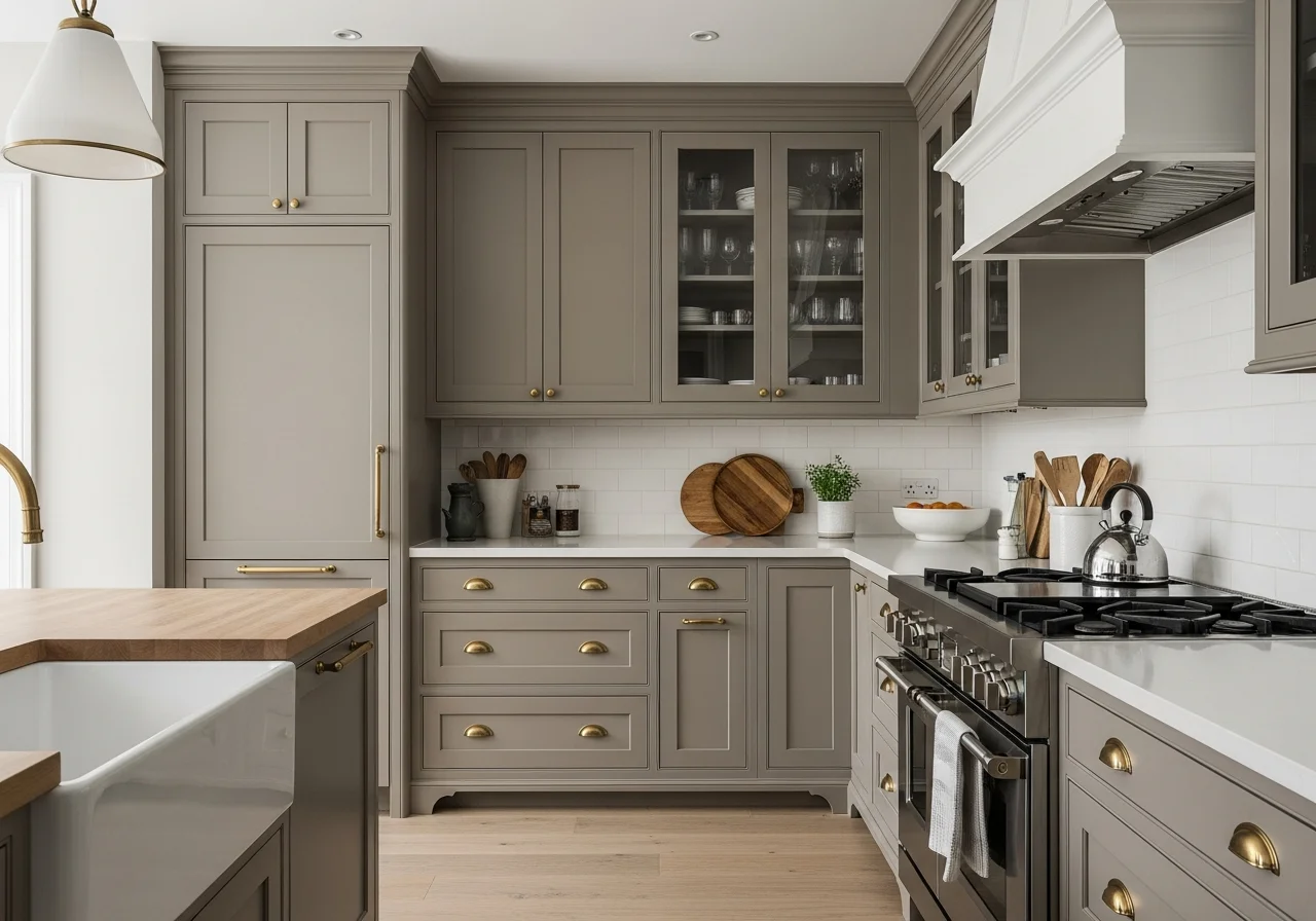
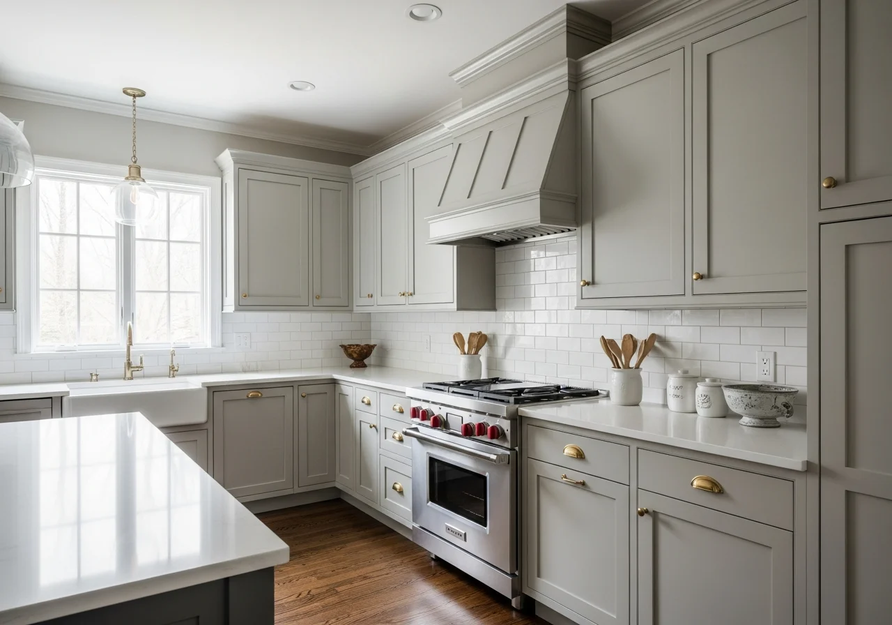
Taupe Understated Elegance
Taupe cabinets occupy that perfect middle ground between gray and beige, offering warmth without appearing dated. This sophisticated neutral works in virtually any kitchen style, from ultra-modern to traditionally ornate. Taupe provides depth and richness while remaining understated enough to coordinate with changing decor and accessories.
The complexity of taupe lies in its chameleon-like quality, appearing different under various lighting conditions. Some taupes lean more gray in certain light, while others reveal warmer beige undertones. This complexity adds visual interest and prevents the color from appearing flat or one-dimensional.
Taupe cabinets pair beautifully with warm metals including brass, bronze, and copper. These combinations create a sophisticated, layered look that feels collected over time rather than perfectly coordinated. Matte black hardware also works well, providing contrast without appearing harsh. Brushed nickel or stainless steel maintains a clean, contemporary aesthetic.
Countertop options range from white or cream quartz for contrast to natural wood for warmth. Even black or dark gray countertops work with taupe cabinets, creating a moody, dramatic aesthetic. The versatile nature of taupe allows for flexibility in other design elements, making it an excellent choice for homeowners who like to update their kitchens periodically.
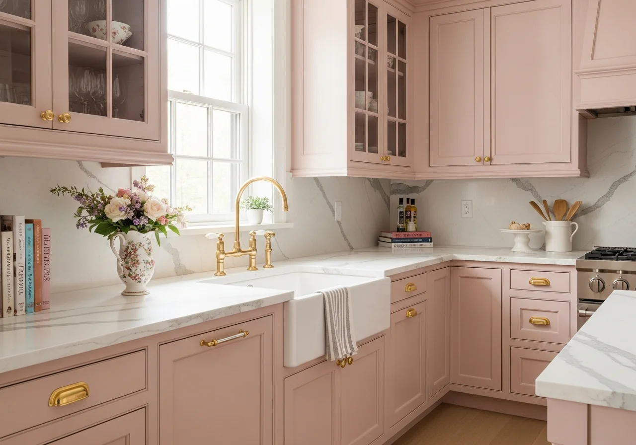
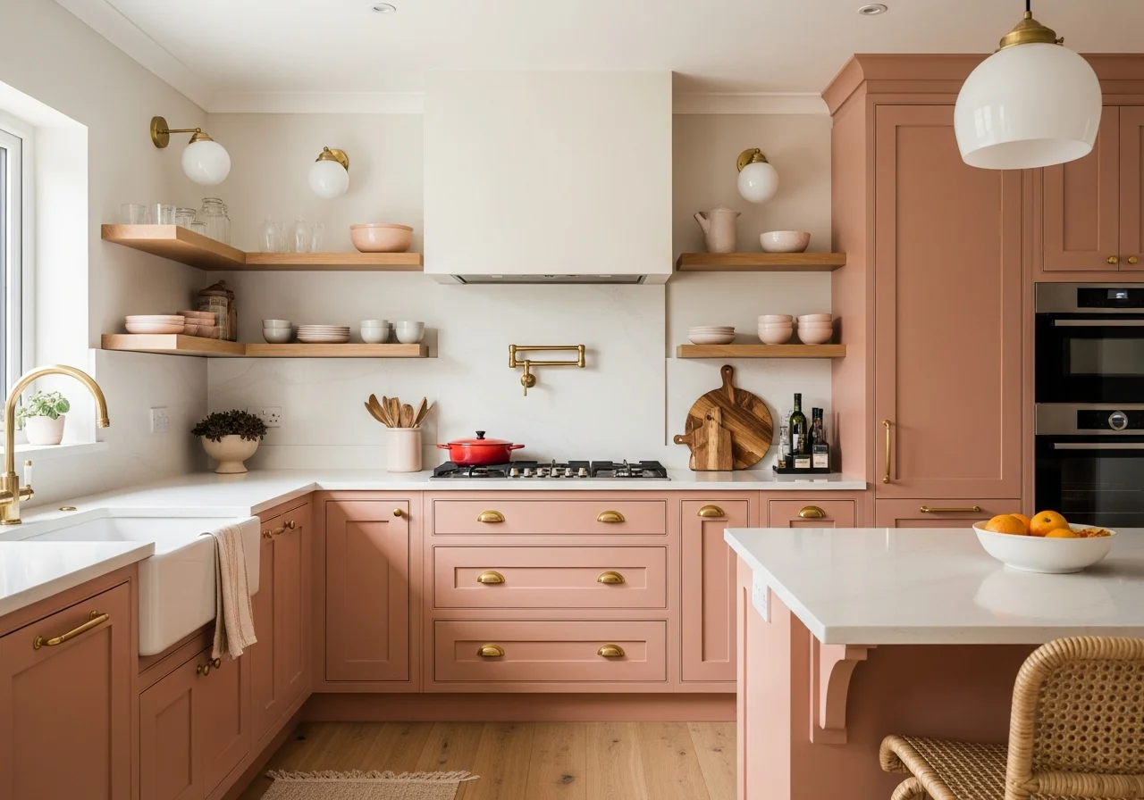
Blush Pink Subtle Romance
Blush pink cabinets represent an emerging trend that brings subtle romance and femininity to kitchens without appearing juvenile. The key lies in selecting muted, dusty pinks with gray undertones rather than bright or coral-toned shades. When executed properly, blush pink feels sophisticated and unexpected, creating kitchens that stand out from standard neutrals.
Blush pink works particularly well in vintage or traditional kitchens, complementing ornate molding and classic design elements. However, it can also work in contemporary spaces when paired with modern hardware and minimalist styling. The gentle nature of blush creates a soft, welcoming atmosphere perfect for family gathering spaces.
Gold or brass hardware enhances the warm undertones in blush pink cabinets, creating an elegant, feminine aesthetic. For a more contemporary look, matte black hardware provides striking contrast. Chrome or brushed nickel maintains a clean, classic appearance. The subtle quality of blush allows for various hardware finishes without overwhelming the space.
Countertops in white marble or quartz create beautiful contrast with blush cabinets, while cream or beige tones soften the overall appearance. Natural wood adds warmth and prevents the pink from feeling too sweet. White subway tile backsplashes maintain a classic look, while patterned tiles in coordinating colors add visual interest and personality.
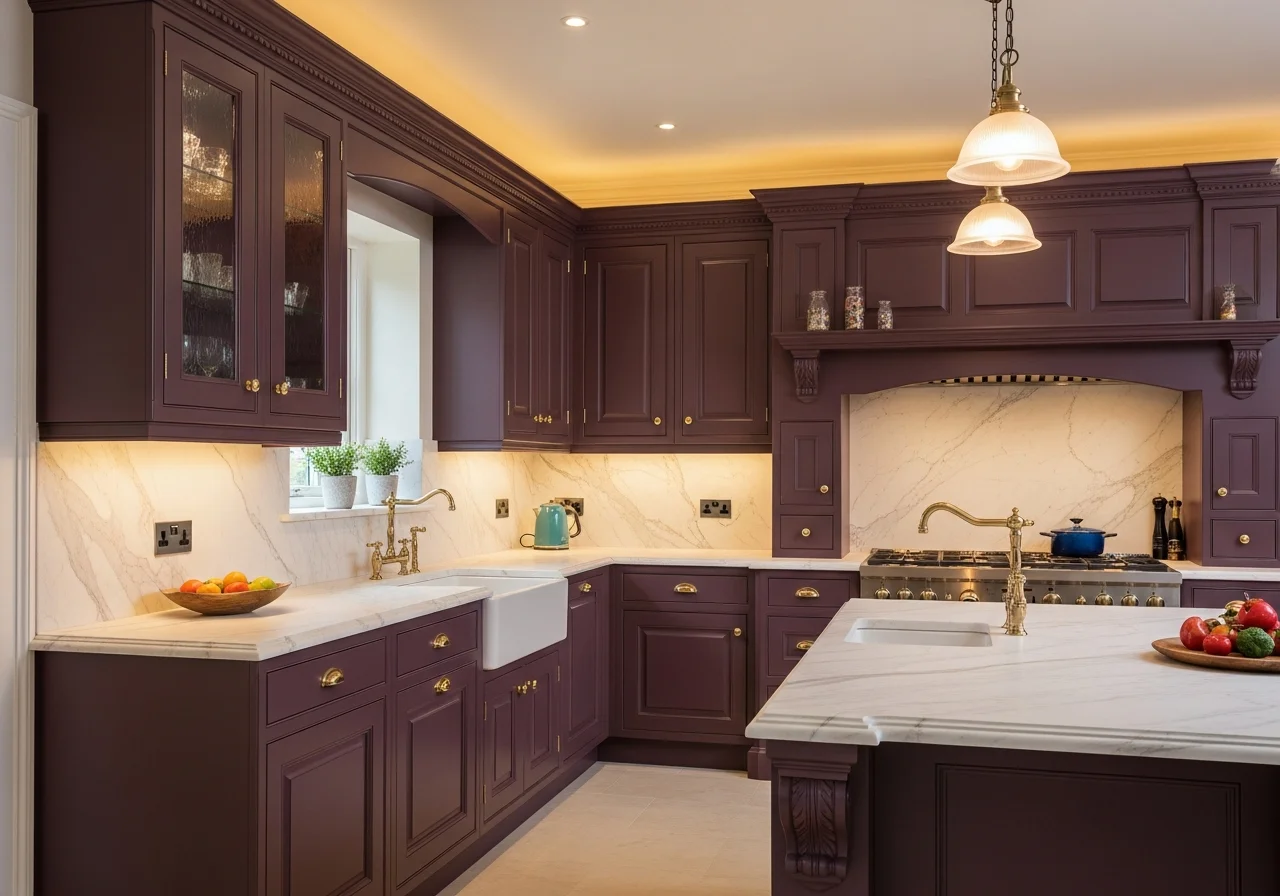
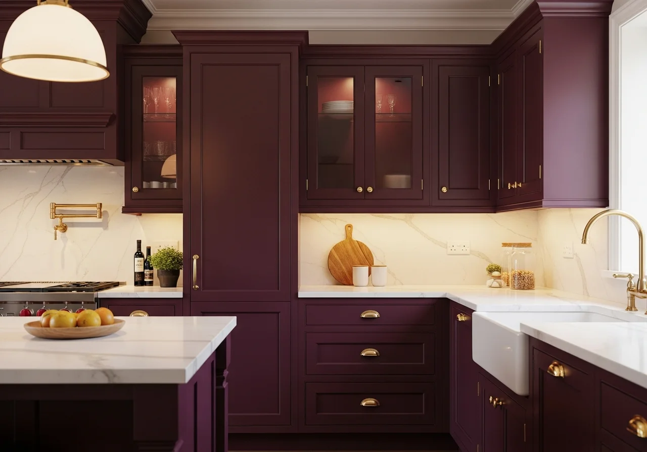
Deep Plum Rich Drama
Deep plum cabinets bring unexpected richness and drama, creating kitchens that feel luxurious and unique. This sophisticated purple-brown hybrid works particularly well in larger kitchens or open-concept spaces where the bold color has room to make an impact. Plum feels regal and distinctive while remaining surprisingly versatile and livable.
The success of plum cabinets depends on selecting the right shade. Too purple appears costume-like, while too brown loses the distinctive character. Look for balanced plums with brown and gray mixed in, creating depth without overwhelming intensity. These sophisticated tones work in traditional and contemporary kitchens alike.
Plum pairs beautifully with brass or gold hardware, which enhances the warm undertones and creates a luxurious appearance. Matte black hardware provides contemporary contrast, while brushed nickel or chrome keeps the look clean and modern. The richness of plum allows for statement hardware that becomes a focal point.
Countertop selections require balance with plum cabinets. White marble or quartz creates elegant contrast, while cream or beige tones soften the intensity. Natural wood countertops coordinate with the warm undertones in plum, creating a cohesive appearance. Adequate lighting becomes crucial with dark plum cabinets to ensure the space remains functional and inviting.
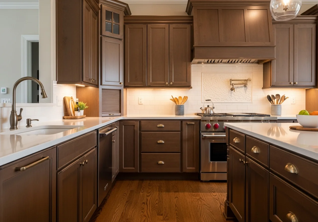
Warm Brown Natural Appeal
Brown cabinets have experienced a resurgence, moving away from dated oak to sophisticated painted finishes in rich chocolate, coffee, and caramel tones. These warm browns create cozy, inviting kitchens that feel grounded and natural. Brown works particularly well in homes with natural wood elements elsewhere, creating visual continuity throughout the space.
The key to contemporary brown cabinets lies in selecting the right shade and finish. Avoid anything too orange or reddish, which reads as dated. Instead, look for neutral browns with gray or taupe mixed in, creating sophisticated depth. Matte or satin finishes feel more current than glossy alternatives.
Brown cabinets pair beautifully with cream or white subway tiles, creating classic contrast. Countertops in white, cream, or even black quartz work well, as do natural stone options with warm veining. Light-colored backsplashes prevent brown cabinets from feeling too dark or heavy in the space.
Hardware in brass, bronze, or gold enhances the warm undertones in brown cabinets, while matte black provides contemporary contrast. Brushed nickel or stainless steel maintains a clean, modern appearance. The warm nature of brown allows for various hardware finishes, providing flexibility as design preferences evolve.
Powder Room Blue Personality
Powder blue represents a step bolder than soft coastal blues, bringing more saturation and personality to kitchen cabinets. This medium-toned blue works beautifully in kitchens where you want to make a statement without the drama of navy. Powder blue feels fresh and current while possessing timeless qualities that prevent rapid dating.
The versatility of powder blue allows it to work in various design styles. It feels at home in coastal kitchens with white subway tiles and natural wood elements, as well as contemporary spaces with sleek hardware and minimalist styling. The balanced saturation provides enough impact without overwhelming smaller kitchens.
Powder blue pairs beautifully with brass or gold hardware, creating warmth that prevents the blue from feeling cold. Chrome or brushed nickel maintains a clean, contemporary aesthetic, while matte black provides striking contrast. The medium value of powder blue allows various hardware finishes to shine without competing.
Countertops in white or cream quartz create clean contrast with powder blue cabinets, while natural wood adds warmth and organic appeal. Black or dark gray countertops create unexpected drama that grounds the blue. White subway tile backsplashes maintain a classic look, while patterned tiles add visual interest and personality to the space.

Olive Green Earthy Sophistication
Olive green offers a more muted, earthy alternative to sage or emerald, bringing understated sophistication to kitchens. This yellow-toned green works particularly well in spaces with abundant natural light, where it can shift from yellow-green to true olive throughout the day. Olive feels organic and grounded, creating calm, collected kitchens.
The complexity of olive green lies in its subtle nature. Unlike brighter greens, olive requires proper lighting and thoughtful pairing to prevent it from appearing muddy or dull. When executed correctly, however, olive creates sophisticated, unique kitchens that stand apart from typical neutrals while remaining livable and practical.
Olive green pairs beautifully with natural materials including wood, stone, and ceramic. Butcher block or warm wood countertops enhance the earthy quality of olive, while white or cream quartz provides contrast. Brass or bronze hardware complements the warm yellow undertones, creating cohesive, collected appearances.
This color works particularly well in farmhouse or transitional kitchens where you want to incorporate current trends without appearing too trendy. Olive feels both contemporary and timeless, ensuring longevity in design relevance. The muted nature makes it an excellent choice for homeowners who want color without excessive boldness.
Soft Coral Unexpected Warmth
Soft coral cabinets bring unexpected warmth and personality, creating kitchens that feel welcoming and unique. This peachy-pink shade works particularly well in kitchens with warm wood floors or natural wood elements, coordinating with existing finishes rather than clashing. Soft coral feels both current and classic, avoiding trendy territory.
The key to successful coral cabinets lies in selecting muted shades with plenty of pink, peach, and brown mixed in. Avoid anything too bright or orange, which can appear dated. Look for dusty corals that feel sophisticated and grown-up, creating subtle warmth without overwhelming intensity.
Coral pairs beautifully with brass or gold hardware, which enhances the warm undertones and creates a cohesive appearance. For more contrast, matte black hardware works well, providing definition without harshness. Chrome or brushed nickel maintains a clean, contemporary aesthetic that keeps coral from feeling too vintage.
Countertops in white or cream quartz create beautiful contrast with coral cabinets, while natural wood adds warmth and prevents the color from feeling too delicate. White subway tile backsplashes maintain a classic look, while patterned tiles in coordinating colors add visual interest. Adequate natural light helps coral cabinets look their best throughout the day.
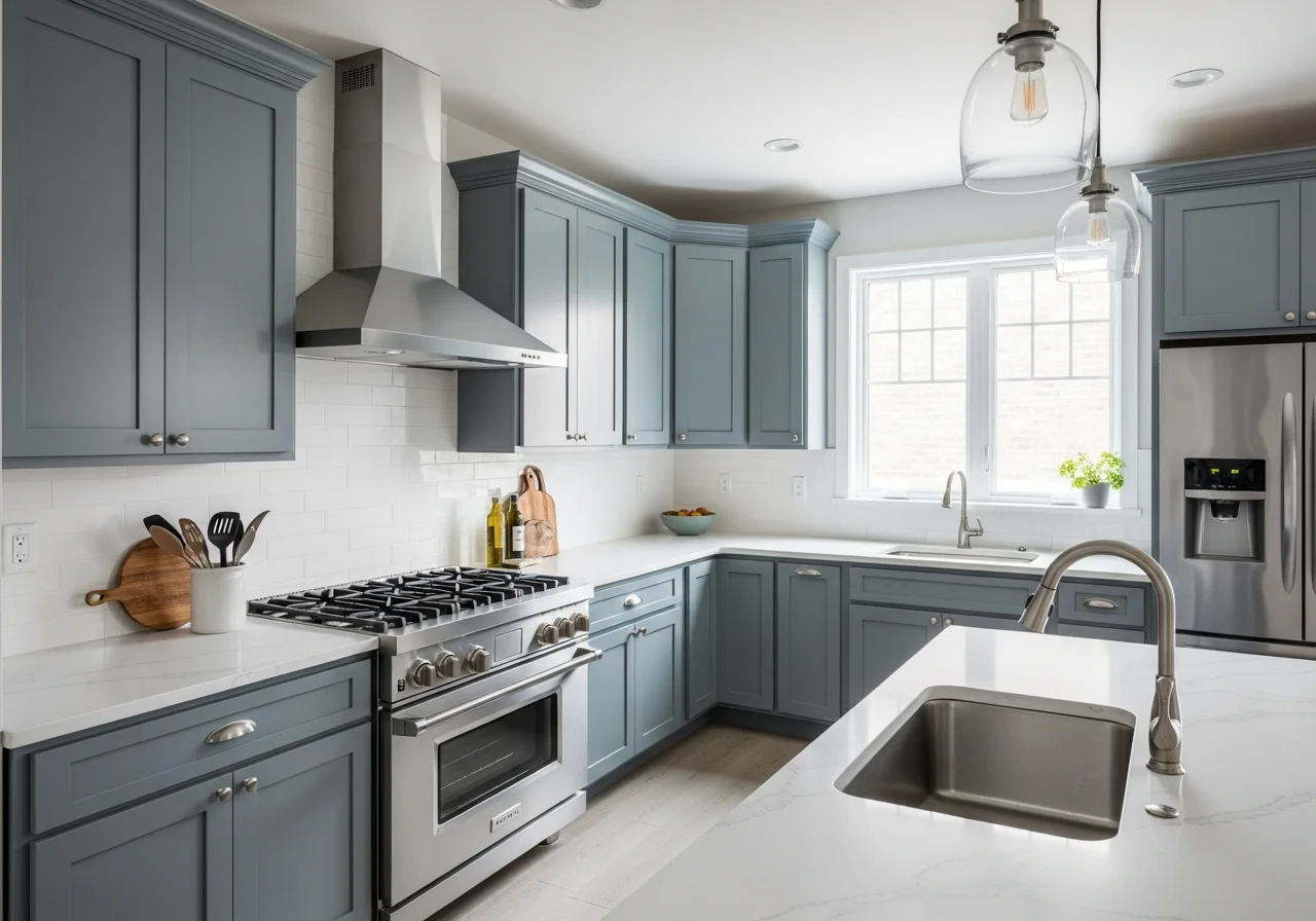
Steel Blue Cool Sophistication
Steel blue offers a cooler, more gray-toned alternative to powder or navy blue, bringing understated sophistication to kitchens. This muted blue-gray works particularly well in contemporary or industrial-style kitchens, complementing stainless steel appliances and modern design elements. Steel blue feels calming and sophisticated without dramatic boldness.
The balanced nature of steel blue makes it incredibly versatile. It works as an all-over cabinet color or as part of two-tone combinations with white or cream. The gray undertones prevent it from appearing too colorful or bold, creating a sophisticated backdrop that allows other design elements to shine.
Steel blue pairs well with various hardware finishes. Brushed nickel or chrome creates tonal cohesion, while brass or gold provides warm contrast. Matte black adds contemporary edge and definition. The medium-cool tone of steel blue allows different hardware finishes to create distinctly different aesthetics within the same kitchen.
Countertop options range from white or cream quartz for classic contrast to natural wood for warmth. Even dark gray or black countertops work well, creating a moody, sophisticated aesthetic. White subway tile backsplashes maintain a clean appearance, while natural stone or patterned tiles add texture and visual interest to complement steel blue cabinetry.
Achieving the Kait Style Cabinet Transformation
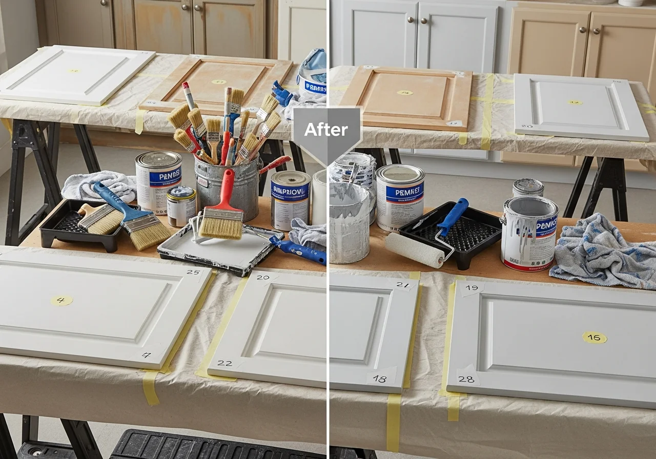
The House of Kait approach to cabinet painting emphasizes thorough preparation, quality materials, and patience throughout the process. Success begins with proper surface preparation, including removing all hardware, numbering each door and corresponding cabinet box, and thoroughly cleaning or deglazing surfaces to remove built-up grease and grime.
Sanding creates the surface texture needed for proper paint adhesion. While some modern cabinet paints claim to eliminate sanding, light sanding with fine-grit sandpaper ensures the best possible results. Focus extra attention on areas around hardware holes and frequently touched surfaces where oils from hands may have created smooth, resistant spots.
Primer application provides the foundation for durable, long-lasting painted cabinets. Quality primer helps paint adhere properly, prevents staining or color bleeding, and creates an even base for paint application. For dark-to-light transitions, tinted primer matching your final paint color reduces the number of paint coats needed for full coverage.
The painting process requires patience and attention to detail. Multiple thin coats produce better results than fewer thick applications, preventing drips, runs, and visible brushstrokes. Allow adequate drying time between coats, following manufacturer recommendations for temperature and humidity conditions. High-quality brushes and foam rollers produce the smoothest finishes without visible texture or bristle marks.
Conclusion
Painted kitchen cabinets offer transformative potential for homeowners seeking dramatic updates without complete renovations. The House of Kait style demonstrates that beautiful, professional-looking results are achievable through careful planning, quality materials, and patient execution. Whether you choose classic white, trending sage green, dramatic navy, or unexpected coral, painted cabinets allow personal expression while maintaining practical functionality.
The 24 ideas presented here represent current trends balanced with timeless appeal, ensuring your investment remains relevant for years to come. Each color option offers unique benefits and aesthetic qualities, from the brightness of white to the richness of burgundy to the sophistication of steel blue. Consider your existing design elements, lighting conditions, and personal preferences when selecting the perfect shade for your cabinet transformation.
Remember that painting kitchen cabinets represents a significant time investment but offers substantial rewards. The process requires dedication and attention to detail, but the results completely reimagine your kitchen space for a fraction of the cost of replacement. Embrace the Kait style philosophy of accessible DIY transformation, invest in quality materials, and trust the process to create the kitchen you have envisioned.
Frequently Asked Questions
How long does it take to paint kitchen cabinets?
Most kitchen cabinet painting projects require three to five days of active work, depending on kitchen size and the number of coats needed. This includes time for removing doors and hardware, cleaning and sanding surfaces, applying primer, painting multiple coats, and reassembly. Proper drying time between coats is essential for durability, so avoid rushing the process even if you complete the physical work more quickly.
What type of paint works best for kitchen cabinets?
High-quality cabinet-specific paints like Benjamin Moore Advance or specialized cabinet coating systems provide the most durable results. These paints are formulated to withstand frequent cleaning, moisture, and daily wear. Both oil-based and water-based options work well, though water-based paints have become increasingly popular due to easier cleanup, lower odor, and improved formulations that rival oil-based durability.
Do I need to sand cabinets before painting?
Light sanding is highly recommended even when using modern no-sand cabinet paints. Sanding creates surface texture that helps paint adhere properly and removes any glossy finish that could prevent proper bonding. Use fine-grit sandpaper and focus on removing the sheen rather than removing wood. Thorough cleaning or deglasing after sanding removes dust and ensures the best possible paint adhesion.
How many coats of paint do kitchen cabinets need?
Most cabinet painting projects require two to three coats of paint after primer, though light colors covering dark wood may need four to five coats for complete coverage. Apply thin, even coats rather than thick applications to prevent drips and achieve smooth finishes. Allow proper drying time between coats as specified by the paint manufacturer for optimal results.
Will painted cabinets hold up to daily kitchen use?
Properly painted cabinets using quality materials and correct techniques are extremely durable and withstand daily kitchen use for many years. The key lies in thorough surface preparation, quality primer, multiple thin paint coats, and proper curing time before heavy use. Many homeowners report their painted cabinets lasting a decade or more with normal wear, particularly when protected with quality topcoat or sealant designed for kitchen cabinetry.