20 Kitchen Cabinet Color Trends
The kitchen has always been the most lived-in room in a home. It is where mornings begin, meals are shared, and memories take shape. And increasingly, homeowners understand that the single most powerful design decision in any kitchen remodel is the color of the cabinets. Cabinet color does not just set the mood. It defines the personality of the entire space, influences how large or intimate a kitchen feels, and has a measurable impact on a home’s resale value.
Over the past few years, the design world has moved decisively away from the cold, stark white kitchens that dominated the previous decade. Today, the conversation is richer, warmer, and far more personal. From deep forest greens to sun-bleached creams, from moody charcoals to breezy coastal blues, the spectrum of cabinet colors now available to homeowners is both exciting and, at times, a little overwhelming. This guide covers 20 kitchen cabinet color trends shaping kitchens in 2025 and beyond, with practical insights on how to use each one effectively.
Warm Neutrals That Feel Like Home
Creamy White
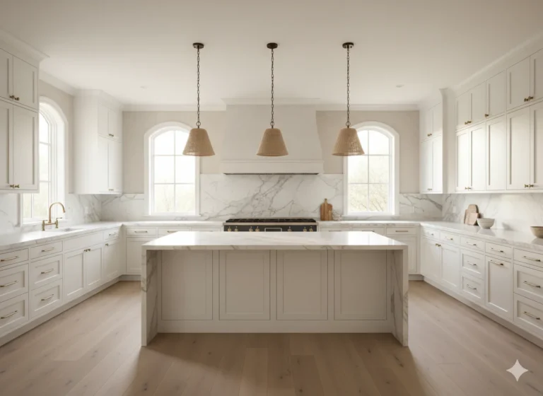
The all-white kitchen is not dead, but it has evolved. Pure, clinical white has given way to creamy, off-white tones that carry warmth without sacrificing brightness. Creamy white cabinets pair beautifully with brushed brass hardware, warm wood countertops, and linen-toned backsplash tile. They are forgiving in different lighting conditions and work across traditional, transitional, and modern kitchen styles.
Greige and Warm Gray
Greige, the sophisticated blend of gray and beige, remains a strong performer for homeowners who want neutrality without coldness. Warm gray tones with slightly brown or beige undertones create a versatile backdrop that accommodates nearly any countertop material, from white quartz to dark granite. This shade is particularly well-suited for open-concept homes where the kitchen must connect visually with adjacent living spaces.
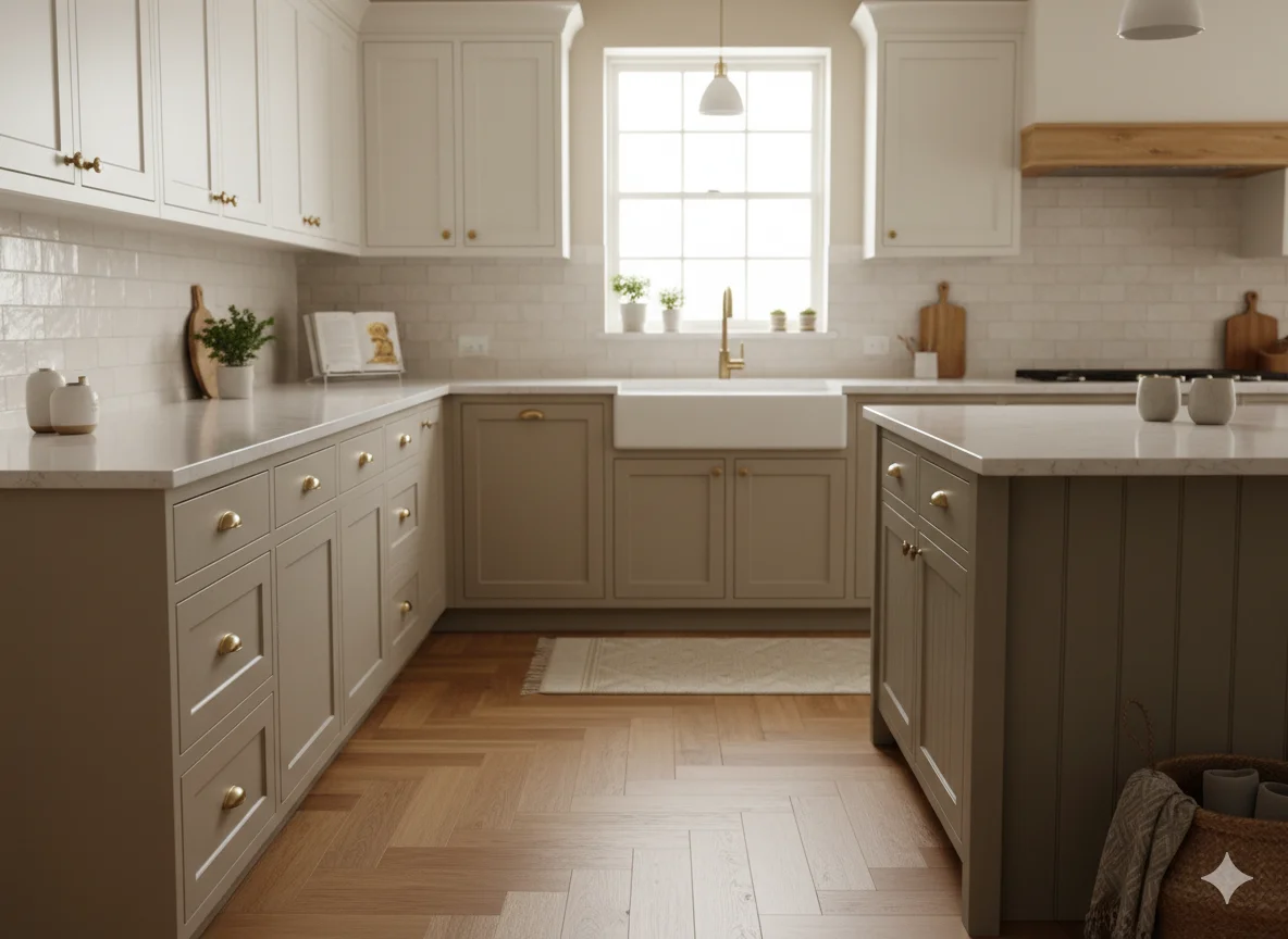
Taupe and Sand
Taupe and sand tones are gaining traction as earthy, grounded alternatives to gray. These hues suggest warmth and stability, and they sit beautifully alongside natural materials like stone, rattan, and light oak. In a farmhouse or transitional kitchen, taupe cabinetry feels both timeless and current.
Soft Beige
Soft beige is having a genuine moment. Not the dated beige of 1990s kitchens, but a refined, almost European version that feels contemporary and calm. Paired with matte black fixtures and honed limestone countertops, soft beige cabinets strike a balance between understated and intentional.
The Green Revolution in Cabinet Color
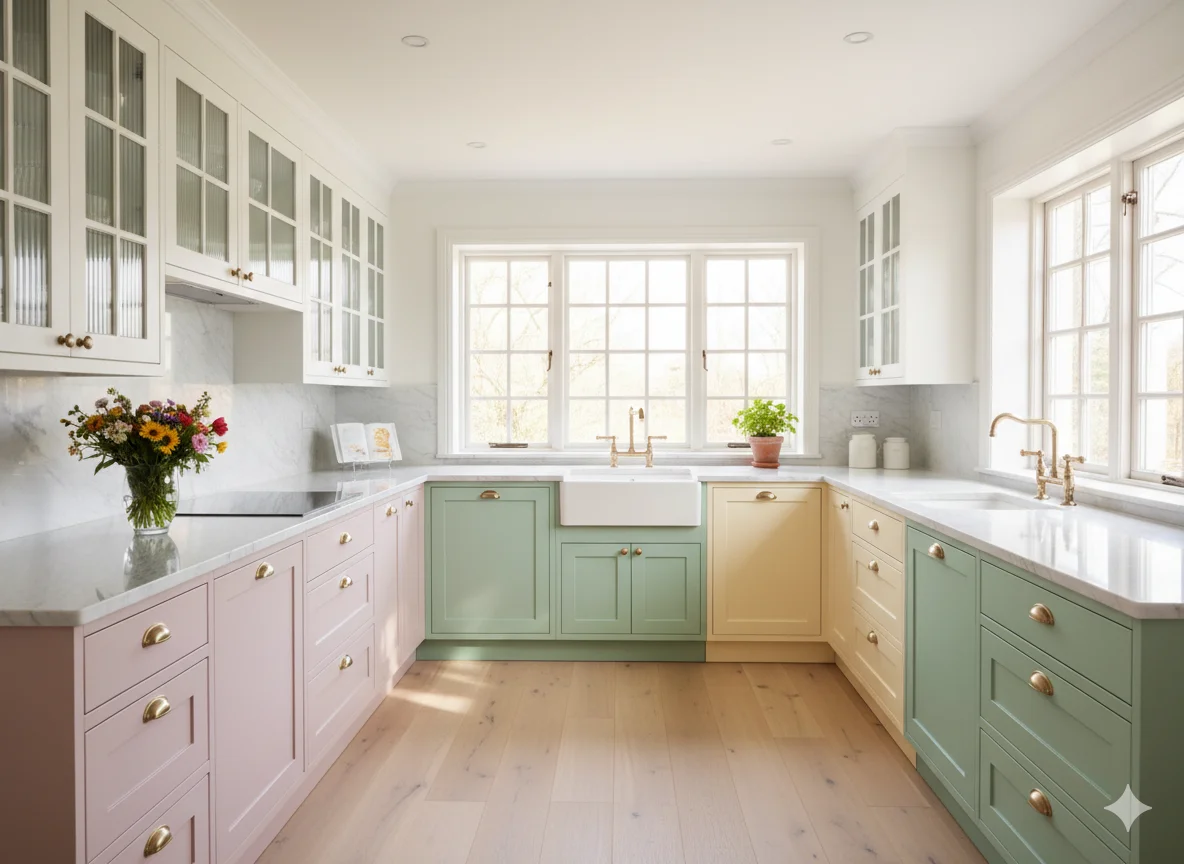
Sage Green
Sage green is consistently ranked among the top cabinet color choices for 2025. Its muted, grayish-green tone is both calming and sophisticated. Sage reads differently depending on the light, which gives kitchens with sage cabinets a dynamic quality that changes from morning to evening. It pairs well with warm wood tones, brass hardware, and terracotta accents, making it a natural fit for farmhouse, transitional, and even modern kitchens.
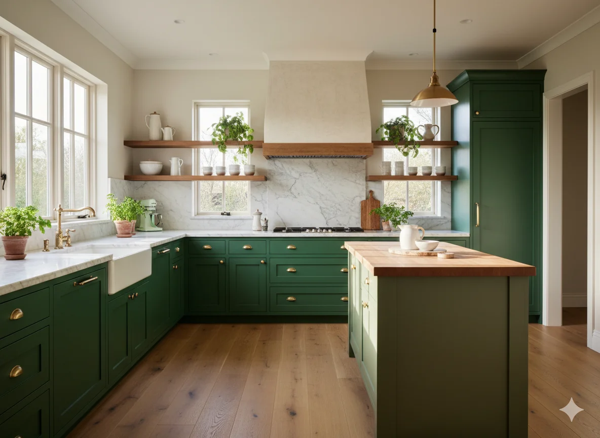
Forest and Olive Green
Deeper green tones, particularly forest green and olive green, bring a richness and gravitas that lighter shades cannot achieve. Forest green cabinets feel luxurious when paired with unlacquered brass fixtures and white marble countertops. Olive green, with its earthy warmth, suits a more rustic or Tuscan-inspired kitchen. Both shades work well on island cabinetry, creating a focal point without committing the entire kitchen to a bold color.
Moss Green
Moss green occupies a middle ground between sage and olive. It is earthy without being heavy, and fresh without being bright. Moss green cabinets with matte hardware and natural stone countertops give a kitchen a grounded, almost meditative quality that resonates with the growing interest in biophilic design.
Blues That Command Attention
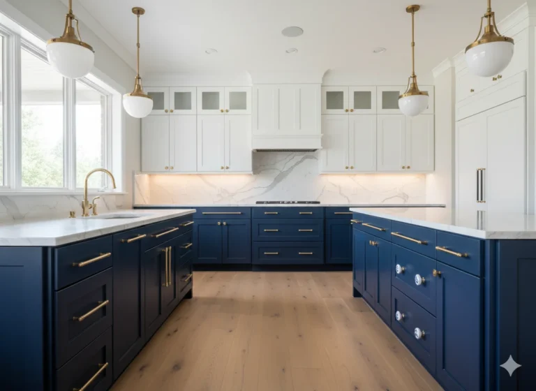
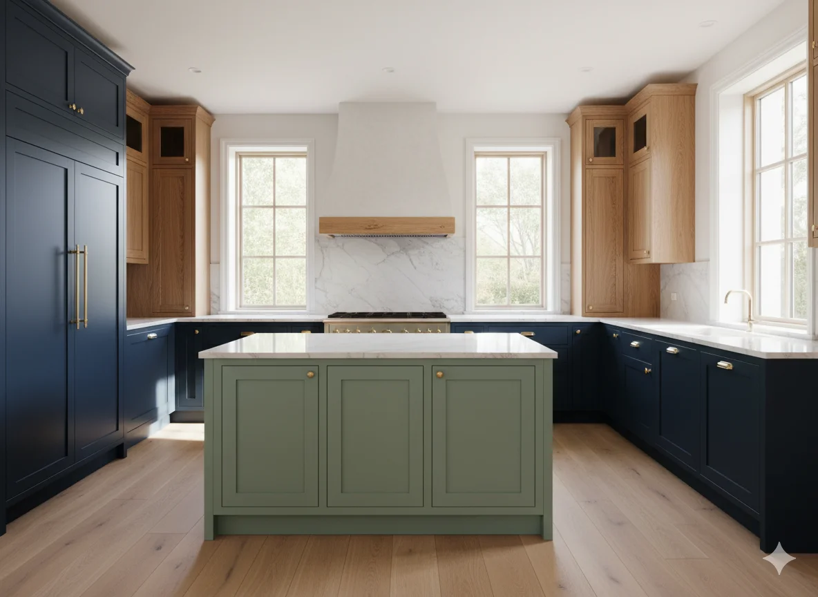
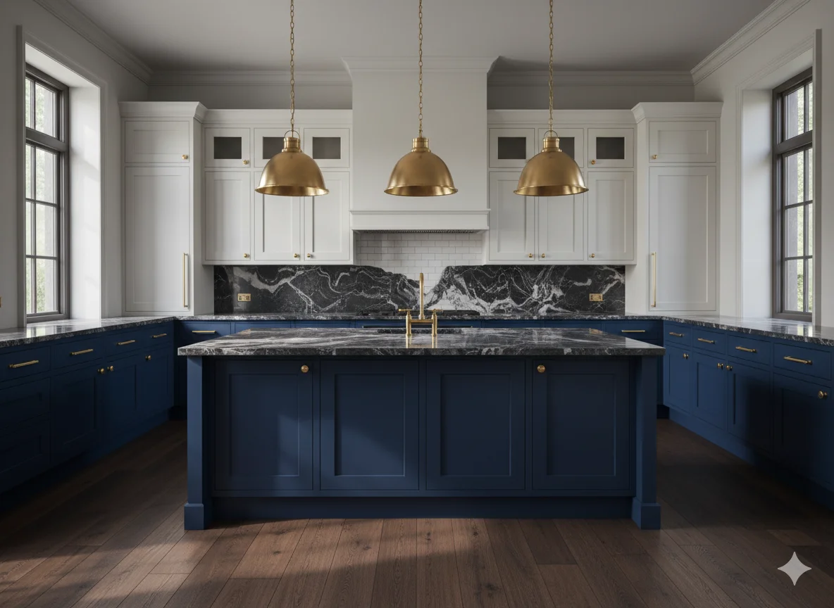
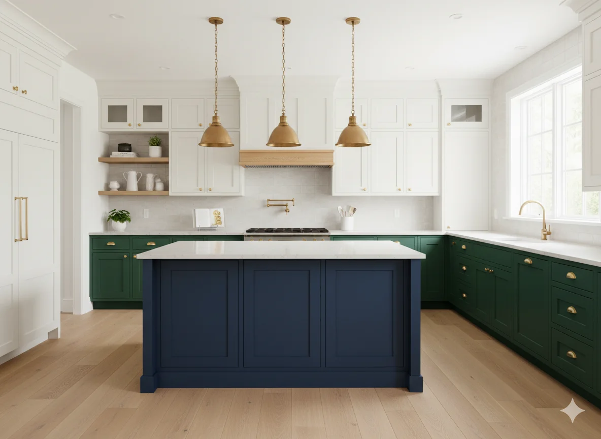
Navy Blue
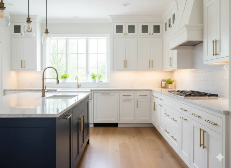
Navy blue cabinets have transitioned from trendy to truly enduring. The depth of navy creates a rich, library-like quality in a kitchen, and it is versatile enough to work in both classic and contemporary settings. Navy lower cabinets paired with soft white uppers is one of the most popular two-tone combinations of the current era. Adding polished chrome or brass hardware elevates navy cabinetry from bold to genuinely refined.
Dusty Blue and Powder Blue
For homeowners who want blue without drama, dusty blue and powder blue offer a softer path. These pale, slightly muted blues feel nostalgic and cheerful at the same time. They are a natural fit for cottage, coastal, and Scandinavian-influenced kitchens. Dusty blue cabinets paired with white subway tile and open wood shelving creates a kitchen that feels relaxed and welcoming.
Deep Sapphire and Cobalt
For those with bolder appetites, deep sapphire and cobalt blue make an unmistakable statement. These vivid, jewel-toned blues work best in larger kitchens where they have room to breathe, or as accent colors on an island. Paired with gold hardware and dramatic pendant lighting, cobalt blue cabinetry commands attention in the best possible way.
Dark and Dramatic Cabinet Colors
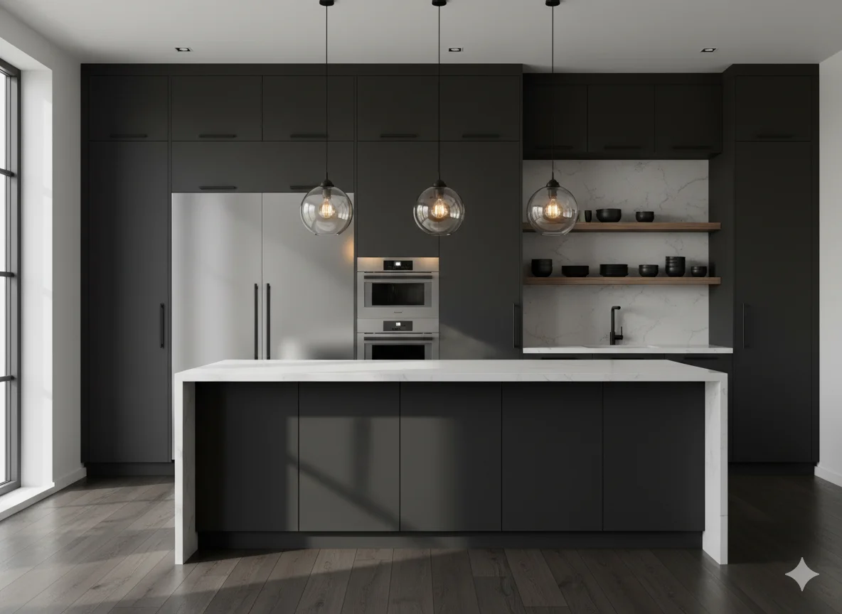
Charcoal Gray
Charcoal gray has become one of the most requested dark cabinet colors, and it is easy to understand why. It is versatile, sophisticated, and endlessly adaptable. Charcoal works in industrial kitchens alongside stainless steel appliances, in modern farmhouse kitchens with shiplap walls, and in sleek urban kitchens with integrated appliances. Matte charcoal especially, has an understated elegance that glossy black cannot quite replicate.
Matte Black
Matte black cabinets are bold, modern, and surprisingly livable. The key to making matte black work is balance. Pairing black cabinetry with white countertops, natural wood open shelving, and warm lighting prevents the space from feeling heavy. In smaller kitchens, consider using matte black only on the lower cabinets and island while keeping upper cabinets in a lighter tone.
Deep Burgundy and Rich Red
Warm, wine-inspired tones like deep burgundy and terracotta red are a compelling alternative to the usual dark colors. These shades bring energy and warmth, and they feel particularly at home in traditional or Mediterranean-inspired kitchens. Deep red cabinetry paired with brushed gold hardware and dark stone countertops creates a kitchen with the warmth and richness of a European villa.
Soft Pastels Making a Comeback
Blush Pink
Blush pink cabinets are not as daring as they sound. At their best, they deliver a quiet, romantic quality that feels both modern and nostalgic. Pale blush works especially well in smaller kitchens where a touch of warmth and personality goes a long way. Pair it with white countertops, brass hardware, and fluted cabinet doors for a look that feels fresh and considered.
Butter Yellow
Butter yellow is one of the most uplifting cabinet colors available. It is joyful without being overwhelming, and it reflects light in a way that makes kitchens feel naturally bright and energetic. Butter yellow cabinets with white shaker doors and oil-rubbed bronze hardware create a cheerful, vintage-inspired kitchen that never feels dated.
Muted Mint
Muted mint brings a retro sensibility to modern kitchens. Unlike bright mint, the muted version has a grayed quality that keeps it from feeling too sweet. It pairs well with warm wood tones, concrete countertops, and black hardware for a kitchen that balances softness with an industrial edge.
Natural Wood Tones as Color
Light Oak and White Oak
Natural wood finishes are experiencing a powerful resurgence. Light oak and white oak cabinetry bring warmth, texture, and an organic quality that painted cabinets simply cannot replicate. White oak cabinets in a Japandi-inspired kitchen, paired with matte white countertops and hidden hardware, represent one of the most refined kitchen aesthetics available today.
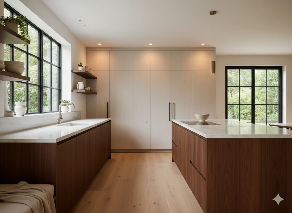
Walnut
Walnut cabinetry occupies the darker end of the wood spectrum. Rich, warm, and naturally dramatic, walnut brings a depth and luxury to kitchens without resorting to paint. Walnut works particularly well in mid-century modern, contemporary, and high-end transitional kitchens. Paired with brushed black hardware and a waterfall quartz island, walnut cabinetry has a commanding, timeless appeal.
The Power of Two-Tone Combinations
Classic Upper and Lower Contrasts
Two-tone cabinetry, where upper and lower cabinets are painted in contrasting colors, remains one of the most design-forward choices available to homeowners. The most popular pairings include soft white upper cabinets with navy or forest green lower cabinets, and warm cream uppers with charcoal or sage lowers. This approach adds visual depth and allows homeowners to introduce a bold color without overwhelming the entire kitchen.
Island as Accent
Using the kitchen island as a color accent is an accessible way to experiment with bolder hues. An island painted in deep green, warm red, or navy blue while the perimeter cabinetry remains in a neutral tone creates a focal point that draws the eye and adds personality without requiring a full commitment to a dramatic palette.
Choosing the Right Color for Your Kitchen
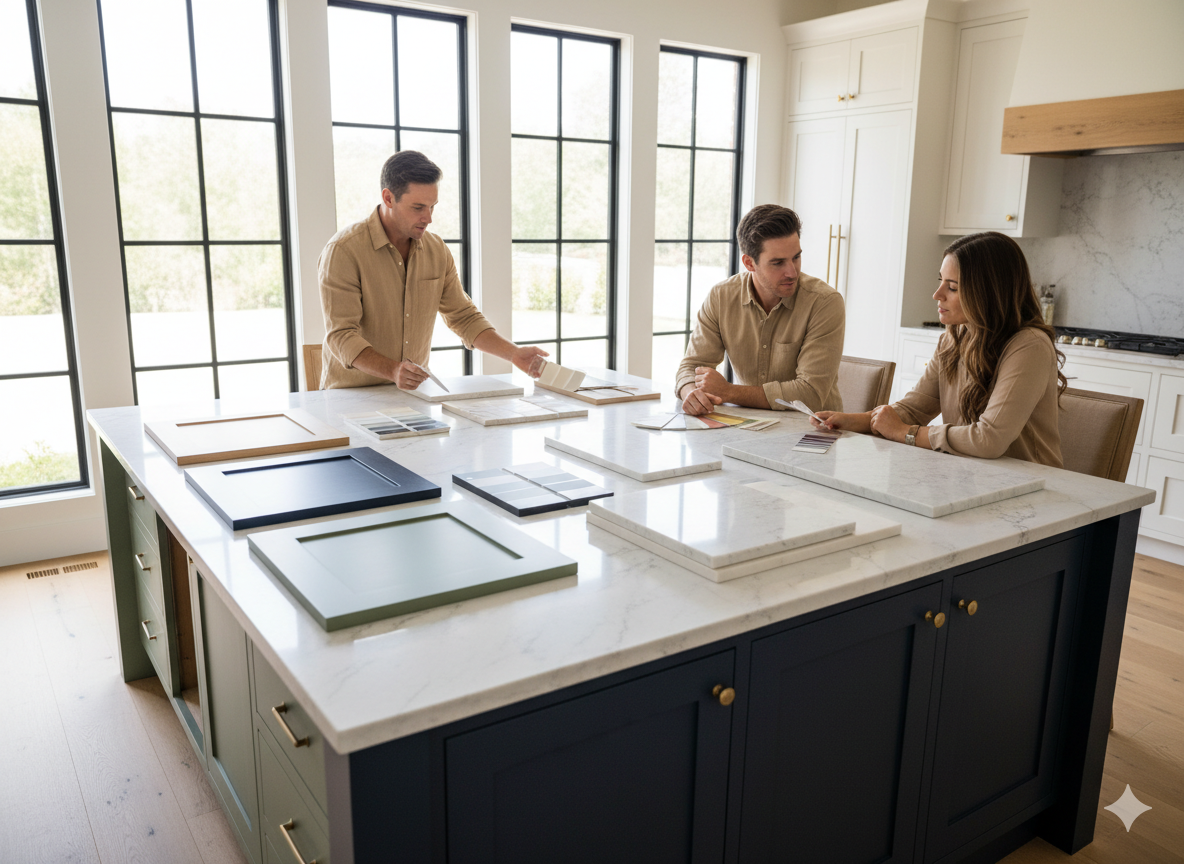
Selecting a cabinet color is rarely just about personal preference. The size of the kitchen, the quality and direction of natural light, the style of the home, and the materials already present all play a role. Dark cabinets thrive in large, well-lit kitchens and can make smaller spaces feel enclosed if not balanced with lighter countertops, reflective surfaces, and strong overhead lighting. Warm neutrals and soft pastels are forgiving in almost any kitchen, while bold jewel tones require careful consideration of proportion and light.
It is also worth considering the longevity of a color choice. Design-forward homeowners may love an on-trend emerald green kitchen today, but a more timeless sage or forest green will serve the space better over the long term. As a general principle, using bold colors as accents rather than as the dominant palette extends the life of any design decision.
Conclusion
Kitchen cabinet color has never been more expressive or more intentional than it is right now. The trends of this era reflect a broader cultural shift toward warmth, personalization, and a desire for spaces that feel genuinely livable rather than simply photogenic. Whether a homeowner gravitates toward the enduring sophistication of forest green, the quiet authority of charcoal, the natural beauty of white oak, or the cheerful optimism of butter yellow, the current landscape of cabinet colors offers something meaningful for every taste and every kitchen. The most important thing is to choose a color that feels authentic to the home and to the people who live in it, because the best kitchen design is never just about trend, it is about belonging.
Frequently Asked Questions
1. What is the most popular kitchen cabinet color in 2025?
Sage green and warm neutrals like creamy white and greige are among the most requested cabinet colors in 2025. Navy blue and forest green are also consistently popular choices across a variety of kitchen styles.
2. Are dark kitchen cabinets a good long-term investment?
Dark cabinets like charcoal gray and navy blue are increasingly considered timeless rather than purely trendy. When properly balanced with lighter countertops and adequate lighting, dark cabinets can add lasting sophistication and appeal to a kitchen.
3. How do two-tone kitchen cabinets work in smaller kitchens?
Two-tone cabinets work well in smaller kitchens when the upper cabinets are kept in a lighter tone to maintain a sense of height and airiness. The lower cabinets can carry a deeper color, which adds visual interest without making the space feel compressed.
4. What hardware finish works best with green kitchen cabinets?
Brushed brass and unlacquered brass hardware are the most popular pairings with green cabinets, particularly sage and forest green. Matte black hardware is an excellent alternative for a more modern or industrial aesthetic.
5. Should kitchen cabinet color match the rest of the home?
Kitchen cabinets do not need to match the broader home palette exactly, but they should connect to it through shared undertones, materials, or complementary colors. An abrupt shift in color between the kitchen and adjacent living spaces can feel jarring, particularly in open-concept floor plans.